
Article Categories
- All Categories
-
 Data Structure
-
 Networking
-
 RDBMS
RDBMS
-
 Operating System
-
 Java
Java
-
 MS Excel
-
 iOS
iOS
-
 HTML
HTML
-
 CSS
CSS
-
 Android
-
 Python
-
 C Programming
-
 C++
C++
-
 C#
C#
-
 MongoDB
-
 MySQL
MySQL
-
 Javascript
-
 PHP
PHP
-
 Economics & Finance
How to use Material-UI with Next.js?
Material-UI is a popular React-based UI library that provides a wide2 range of UI components and design elements. Next.js is a React-based framework for building server-side rendered (SSR) and statically exported web applications. In this tutorial, we will learn how to use Material-UI with Next.js to create a user-friendly, modern and responsive user interface.
Steps to integrate Material-UI with Next.js
Users can follow the steps below to use Material-UI with NextJS.
Step 1 ? Start by creating a new Next.js project using the following command ?
npx create-next-app my-app
Step 2 ? Navigate to the newly created project folder ?
cd my-app
Step 3 ? Install Material-UI by running the following command ?
npm install @mui/material @emotion/react @emotion/styled
Step 4 ? Import Material-UI components in the Next.js pages. For example, we can import the Button component from Material-UI as follows:
import Button from '@mui/material/Button';
Step 5 ? Use the imported Material-UI components in the Next.js pages. For example, users can use the Button component as follows:
<span class="tag"><Button</span><span class="pln"> </span><span class="atn">variant</span><span class="pun">=</span><span class="atv">"contained"</span><span class="pln"> </span><span class="atn">color</span><span class="pun">=</span><span class="atv">"primary"</span><span class="tag">></span><span class="pln">
   Click Me!
</span><span class="tag"></Button></span>
Step 6 ? To add a Material-UI theme, first import the createTheme function ?
<span class="kwd">import</span><span class="pln"> </span><span class="pun">{</span><span class="pln"> createTheme </span><span class="pun">}</span><span class="pln"> </span><span class="kwd">from</span><span class="pln"> </span><span class="str">'@mui/material/styles'</span><span class="pun">;</span>
Step 7 ? Create a theme object ?
<span class="kwd">const</span><span class="pln"> theme </span><span class="pun">=</span><span class="pln"> createTheme</span><span class="pun">({</span><span class="pln">
   palette</span><span class="pun">:</span><span class="pln"> </span><span class="pun">{</span><span class="pln">
      primary</span><span class="pun">:</span><span class="pln"> </span><span class="pun">{</span><span class="pln">
         main</span><span class="pun">:</span><span class="pln"> </span><span class="str">'#1976d2'</span><span class="pun">,</span><span class="pln">
      </span><span class="pun">},</span><span class="pln">
   </span><span class="pun">},</span><span class="pln">
</span><span class="pun">});</span>
Step 8 ? Now we need to wrap our entire Next.js application in a ThemeProvider component and pass the theme object as a prop ?
<span class="kwd">import</span><span class="pln"> </span><span class="pun">{</span><span class="pln"> </span><span class="typ">ThemeProvider</span><span class="pln"> </span><span class="pun">}</span><span class="pln"> </span><span class="kwd">from</span><span class="pln"> </span><span class="str">'@mui/material/styles'</span><span class="pun">;</span><span class="pln">
</span><span class="kwd">function</span><span class="pln"> </span><span class="typ">MyApp</span><span class="pun">({</span><span class="pln"> </span><span class="typ">Component</span><span class="pun">,</span><span class="pln"> pageProps </span><span class="pun">})</span><span class="pln"> </span><span class="pun">{</span><span class="pln">
   </span><span class="kwd">return</span><span class="pln"> </span><span class="pun">(</span><span class="pln">
      </span><span class="pun"><</span><span class="typ">ThemeProvider</span><span class="pln"> theme</span><span class="pun">={</span><span class="pln">theme</span><span class="pun">}></span><span class="pln">
      </span><span class="pun"><</span><span class="typ">Component</span><span class="pln"> </span><span class="pun">{...</span><span class="pln">pageProps</span><span class="pun">}</span><span class="pln"> </span><span class="pun">/></span><span class="pln">
      </span><span class="pun"></</span><span class="typ">ThemeProvider</span><span class="pun">></span><span class="pln">
   </span><span class="pun">);</span><span class="pln">
</span><span class="pun">}</span>
And that's it! Now we have Material-UI components and themes integrated into our Next.js application.
Example
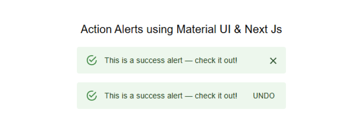
In this example, we are using Material-UI to create two alerts. The code starts with the import statement, which imports the necessary React library and Material-UI components we need.
Next, we define the component "ActionAlerts". This component uses the Stack component from Material-UI to display two alerts. The Stack component is given a width of 100% and a spacing of 2 units.
The first alert is defined using the Alert component from Material-UI. This alert has the message "This is a success alert ? check it out!" and does not have an action defined.
The second alert is defined using the Alert component as well. This alert has the message "This is a success alert ? check it out!" and has an action defined, which is a button that says "UNDO".
This code demonstrates how to use Material-UI to create alerts in Next.js, which can provide user feedback or display important information.
import * as React from 'react';
import Alert from '@mui/material/Alert';
import Button from '@mui/material/Button';
import Stack from '@mui/material/Stack';
import { Typography } from '@mui/material';

export default function ActionAlerts() {
   return (
      <>
         <Typography sx= {{textAlign: "center",mb: "1rem"}} >Action Alerts</Typography>
         <Stack sx= {{ width: '100%' }} spacing= {2} >
            <Alert onClose={() => {}}> This is a success alert ? check it out! </Alert>
            <Alert
               action={
                  <Button color = "inherit" size = "small" >
                     UNDO
                  </Button>
               }
            >
               This is a success alert ? check it out!
            </Alert>
         </Stack>
      </>
   );
}
Output
Example
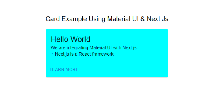
This is another example of how to integrate Material-UI with Next.js. The example creates a simple card component that displays a greeting message and includes a "Learn More" button.
Step 1 ? The code starts by importing the required dependencies from the Material-UI library. These include the Box, Card, CardActions, CardContent, Button, and Typography components.
Step 2 ? The bull constant is defined using a Box component. This component is used to display a bullet point character (?) and is used to separate the two lines of text in the card.
Step 3 ? The Mui component is defined as the default export of this file.
Step 4 ? The Card component is then defined, using the minWidth and backgroundColor properties to set the width and background colour of the card.
Step 5 ? The CardContent component is used to display the greeting message "Hello World" .
Step 6 ? The CardActions component is used to display a button with the text "Learn More".
Overall, this code demonstrates how to use Material-UI components to create a simple card component in Next.js. The Box, Card, CardActions, CardContent, Button, and Typography components from Material-UI are used to create a visually appealing and functional card component.
import * as React from 'react';
import Box from '@mui/material/Box';
import Card from '@mui/material/Card';
import CardActions from '@mui/material/CardActions';
import CardContent from '@mui/material/CardContent';
import Button from '@mui/material/Button';
import Typography from '@mui/material/Typography';

// Create a bullet point character for use in the CardContent component
const bull = (
   <Box
      component="span"
      sx={{ display: 'inline-block', mx: '2px', transform: 'scale(0.8)' }}
   >
   </Box>
);

// The default export of this file, the Mui component
export default function SimpleCard() {
   return (

      // A typography component to display a heading
      <Typography variant = "h6" component = "div" sx = {{marginBottom:"1rem"}}>
         Card Example Using Material UI & Next Js
      </Typography>

      // A Card component with specific styles applied
      <Card sx={{ minWidth: 275, backgroundColor:`aqua` }}>
         <CardContent>
            {/* A typography component to display the greeting message */}
            <Typography variant = "h5" component = "div">
               Hello World
            </Typography>
            {/* A typography component to display the description of the example */}
            <Typography variant = "body2">
               We are integrating Material UI with Next.js
               <br />
               {/* Use the bull constant to separate the two lines of text */}
               {bull} Next.js is a React framework
            </Typography>
         </CardContent>
         {/* A CardActions component to display the "Learn More" button */}
         <CardActions>
            <Button size = "small" > Learn More </Button>
         </CardActions>
      </Card>
   );
}
Now add the custom card component to a Next.js page ?
import SimpleCard from './SimpleCard';

function HomePage() {
   return (
      <div>
         <SimpleCard />
      </div>
   );
}
export default HomePage;
Output
In this tutorial, we learned how to use Material-UI with Next.js to create a modern and responsive user interface. Material-UI provides a wide range of UI components and design elements that can be easily integrated into Next.js applications. With its powerful styling system, Material-UI makes it easy to create custom themes and styles for our Next.js application. We hope this tutorial has helped users start using Material-UI with Next.js.

7K+ Views
