
Article Categories
- All Categories
-
 Data Structure
-
 Networking
-
 RDBMS
RDBMS
-
 Operating System
-
 Java
Java
-
 MS Excel
-
 iOS
iOS
-
 HTML
HTML
-
 CSS
CSS
-
 Android
-
 Python
-
 C Programming
-
 C++
C++
-
 C#
C#
-
 MongoDB
-
 MySQL
MySQL
-
 Javascript
-
 PHP
PHP
-
 Economics & Finance
How to use AppBar Component in Material UI?
The Material UI is a library containing various components with different styles and responsive designs. For example, Material UI contains an AppBar component, which we can directly import into the React component and use as a child component of other components.
Also, the Material UI library contains different components like buttons, links, tab bars, pagination etc. Furthermore, we can manipulate every component by passing a prop while using the component. For example, we can make an AppBar responsive by passing the respected props.
This tutorial will teach us to use the AppBar component in Material UI.
Users should install the Material UI library before using it in the application. Open the terminal, go to the project directory and enter the below commands to install Material UI in the React application.
npm install @mui/material @mui/icons-material
Syntax
Users can follow the syntax below to use the Material UI library for a stylish AppBar component.
<Box sx = {{ flexGrow: 1 }}>
   <AppBar position = "static">
      <Toolbar>
         {/* Add the content for toolbar */}
      </Toolbar>
   </AppBar>
</Box>
In the above syntax, we have used the AppBar component and passed the position as a prop. Also, we have wrapped the AppBar component in the Box component and added the Toolbar component as a child of the AppBar component.
Example
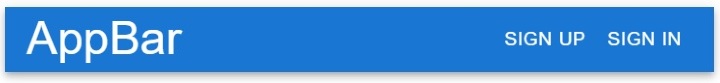
In the example below, we have used the AppBar component from the Material UI library and created the simple top navbar.
In the AppBar component, we have also passed some child components with props. In the TypoGraphy component, we have passed ?sx={{ flexGrow: 1}}? as a prop which allows us to set other content at the right corner of the AppBar component.
Also, we have added the Sign Up, and Sign In buttons at the right corner of the NavBar.
<div class="code-mirror  language-java" contenteditable="plaintext-only" spellcheck="false" style="outline: none; overflow-wrap: break-word; overflow-y: auto; white-space: pre-wrap;"><span class="token keyword">import</span> <span class="token class-name">React</span> from <span class="token string">"react"</span><span class="token punctuation">;</span>
<span class="token keyword">import</span> <span class="token class-name">AppBar</span> from <span class="token string">"@mui/material/AppBar"</span><span class="token punctuation">;</span>
<span class="token keyword">import</span> <span class="token class-name">Box</span> from <span class="token string">"@mui/material/Box"</span><span class="token punctuation">;</span>
<span class="token keyword">import</span> <span class="token class-name">Typography</span> from <span class="token string">"@mui/material/Typography"</span><span class="token punctuation">;</span>
<span class="token keyword">import</span> <span class="token class-name">Button</span> from <span class="token string">"@mui/material/Button"</span><span class="token punctuation">;</span>
<span class="token keyword">import</span> <span class="token class-name">Toolbar</span> from <span class="token string">"@mui/material/Toolbar"</span><span class="token punctuation">;</span>

export <span class="token keyword">default</span> function <span class="token class-name">App</span><span class="token punctuation">(</span><span class="token punctuation">)</span> <span class="token punctuation">{</span>
   <span class="token keyword">return</span> <span class="token punctuation">(</span>
      <span class="token generics"><span class="token punctuation"><</span><span class="token class-name">Box</span><span class="token punctuation">></span></span>
         <span class="token operator"><</span><span class="token class-name">AppBar</span> position<span class="token operator">=</span><span class="token string">"static"</span><span class="token operator">></span>
            <span class="token generics"><span class="token punctuation"><</span><span class="token class-name">Toolbar</span><span class="token punctuation">></span></span>
               <span class="token punctuation">{</span><span class="token comment">/* sx = {flexGrow: 1} allows us to set all content at right except typography */</span><span class="token punctuation">}</span>
               <span class="token operator"><</span><span class="token class-name">Typography</span> variant <span class="token operator">=</span> <span class="token string">"h4"</span> sx <span class="token operator">=</span> <span class="token punctuation">{</span><span class="token punctuation">{</span> flexGrow<span class="token operator">:</span> <span class="token number">1</span> <span class="token punctuation">}</span><span class="token punctuation">}</span><span class="token operator">></span>
                  <span class="token class-name">AppBar</span>
               <span class="token operator"><</span><span class="token operator">/</span><span class="token class-name">Typography</span><span class="token operator">></span>
               <span class="token operator"><</span><span class="token class-name">Button</span> color <span class="token operator">=</span> <span class="token string">"inherit"</span><span class="token operator">></span> <span class="token class-name">Sign</span> <span class="token class-name">Up</span> <span class="token operator"><</span><span class="token operator">/</span><span class="token class-name">Button</span><span class="token operator">></span>
               <span class="token operator"><</span><span class="token class-name">Button</span> color <span class="token operator">=</span> <span class="token string">"inherit"</span><span class="token operator">></span> <span class="token class-name">Sign</span> <span class="token class-name">In</span> <span class="token operator"><</span><span class="token operator">/</span><span class="token class-name">Button</span><span class="token operator">></span>
            <span class="token operator"><</span><span class="token operator">/</span><span class="token class-name">Toolbar</span><span class="token operator">></span>
         <span class="token operator"><</span><span class="token operator">/</span><span class="token class-name">AppBar</span><span class="token operator">></span>
      <span class="token operator"><</span><span class="token operator">/</span><span class="token class-name">Box</span><span class="token operator">></span>
   <span class="token punctuation">)</span><span class="token punctuation">;</span>
<span class="token punctuation">}</span>
</div>
Output
Example
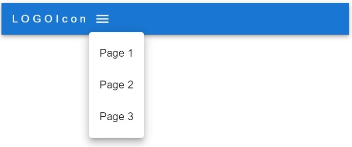
In the example below, we have created the responsive Navbar using the AppBar component of the Material UI library.
Users can see a menu item in the row for laptop-size devices and as a tooltip for tablet and mobile devices. Also, users can change the menu options in the page array. Furthermore, developers can observe how we have used the map() method to create each menu item.
<div class="code-mirror  language-java" contenteditable="plaintext-only" spellcheck="false" style="outline: none; overflow-wrap: break-word; overflow-y: auto; white-space: pre-wrap;"><span class="token keyword">import</span> <span class="token operator">*</span> as <span class="token class-name">React</span> from <span class="token string">"react"</span><span class="token punctuation">;</span>

<span class="token keyword">import</span> <span class="token class-name">Container</span> from <span class="token string">"@mui/material/Container"</span><span class="token punctuation">;</span>
<span class="token keyword">import</span> <span class="token class-name">Toolbar</span> from <span class="token string">"@mui/material/Toolbar"</span><span class="token punctuation">;</span>
<span class="token keyword">import</span> <span class="token class-name">Button</span> from <span class="token string">"@mui/material/Button"</span><span class="token punctuation">;</span>
<span class="token keyword">import</span> <span class="token class-name">MenuItem</span> from <span class="token string">"@mui/material/MenuItem"</span><span class="token punctuation">;</span>
<span class="token keyword">import</span> <span class="token class-name">IconButton</span> from <span class="token string">"@mui/material/IconButton"</span><span class="token punctuation">;</span>
<span class="token keyword">import</span> <span class="token class-name">Box</span> from <span class="token string">"@mui/material/Box"</span><span class="token punctuation">;</span>
<span class="token keyword">import</span> <span class="token class-name">Typography</span> from <span class="token string">"@mui/material/Typography"</span><span class="token punctuation">;</span>
<span class="token keyword">import</span> <span class="token class-name">AppBar</span> from <span class="token string">"@mui/material/AppBar"</span><span class="token punctuation">;</span>
<span class="token keyword">import</span> <span class="token class-name">Menu</span> from <span class="token string">"@mui/material/Menu"</span><span class="token punctuation">;</span>
<span class="token keyword">import</span> <span class="token class-name">MenuIcon</span> from <span class="token string">"@mui/icons-material/Menu"</span><span class="token punctuation">;</span>

export <span class="token keyword">default</span> function <span class="token class-name">App</span><span class="token punctuation">(</span><span class="token punctuation">)</span> <span class="token punctuation">{</span>
   <span class="token keyword">const</span> pages <span class="token operator">=</span> <span class="token punctuation">[</span><span class="token string">"Page 1"</span><span class="token punctuation">,</span> <span class="token string">"Page 2"</span><span class="token punctuation">,</span> <span class="token string">"Page 3"</span><span class="token punctuation">]</span><span class="token punctuation">;</span>

   <span class="token keyword">const</span> <span class="token punctuation">[</span>menuItems<span class="token punctuation">,</span> setmenuItems<span class="token punctuation">]</span> <span class="token operator">=</span> <span class="token class-name">React</span><span class="token punctuation">.</span><span class="token function">useState</span><span class="token punctuation">(</span><span class="token keyword">null</span><span class="token punctuation">)</span><span class="token punctuation">;</span>
   <span class="token comment">// function to close and open the tooltip menu</span>
   <span class="token keyword">const</span> openMenuToolTip <span class="token operator">=</span> <span class="token punctuation">(</span>event<span class="token punctuation">)</span> <span class="token operator">=</span><span class="token operator">></span> <span class="token punctuation">{</span>
      <span class="token function">setmenuItems</span><span class="token punctuation">(</span>event<span class="token punctuation">.</span>currentTarget<span class="token punctuation">)</span><span class="token punctuation">;</span>
   <span class="token punctuation">}</span><span class="token punctuation">;</span>

   <span class="token keyword">const</span> closeMenuToolTip <span class="token operator">=</span> <span class="token punctuation">(</span><span class="token punctuation">)</span> <span class="token operator">=</span><span class="token operator">></span> <span class="token punctuation">{</span>
      <span class="token function">setmenuItems</span><span class="token punctuation">(</span><span class="token keyword">null</span><span class="token punctuation">)</span><span class="token punctuation">;</span>
   <span class="token punctuation">}</span><span class="token punctuation">;</span>
   <span class="token keyword">return</span> <span class="token punctuation">(</span>
      <span class="token operator"><</span><span class="token class-name">AppBar</span> position <span class="token operator">=</span> <span class="token string">"static"</span><span class="token operator">></span>
         <span class="token operator"><</span><span class="token class-name">Container</span> maxWidth <span class="token operator">=</span> <span class="token string">"xxl"</span><span class="token operator">></span>
            <span class="token punctuation">{</span><span class="token comment">/* adding the toolbar */</span><span class="token punctuation">}</span>
            <span class="token generics"><span class="token punctuation"><</span><span class="token class-name">Toolbar</span> disableGutters<span class="token punctuation">></span></span>
               <span class="token punctuation">{</span><span class="token comment">/* adding the logo icon */</span><span class="token punctuation">}</span>
               <span class="token operator"><</span><span class="token class-name">Typography</span>
                  <span class="token class-name">Variant</span> <span class="token operator">=</span> <span class="token string">"h4"</span>
                  sx <span class="token operator">=</span> <span class="token punctuation">{</span><span class="token punctuation">{</span>
                  letterSpacing<span class="token operator">:</span> <span class="token string">"5px"</span><span class="token punctuation">,</span>
                  color<span class="token operator">:</span> <span class="token string">"white"</span><span class="token punctuation">,</span>
                  textDecoration<span class="token operator">:</span> <span class="token string">"none"</span><span class="token punctuation">,</span>
                  <span class="token punctuation">}</span><span class="token punctuation">}</span>
               <span class="token operator">></span>
                  <span class="token class-name">LOGOIcon</span>
               <span class="token operator"><</span><span class="token operator">/</span><span class="token class-name">Typography</span><span class="token operator">></span>
               <span class="token punctuation">{</span><span class="token comment">/* menu icon for mobile and tablet devices */</span><span class="token punctuation">}</span>
               <span class="token operator"><</span><span class="token class-name">Box</span> sx <span class="token operator">=</span> <span class="token punctuation">{</span><span class="token punctuation">{</span> flexGrow<span class="token operator">:</span> <span class="token number">1</span><span class="token punctuation">,</span> display<span class="token operator">:</span> <span class="token punctuation">{</span> xs<span class="token operator">:</span> <span class="token string">"flex"</span><span class="token punctuation">,</span> md<span class="token operator">:</span> <span class="token string">"none"</span> <span class="token punctuation">}</span> <span class="token punctuation">}</span><span class="token punctuation">}</span><span class="token operator">></span>
               <span class="token operator"><</span><span class="token class-name">IconButton</span> onClick <span class="token operator">=</span> <span class="token punctuation">{</span>openMenuToolTip<span class="token punctuation">}</span> color <span class="token operator">=</span> <span class="token string">"inherit"</span><span class="token operator">></span>
                  <span class="token operator"><</span><span class="token class-name">MenuIcon</span> <span class="token operator">/</span><span class="token operator">></span>
               <span class="token operator"><</span><span class="token operator">/</span><span class="token class-name">IconButton</span><span class="token operator">></span>
               <span class="token punctuation">{</span><span class="token comment">/* tooptip options */</span><span class="token punctuation">}</span>
               <span class="token operator"><</span><span class="token class-name">Menu</span>
                  anchorEl <span class="token operator">=</span> <span class="token punctuation">{</span>menuItems<span class="token punctuation">}</span>
                  <span class="token keyword">open</span> <span class="token operator">=</span> <span class="token punctuation">{</span><span class="token class-name">Boolean</span><span class="token punctuation">(</span>menuItems<span class="token punctuation">)</span><span class="token punctuation">}</span>
                  onClose <span class="token operator">=</span> <span class="token punctuation">{</span>closeMenuToolTip<span class="token punctuation">}</span>
               <span class="token operator">></span>
                  <span class="token punctuation">{</span>pages<span class="token punctuation">.</span><span class="token function">map</span><span class="token punctuation">(</span><span class="token punctuation">(</span>page<span class="token punctuation">)</span> <span class="token operator">=</span><span class="token operator">></span> <span class="token punctuation">(</span>
                     <span class="token operator"><</span><span class="token class-name">MenuItem</span> key <span class="token operator">=</span> <span class="token punctuation">{</span>page<span class="token punctuation">}</span> onClick <span class="token operator">=</span> <span class="token punctuation">{</span>closeMenuToolTip<span class="token punctuation">}</span><span class="token operator">></span>
                        <span class="token operator"><</span><span class="token class-name">Typography</span> textAlign <span class="token operator">=</span> <span class="token string">"center"</span><span class="token operator">></span> <span class="token punctuation">{</span>page<span class="token punctuation">}</span> <span class="token operator"><</span><span class="token operator">/</span><span class="token class-name">Typography</span><span class="token operator">></span>
                     <span class="token operator"><</span><span class="token operator">/</span><span class="token class-name">MenuItem</span><span class="token operator">></span>
                  <span class="token punctuation">)</span><span class="token punctuation">)</span><span class="token punctuation">}</span>
               <span class="token operator"><</span><span class="token operator">/</span><span class="token class-name">Menu</span><span class="token operator">></span>
               <span class="token operator"><</span><span class="token operator">/</span><span class="token class-name">Box</span><span class="token operator">></span>
               <span class="token punctuation">{</span><span class="token comment">/* menu items for laptop devices */</span><span class="token punctuation">}</span>
               <span class="token operator"><</span><span class="token class-name">Box</span> sx <span class="token operator">=</span> <span class="token punctuation">{</span><span class="token punctuation">{</span> flexGrow<span class="token operator">:</span> <span class="token number">1</span><span class="token punctuation">,</span> display<span class="token operator">:</span> <span class="token punctuation">{</span> xs<span class="token operator">:</span> <span class="token string">"none"</span><span class="token punctuation">,</span> md<span class="token operator">:</span> <span class="token string">"flex"</span> <span class="token punctuation">}</span> <span class="token punctuation">}</span><span class="token punctuation">}</span><span class="token operator">></span>
                  <span class="token punctuation">{</span>pages<span class="token punctuation">.</span><span class="token function">map</span><span class="token punctuation">(</span><span class="token punctuation">(</span>page<span class="token punctuation">)</span> <span class="token operator">=</span><span class="token operator">></span> <span class="token punctuation">(</span>
                     <span class="token operator"><</span><span class="token class-name">Button</span>
                        key <span class="token operator">=</span> <span class="token punctuation">{</span>page<span class="token punctuation">}</span>
                        onClick <span class="token operator">=</span> <span class="token punctuation">{</span>closeMenuToolTip<span class="token punctuation">}</span>
                        sx <span class="token operator">=</span> <span class="token punctuation">{</span><span class="token punctuation">{</span> color<span class="token operator">:</span> <span class="token string">"white"</span><span class="token punctuation">,</span> display<span class="token operator">:</span> <span class="token string">"block"</span> <span class="token punctuation">}</span><span class="token punctuation">}</span>
                     <span class="token operator">></span>
                        <span class="token punctuation">{</span>page<span class="token punctuation">}</span>
                     <span class="token operator"><</span><span class="token operator">/</span><span class="token class-name">Button</span><span class="token operator">></span>
                  <span class="token punctuation">)</span><span class="token punctuation">)</span><span class="token punctuation">}</span>
               <span class="token operator"><</span><span class="token operator">/</span><span class="token class-name">Box</span><span class="token operator">></span>
            <span class="token operator"><</span><span class="token operator">/</span><span class="token class-name">Toolbar</span><span class="token operator">></span>
         <span class="token operator"><</span><span class="token operator">/</span><span class="token class-name">Container</span><span class="token operator">></span>
      <span class="token operator"><</span><span class="token operator">/</span><span class="token class-name">AppBar</span><span class="token operator">></span>
   <span class="token punctuation">)</span><span class="token punctuation">;</span>
<span class="token punctuation">}</span>
</div>
Output
Example
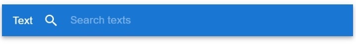
In the example below, we have added the search bar in the navbar using the AppBar component. We have created custom styles for the search bar.
In the output, users can observe that we have added the search bar at the right corner of the AppBar component.
<div class="code-mirror  language-java" contenteditable="plaintext-only" spellcheck="false" style="outline: none; overflow-wrap: break-word; overflow-y: auto; white-space: pre-wrap;"><span class="token keyword">import</span> <span class="token operator">*</span> as <span class="token class-name">React</span> from <span class="token string">"react"</span><span class="token punctuation">;</span>
<span class="token keyword">import</span> <span class="token punctuation">{</span> styled <span class="token punctuation">}</span> from <span class="token string">"@mui/material/styles"</span><span class="token punctuation">;</span>
<span class="token keyword">import</span> <span class="token class-name">AppBar</span> from <span class="token string">"@mui/material/AppBar"</span><span class="token punctuation">;</span>
<span class="token keyword">import</span> <span class="token class-name">Box</span> from <span class="token string">"@mui/material/Box"</span><span class="token punctuation">;</span>
<span class="token keyword">import</span> <span class="token class-name">InputBase</span> from <span class="token string">"@mui/material/InputBase"</span><span class="token punctuation">;</span>
<span class="token keyword">import</span> <span class="token class-name">Toolbar</span> from <span class="token string">"@mui/material/Toolbar"</span><span class="token punctuation">;</span>
<span class="token keyword">import</span> <span class="token class-name">SearchIcon</span> from <span class="token string">"@mui/icons-material/Search"</span><span class="token punctuation">;</span>
<span class="token keyword">import</span> <span class="token class-name">Typography</span> from <span class="token string">"@mui/material/Typography"</span><span class="token punctuation">;</span>

<span class="token comment">// different styles for the search bar</span>
<span class="token comment">// style for search div</span>
<span class="token keyword">const</span> <span class="token class-name">Search</span> <span class="token operator">=</span> <span class="token function">styled</span><span class="token punctuation">(</span><span class="token string">"div"</span><span class="token punctuation">)</span><span class="token punctuation">(</span><span class="token punctuation">(</span><span class="token punctuation">{</span> theme <span class="token punctuation">}</span><span class="token punctuation">)</span> <span class="token operator">=</span><span class="token operator">></span> <span class="token punctuation">(</span><span class="token punctuation">{</span>
   position<span class="token operator">:</span> <span class="token string">"relative"</span><span class="token punctuation">,</span>
   width<span class="token operator">:</span> <span class="token string">"100%"</span><span class="token punctuation">,</span>
   <span class="token punctuation">[</span>theme<span class="token punctuation">.</span>breakpoints<span class="token punctuation">.</span><span class="token function">up</span><span class="token punctuation">(</span><span class="token string">"sm"</span><span class="token punctuation">)</span><span class="token punctuation">]</span><span class="token operator">:</span> <span class="token punctuation">{</span>
      marginLeft<span class="token operator">:</span> theme<span class="token punctuation">.</span><span class="token function">spacing</span><span class="token punctuation">(</span><span class="token number">1</span><span class="token punctuation">)</span><span class="token punctuation">,</span>
      width<span class="token operator">:</span> <span class="token string">"auto"</span><span class="token punctuation">,</span>
   <span class="token punctuation">}</span><span class="token punctuation">,</span>
<span class="token punctuation">}</span><span class="token punctuation">)</span><span class="token punctuation">)</span><span class="token punctuation">;</span>

<span class="token comment">// style for a search icon</span>
<span class="token keyword">const</span> <span class="token class-name">SearchIconWrapper</span> <span class="token operator">=</span> <span class="token function">styled</span><span class="token punctuation">(</span><span class="token string">"div"</span><span class="token punctuation">)</span><span class="token punctuation">(</span><span class="token punctuation">(</span><span class="token punctuation">{</span> theme <span class="token punctuation">}</span><span class="token punctuation">)</span> <span class="token operator">=</span><span class="token operator">></span> <span class="token punctuation">(</span><span class="token punctuation">{</span>
   display<span class="token operator">:</span> <span class="token string">"flex"</span><span class="token punctuation">,</span>
   alignItems<span class="token operator">:</span> <span class="token string">"center"</span><span class="token punctuation">,</span>
   padding<span class="token operator">:</span> theme<span class="token punctuation">.</span><span class="token function">spacing</span><span class="token punctuation">(</span><span class="token number">0</span><span class="token punctuation">,</span> <span class="token number">2</span><span class="token punctuation">)</span><span class="token punctuation">,</span>
   height<span class="token operator">:</span> <span class="token string">"100%"</span><span class="token punctuation">,</span>
   position<span class="token operator">:</span> <span class="token string">"absolute"</span><span class="token punctuation">,</span>
<span class="token punctuation">}</span><span class="token punctuation">)</span><span class="token punctuation">)</span><span class="token punctuation">;</span>

<span class="token comment">// style for input in the search</span>
<span class="token keyword">const</span> <span class="token class-name">StyledInputBase</span> <span class="token operator">=</span> <span class="token function">styled</span><span class="token punctuation">(</span><span class="token class-name">InputBase</span><span class="token punctuation">)</span><span class="token punctuation">(</span><span class="token punctuation">(</span><span class="token punctuation">{</span> theme <span class="token punctuation">}</span><span class="token punctuation">)</span> <span class="token operator">=</span><span class="token operator">></span> <span class="token punctuation">(</span><span class="token punctuation">{</span>
   color<span class="token operator">:</span> <span class="token string">"inherit"</span><span class="token punctuation">,</span>
   <span class="token string">"& .MuiInputBase-input"</span><span class="token operator">:</span> <span class="token punctuation">{</span>
      padding<span class="token operator">:</span> theme<span class="token punctuation">.</span><span class="token function">spacing</span><span class="token punctuation">(</span><span class="token number">1</span><span class="token punctuation">,</span> <span class="token number">1</span><span class="token punctuation">,</span> <span class="token number">1</span><span class="token punctuation">,</span> <span class="token number">0</span><span class="token punctuation">)</span><span class="token punctuation">,</span>
      paddingLeft<span class="token operator">:</span> `<span class="token number">3.5</span>rem`<span class="token punctuation">,</span>
      width<span class="token operator">:</span> <span class="token string">"100%"</span><span class="token punctuation">,</span>
   <span class="token punctuation">}</span><span class="token punctuation">,</span>
<span class="token punctuation">}</span><span class="token punctuation">)</span><span class="token punctuation">)</span><span class="token punctuation">;</span>

export <span class="token keyword">default</span> function <span class="token class-name">App</span><span class="token punctuation">(</span><span class="token punctuation">)</span> <span class="token punctuation">{</span>
   <span class="token keyword">return</span> <span class="token punctuation">(</span>
      <span class="token operator"><</span><span class="token class-name">Box</span> sx <span class="token operator">=</span> <span class="token punctuation">{</span><span class="token punctuation">{</span> flexGrow<span class="token operator">:</span> <span class="token number">1</span> <span class="token punctuation">}</span><span class="token punctuation">}</span><span class="token operator">></span>
         <span class="token operator"><</span><span class="token class-name">AppBar</span> position <span class="token operator">=</span> <span class="token string">"static"</span><span class="token operator">></span>
            <span class="token generics"><span class="token punctuation"><</span><span class="token class-name">Toolbar</span><span class="token punctuation">></span></span>
               <span class="token operator"><</span><span class="token class-name">Typography</span> sx <span class="token operator">=</span> <span class="token punctuation">{</span><span class="token punctuation">{</span> flexGrow<span class="token operator">:</span> <span class="token number">1</span> <span class="token punctuation">}</span><span class="token punctuation">}</span><span class="token operator">></span><span class="token class-name">Text</span><span class="token operator"><</span><span class="token operator">/</span><span class="token class-name">Typography</span><span class="token operator">></span>
                  <span class="token punctuation">{</span><span class="token comment">/* adding the search to AppBar component */</span><span class="token punctuation">}</span>
               <span class="token generics"><span class="token punctuation"><</span><span class="token class-name">Search</span><span class="token punctuation">></span></span>
                  <span class="token generics"><span class="token punctuation"><</span><span class="token class-name">SearchIconWrapper</span><span class="token punctuation">></span></span>
                     <span class="token operator"><</span><span class="token class-name">SearchIcon</span> <span class="token operator">/</span><span class="token operator">></span>
                  <span class="token operator"><</span><span class="token operator">/</span><span class="token class-name">SearchIconWrapper</span><span class="token operator">></span>
                  <span class="token operator"><</span><span class="token class-name">StyledInputBase</span> placeholder<span class="token operator">=</span><span class="token string">"Search texts"</span> <span class="token operator">/</span><span class="token operator">></span>
               <span class="token operator"><</span><span class="token operator">/</span><span class="token class-name">Search</span><span class="token operator">></span>
            <span class="token operator"><</span><span class="token operator">/</span><span class="token class-name">Toolbar</span><span class="token operator">></span>
         <span class="token operator"><</span><span class="token operator">/</span><span class="token class-name">AppBar</span><span class="token operator">></span>
      <span class="token operator"><</span><span class="token operator">/</span><span class="token class-name">Box</span><span class="token operator">></span>
   <span class="token punctuation">)</span><span class="token punctuation">;</span>
<span class="token punctuation">}</span>
</div>
Output
In this tutorial, users learned to use the AppBar component of the Material UI. We have seen three different examples with an AppBar component. In the first example, we have created a basic Navbar, in second example we have created responsive navbar, and in third example we have aadded the search bar to the AppBar component.

3K+ Views
