
Article Categories
- All Categories
-
 Data Structure
-
 Networking
-
 RDBMS
RDBMS
-
 Operating System
-
 Java
Java
-
 MS Excel
-
 iOS
iOS
-
 HTML
HTML
-
 CSS
CSS
-
 Android
-
 Python
-
 C Programming
-
 C++
C++
-
 C#
C#
-
 MongoDB
-
 MySQL
MySQL
-
 Javascript
-
 PHP
PHP
-
 Economics & Finance
How to use Icons in Material UI?
Icons play a crucial role in enhancing the visual appeal and usability of user interfaces. When using the Material UI framework, incorporating icons is a seamless process that adds a touch of elegance and functionality to your application. In this article, we will explore how to use icons in Material UI and leverage the extensive collection of icons provided by the library.
To get started, Material UI offers its own set of icon components that are easy to use and highly customizable. These components are designed to align with the Material Design guidelines, ensuring consistency and a cohesive visual experience. Whether you need basic icons like arrows and checkboxes or more complex icons for specific purposes, Material UI has got you covered.
Installation
To install and save in your package.json dependencies, run the command below using npm
npm
npm install @mui/icons-material
yarn
yarn add @mui/icons-material
The above components use the Material UI SvgIcon component to render the SVG path for each icon, and so have a peer-dependency on @mui/material.
Steps to Use the Icons in Material UI
To use the icons in your react app using material UI, you first need to import the icons.
Step 1: Import the Icons
There are two different ways to import the icons in Material UI, and both of them are discussed below
Option 1
import AccessAlarmIcon from '@mui/icons-material/AccessAlarm';
import ThreeDRotation from '@mui/icons-material/ThreeDRotation';
Option 2
import { AccessAlarm, ThreeDRotation } from '@mui/icons-material';
Step 2: Use in React App
Now, once you have imported the desired icons, we can now use them in our React app.
<AccessAlarm color="primary" />
Approaches
To use the icons in Material UI, React, there are two different ways. Both approaches are discussed below
SVG Icons
Material-UI provides a wide range of pre-built icons that are designed as SVG (Scalable Vector Graphics) files. These icons are vector-based and can be scaled and resized without losing quality. To use an SVG icon in your React component, you typically import the desired icon from the Material-UI icons library and render it as a component. See the below syntax
Syntax
import { IconButton } from '@material-ui/core';
import SvgIcon from '@mui/material/SvgIcon';

const MyComponent = () => {
   return (
      <SvgIcon>
         {/* credit: plus icon from https://heroicons.com/ */}
         <svg
            xmlns="http://www.w3.org/2000/svg"
            fill="none"
            viewBox="0 0 24 24"
            strokeWidth={1.5}
            stroke="currentColor">
            <path
               strokeLinecap="round"
               strokeLinejoin="round"
               d="M4.5 12a7.5 7.5 0 0015 0m-15 0a7.5 7.5 0 1115 0m-15 0H3m16.5 0H21m-1.5 0H12m-8.457 3.077l1.41-.513m14.095-5.13l1.41-.513M5.106 17.785l1.15-.964m11.49-9.642l1.149-.964M7.501 19.795l.75-1.3m7.5-12.99l.75-1.3m-6.063 16.658l.26-1.477m2.605-14.772l.26-1.477m0 17.726l-.26-1.477M10.698 4.614l-.26-1.477M16.5 19.794l-.75-1.299M7.5 4.205L12 12m6.894 5.785l-1.149-.964M6.256 7.178l-1.15-.964m15.352 8.864l-1.41-.513M4.954 9.435l-1.41-.514M12.002 12l-3.75 6.495"
            />
         </svg>
      </SvgIcon>
   );
};
In the syntax, we import the IconButton component from Material-UI, as well as the Search icon. We then render the Search icon as a child component within the IconButton component.
Icon
The Icon component will display an icon from any icon font that supports ligatures. As a prerequisite, you must include one, such as the Material Icons font in your project. To use an icon simply wrap the icon name (font ligature) with the Icon component, see the below syntax
Syntax
import { IconButton, Icon } from '@material-ui/core';

const MyComponent = () => {
   return (
      <IconButton>
         <Icon>add_circle</Icon>
      </IconButton>
   );
};
In this example, we render the Icon component with the string value 'add_circle', representing the add circle icon from the default Material Icons library.
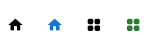
Example 1: Creating Icons using the createSvgIcon
In this example, SVG icons are created for utilization within the Material UI React project.
import React from "react";
import Box from "@mui/material/Box";
import { createSvgIcon } from "@mui/material/utils";

//creating a Home Icon using path of SVG
const HomeIcon = createSvgIcon(
   <path d="M10 20v-6h4v6h5v-8h3L12 3 2 12h3v8z" />,
   "Home"
);

//creating a Squar Box Icon using complete SVG
const SquareIcon = createSvgIcon(
   <svg
      xmlns="http://www.w3.org/2000/svg"
      viewBox="0 0 24 24"
      fill="currentColor"
      >
      <path
         fill-rule="evenodd"
         d="M3 6a3 3 0 013-3h2.25a3 3 0 013 3v2.25a3 3 0 01-3 3H6a3 3 0 01-3-3V6zm9.75 0a3 3 0 013-3H18a3 3 0 013 3v2.25a3 3 0 01-3 3h-2.25a3 3 0 01-3-3V6zM3 15.75a3 3 0 013-3h2.25a3 3 0 013 3V18a3 3 0 01-3 3H6a3 3 0 01-3-3v-2.25zm9.75 0a3 3 0 013-3H18a3 3 0 013 3V18a3 3 0 01-3 3h-2.25a3 3 0 01-3-3v-2.25z"
         clip-rule="evenodd"
      />
   </svg>,
   "Square"
);

//main App component
const App = () => {
   return (
      <div>
         <Box
            sx={{
               "& > :not(style)": {
                  m: 2,
               },
            }}
            >
            <HomeIcon />
            <HomeIcon color="primary" />
            <SquareIcon />
            <SquareIcon color="success" />
         </Box>
      </div>
   );
};

export default App;
Output
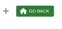
Example 2: Creating FontAwesome Icons using the SvgIcon Component
This example showcases the incorporation of Font Awesome icons as SVG icons within Material UI using React. Different icons are presented individually and within a button.
import * as React from 'react';
import PropTypes from 'prop-types';

import { faAdd } from '@fortawesome/free-solid-svg-icons/faAdd';
import { faHome } from '@fortawesome/free-solid-svg-icons/faHome';
import { FontAwesomeIcon } from '@fortawesome/react-fontawesome';

import Box from '@mui/material/Box';
import Button from '@mui/material/Button';
import IconButton from '@mui/material/IconButton';
import SvgIcon from '@mui/material/SvgIcon';

const FontAwesomeSvgIcon = React.forwardRef((props, ref) => {
   const { icon } = props;

   const {
      icon: [width, height, , , svgPathData],
   } = icon;

   return (
      <SvgIcon ref={ref} viewBox={`0 0 ${width} ${height}`}>
         {typeof svgPathData === 'string' ? (
            <path d={svgPathData} />
         ) : (
            svgPathData.map((d, i) => (
               <path style={{ opacity: i === 0 ? 0.4 : 1 }} d={d} />
            ))
         )}
      </SvgIcon>
   );
});

FontAwesomeSvgIcon.propTypes = {
   icon: PropTypes.any.isRequired,
};

//main App component
const App = () => {
   return (
      <div>
         <Box
            sx={{
               '& > :not(style)': {
                  m: 1,
               },
            }}
            >
            <IconButton aria-label="Example">
               <FontAwesomeIcon icon={faAdd} />
            </IconButton>
            <Button variant="contained" color='success' startIcon={<FontAwesomeIcon icon={faHome} />}>
               Go Back
            </Button>
         </Box>
      </div>
   );
};

export default App;
Output
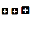
Example 3: Using Icon for adding icons
Within this example, the Icon component is employed to add icons within Material UI using React. The fg-loadcss package is utilized to enable the usage of Font Awesome icons.
import * as React from "react";
import Icon from "@mui/material/Icon";
import Box from "@mui/material/Box";

//adding fg-loadcss to use the fontawesome icons in material ui
import { loadCSS } from "fg-loadcss";

//main App component
const App = () => {
   React.useEffect(() => {
      const node = loadCSS(
         "https://use.fontawesome.com/releases/v5.14.0/css/all.css",
         // Inject before JSS
         document.querySelector("#font-awesome-css") || document.head.firstChild
      );

      return () => {
         node.parentNode.removeChild(node);
      };
   }, []);

   return (
      <div>
         <Box
            sx={{
               "& > :not(style)": {
                  m: 0.5,
               },
            }}
            >
            <Icon baseClassName="fas" className="fa-plus-square" />
            <Icon
               baseClassName="fas"
               className="fa-plus-square"
               fontSize="medium"
            />
            <Icon
               baseClassName="fas"
               className="fa-plus-square"
               sx={{ fontSize: 30 }}
            />
         </Box>
      </div>
   );
};

export default App;
Output
Conclusion
In conclusion, this article provided an in-depth exploration of utilizing icons within Material UI. By following the outlined approaches and leveraging the vast icon collection, developers can enhance visual aesthetics.

679 Views
