
Article Categories
- All Categories
-
 Data Structure
-
 Networking
-
 RDBMS
RDBMS
-
 Operating System
-
 Java
Java
-
 MS Excel
-
 iOS
iOS
-
 HTML
HTML
-
 CSS
CSS
-
 Android
-
 Python
-
 C Programming
-
 C++
C++
-
 C#
C#
-
 MongoDB
-
 MySQL
MySQL
-
 Javascript
-
 PHP
PHP
-
 Economics & Finance
How to use Select Props in Material UI?
This article will cover the usage of features in Material UI. The "Select" component, an element of Material UI allows users to choose options from a menu. To customize the behavior and appearance of the Select component various props are available.
Select API
<Select> This API is used to add the Select component to select data from a list of options in Material UI.
Props
autoWidth This property is used to set the width.
children This property defines the options, for the menu items.
classes This property is used to customize or add styles to an element.
defaultOpen This property opens the component by default.
defaultValue This property defines the default value.
displayEmpty This property is used to display a value even if no item is selected.
IconComponent This property is used to display an arrow icon.
id This property is used to define the ID of the element.
input This property adds an input field.
inputProps This property defines props, for the input field.
label This property labels the input field.
labelId This property adds an ID to label associated with select.
MenuProps This property defines additional props for the menu.
multiple This prop supports multiple selection.
native This property adds a native Select.
onChange This prop triggers a callback function on input change.
onClose This prop closes the select component.
onOpen This prop opens the select component.
open This prop shows the Select Component.
renderValue This prop renders The Selected Value.
sx The custom styles for Material UI components can be added using the sx prop.
value This property is utilized to specify the input value.
variant This property determines the options for selection.
Steps to use Props
Here are the steps for using various props with the Select component
Step 1: Create a React application. Install MUI
Begin by opening your terminal and executing the command to create a new React application project.
npx create react app selectproject
Once the project is created, navigate to its directory by running
cd selectproject
Now install Material UI using this command
npm install @mui/material @emotion/react @emotion/styled
Step 2: Import and Utilize props in Select
Here's an example of how you can utilize props in select.
import { Select } from '@mui/material'

<Select readOnly value={state} onChange={handleState} label="Select">
<Dropdown>
   <Option>Option 1</Option>
   <Option>Option 2</Option>
   ...
</Dropdown>
Example
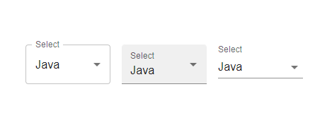
In this example, we have used the variant prop of the select component.
import React from "react";
import { Box, FormControl, InputLabel } from "@mui/material";
import MenuItem from "@mui/material/MenuItem";
import Select from "@mui/material/Select";
import { useState } from "react";

const App = () => {
   const [state, setState] = useState("");

   const handleState = (e) => {
      setState(e.target.value);
   };

   return (
      <div>
         <Box sx={{ p: 10 }}>
            <FormControl variant="outlined" sx={{ m: 1, minWidth: 120 }}>
               <InputLabel id="select">Select</InputLabel>
               <Select value={state} onChange={handleState} label="Select">
                  <MenuItem value={10}>Java</MenuItem>
                  <MenuItem value={20}>Python</MenuItem>
               </Select>
            </FormControl>
            <FormControl variant="filled" sx={{ m: 1, minWidth: 120 }}>
               <InputLabel id="select">Select</InputLabel>
               <Select
                  id="select"
                  value={state}
                  onChange={handleState}
                  >
                  <MenuItem value={10}>Java</MenuItem>
                  <MenuItem value={20}>Python</MenuItem>
               </Select>
            </FormControl>
            <FormControl variant="standard" sx={{ m: 1, minWidth: 120 }}>
               <InputLabel id="select">Select</InputLabel>
               <Select
                  id="select"
                  value={state}
                  onChange={handleState}
                  >
                  <MenuItem value={10}>Java</MenuItem>
                  <MenuItem value={20}>Python</MenuItem>
               </Select>
            </FormControl>
         </Box>
      </div>
   );
};

export default App;
Output
Example
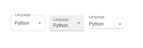
In this example, we have used the label prop of select component.
import React from "react";
import { Box, FormControl, InputLabel } from "@mui/material";
import MenuItem from "@mui/material/MenuItem";
import Select from "@mui/material/Select";
import { useState } from "react";

const App = () => {
   const [state, setState] = useState("");

   const handleState = (e) => {
      setState(e.target.value);
   };

   return (
      <div>
         <Box sx={{ p: 10 }}>
            <FormControl variant="outlined" sx={{ m: 1, minWidth: 120 }}>
               <InputLabel id="select" label="Lang">Language</InputLabel>
               <Select value={state} onChange={handleState} label="Lang">
                  <MenuItem value={10}>Java</MenuItem>
                  <MenuItem value={20}>Python</MenuItem>
               </Select>
            </FormControl>
            <FormControl variant="filled" sx={{ m: 1, minWidth: 120 }}>
               <InputLabel id="select">Language</InputLabel>
               <Select
                  id="select"
                  value={state}
                  onChange={handleState}
                  label="Select"
                  >
                  <MenuItem value={10}>Java</MenuItem>
                  <MenuItem value={20}>Python</MenuItem>
               </Select>
            </FormControl>
            <FormControl variant="standard" sx={{ m: 1, minWidth: 120 }}>
               <InputLabel id="select">Language</InputLabel>
               <Select
                  id="select"
                  value={state}
                  onChange={handleState}
                  label="Select"
                  >
                  <MenuItem value={10}>Java</MenuItem>
                  <MenuItem value={20}>Python</MenuItem>
               </Select>
            </FormControl>
         </Box>
      </div>
   );
};

export default App;
Output
Example
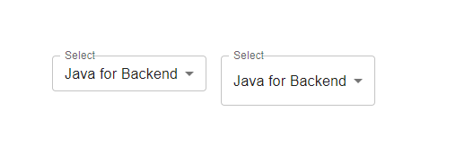
In this example, we have used the size prop of the select component.
import React from "react";
import { Box, FormControl, InputLabel } from "@mui/material";
import MenuItem from "@mui/material/MenuItem";
import Select from "@mui/material/Select";
import { useState } from "react";

const App = () => {
   const [state, setState] = useState("");

   const handleState = (e) => {
      setState(e.target.value);
   };

   return (
      <div>
         <Box sx={{ p: 10 }}>
            <FormControl variant="outlined" sx={{ m: 1, minWidth: 120 }} size="small">
               <InputLabel id="select" label="Lang">Select</InputLabel>
               <Select autoWidth value={state} onChange={handleState} label="Lang">
                  <MenuItem value={10}>Java for Backend</MenuItem>
                  <MenuItem value={20}>C++ for CP</MenuItem>
                  <MenuItem value={30}>JavaScript for web</MenuItem>
                  <MenuItem value={40}>Python for Data</MenuItem>
               </Select>
            </FormControl>
            <FormControl variant="outlined" sx={{ m: 1, minWidth: 120 }} size="medium">
               <InputLabel id="select" label="Lang">Select</InputLabel>
               <Select value={state} onChange={handleState} label="Lang">
                  <MenuItem value={10}>Java for Backend</MenuItem>
                  <MenuItem value={20}>C++ for CP</MenuItem>
                  <MenuItem value={30}>JavaScript for web</MenuItem>
                  <MenuItem value={40}>Python for Data</MenuItem>
               </Select>
            </FormControl>
         </Box>
      </div>
   );
};

export default App;
Output
Example
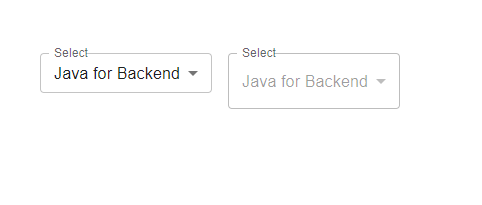
In this example, we have used the disabled and readOnly props of the select component.
import React from "react";
import { Box, FormControl, InputLabel } from "@mui/material";
import MenuItem from "@mui/material/MenuItem";
import Select from "@mui/material/Select";
import { useState } from "react";

const App = () => {
   const [state, setState] = useState("");

   const handleState = (e) => {
      setState(e.target.value);
   };

   return (
      <div>
         <Box sx={{ p: 10 }}>
            <FormControl variant="outlined" sx={{ m: 1, minWidth: 120 }} size="small">
               <InputLabel id="select" label="Lang">Select</InputLabel>
               <Select readOnly value={state} onChange={handleState} label="Lang">
                  <MenuItem value={10}>Java for Backend</MenuItem>
                  <MenuItem value={20}>C++ for CP</MenuItem>
                  <MenuItem value={30}>JavaScript for web</MenuItem>
                  <MenuItem value={40}>Python for Data</MenuItem>
               </Select>
            </FormControl>
            <FormControl variant="outlined" sx={{ m: 1, minWidth: 120 }} size="medium">
               <InputLabel id="select" label="Lang">Select</InputLabel>
               <Select disabled value={state} onChange={handleState} label="Lang">
                  <MenuItem value={10}>Java for Backend</MenuItem>
                  <MenuItem value={20}>C++ for CP</MenuItem>
                  <MenuItem value={30}>JavaScript for web</MenuItem>
                  <MenuItem value={40}>Python for Data</MenuItem>
               </Select>
            </FormControl>
         </Box>
      </div>
   );
};

export default App;
Output

956 Views
