
Article Categories
- All Categories
-
 Data Structure
-
 Networking
-
 RDBMS
RDBMS
-
 Operating System
-
 Java
Java
-
 MS Excel
-
 iOS
iOS
-
 HTML
HTML
-
 CSS
CSS
-
 Android
-
 Python
-
 C Programming
-
 C++
C++
-
 C#
C#
-
 MongoDB
-
 MySQL
MySQL
-
 Javascript
-
 PHP
PHP
-
 Economics & Finance
How to use Slider Component in Material UI?
The slider is an important feature for any application to improve the UX of the application. For example, if you want to allow users to choose any value between 1 to 100, it would be better to use the slider than the custom number input field.
The Material UI provides the pre-designed Slider component. Also, it contains the different variants of the Slider component. We can pass the props to the Slider component to custom it
Execute the below command in the project directory to install the Material UI in the React application.
npm i @mui/material @emotion/react @emotion/style
Syntax
Users can follow the syntax below to use the Slider component of the Material UI.
<Slider
   defaultValue = {50}
   value = {value}
/>
In the above Syntax, we have passed the ?defaultValue? and ?value? props to the Slider component.
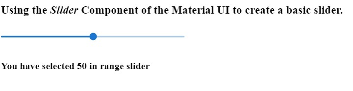
Example 1 (Basic Slider)
In the example below, we created the basic slider using the Slider component of the Material UI. We have passed the ?Size? and ?defaultValue? as props. Also, we invoke the handleRangeSlider() function whenever the user changes the value of the slider to display the selected value in the slider component.
import React, { useState } from "react";
import Slider from "@mui/material/Slider";
const App = () => {
   const [value, setValue] = useState(50);
   function handleRangeSlider(event, value) {
      setValue(value);
   }
   return (
      <div>
         <h3>
            {" "}
            Using the <i> Slider </i> Component of the Material UI to create a basic slider. {" "}
         </h3>
         <div style = {{ width: "300px" }}>
            <Slider
               size = "small"
               defaultValue = {50}
               valueLabelDisplay = "auto"
               value = {value}
               onChange = {handleRangeSlider}
            />
         </div>
         <h4> You have selected {value} in range slider </h4>
      </div>
   );
};
export default App;
Output
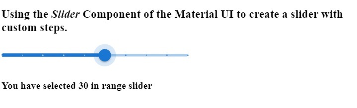
Example 2 (Slider with Steps)
In the example below, we have created the slider with steps using the Material UI?s Slider component. The minimum value of the slider is 5, and the maximum is 50. Users can select only multiple of 5 in the slider as we have used the five as a value of steps prop.
import React, { useState } from "react";
import Slider from "@mui/material/Slider";
const App = () => {
   const [value, setValue] = useState(50);
   function handleRangeSlider(value) {
      setValue(value);
   }
   return (
      <div>
         <h3>
            {" "}
            Using the <i> Slider </i> Component of the Material UI to create a slider with custom steps. {" "}
         </h3>
         <div style = {{ width: "300px" }}>
            <Slider
               aria-label = "discrete slider."
               defaultValue = {30}
               getAriaValueText = {handleRangeSlider}
               valueLabelDisplay = "auto"
               step = {5}
               marks
               min = {5}
               max = {50}
            />
         </div>
         <h4> You have selected {value} in range slider </h4>
      </div>
   );
};
export default App;
Output
In the output, users can observe that whenever they change the value of the slider, it shows the selected value in the label.
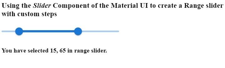
Example 3 (Range Slider)
In the example below, we have created the range slider using the Slider component. The range slider allows users to select any particular range. We have initialized the ?range? variable with the array of length 2. Whenever users change the range, we execute the handleRangeSlider() function and set the new range in the ?range? variable.
import React, { useState } from "react";
import Slider from "@mui/material/Slider";
const App = () => {
   const [range, setRange] = useState([15, 65]);
   function handleRangeSlider(e, range) {
      setRange(range);
   }
   return (
      <div>
         <h3>
            {" "}
            Using the <i> Slider </i> Component of the Material UI to create a Range slider with custom steps {" "}
         </h3>
         <div style = {{ width: "300px" }}>
            <Slider
               getAriaLabel = {() => "Select Range"}
               value = {range}
               onChange = {handleRangeSlider}
               valueLabelDisplay = "auto"
               getAriaValueText = {() => {
                  return `${range}`;
               }}
            />
         </div>
         <h4>
            {" "}
            You have selected {range[0]}, {range[1]} in range slider. {" "}
         </h4>
      </div>
   );
};
export default App;
Output
Also, we show the range value in the output by accessing the range array.
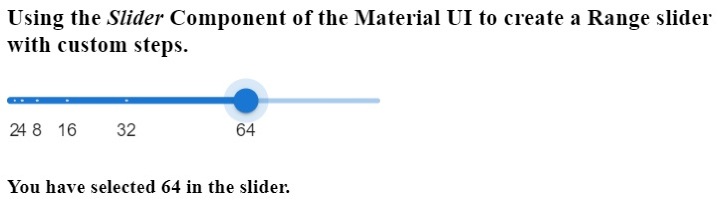
Example 4 (Custom Steps)
In the example below, we have added custom marks in the Slider component. For example, if we want to allow users to select only some values, we should use marks with the Slider component.
We have set the marks at 2, 4, 8, 16, 32, and 64. So, users can select only these values on the slider. We have created the array of objects for the marks and passed the array as a prop of the Slider component.
import React, { useState } from "react";
import Slider from "@mui/material/Slider";
const App = () => {
   const [value, setValue] = useState(64);
   const marks = [
      {
         value: 2,
         label: "2",
      },
      {
         value: 4,
         label: "4",
      },
      {
         value: 8,
         label: "8",
      },
      {
         value: 16,
         label: "16",
      },
      {
         value: 32,
         label: "32",
      },
      {
         value: 64,
         label: "64",
      },
   ];
   function handleSlider(e, value) {
      setValue(value);
   }
   return (
      <div>
         <h3>
            {" "}
            Using the <i> Slider </i> Component of the Material UI to create a Range slider with custom steps. {" "}
         </h3>
         <div style = {{ width: "300px" }}>
            <Slider
               aria-label = "Custom steps in the slider."
               defaultValue = {64}
               onChange = {handleSlider}
               valueLabelDisplay = "auto"
               step = {null}
               getAriaValueText = {() => {
                  return `${value}`;
               }}
            marks = {marks}
            />
         </div>
         <h4> You have selected {value} in the slider. </h4>
      </div>
   );
};
export default App;
Output
In this tutorial, we learned to use the Material UI library Slider component in the React application. We have seen the different variants of the Slider component via different examples.
The first example demonstrates the basic use of the slider component. In the second example, we have added the steps to the slider. In the third example, we created the range slider; in the last example, we added the custom marks to the slider component.

2K+ Views
