
Article Categories
- All Categories
-
 Data Structure
-
 Networking
-
 RDBMS
RDBMS
-
 Operating System
-
 Java
Java
-
 MS Excel
-
 iOS
iOS
-
 HTML
HTML
-
 CSS
CSS
-
 Android
-
 Python
-
 C Programming
-
 C++
C++
-
 C#
C#
-
 MongoDB
-
 MySQL
MySQL
-
 Javascript
-
 PHP
PHP
-
 Economics & Finance
How to use Radio Component in Material UI?
The radio button is used to allow users to choose any one value among a group of values. For example, the best use case of the radio button is allowing users to choose a gender in the form.
The material UI provides the pre-designed Radio component, which we can use to create a group of radio buttons.
Users can use the below command in the terminal to install the Material UI library in the React project.
npm install @mui/material @emotion/react @emotion/styled
Syntax
Users can follow the syntax below to use the Radio component of the Material UI.
<FormControlLabel value = "Delhi" control = {<Radio />} label = "Delhi"/>
In the above syntax, we have passed the Radio component as a props value of the control prop of the FormControlLabel.
Example
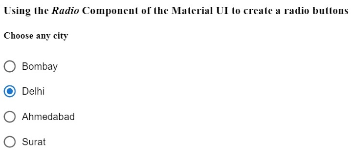
In the example below, we have imported the Radio component to create a radio button, the RadioGroup component to create a group of radio buttons, and the FormControlLabel component to use the Radio component in the form.
In the output, users can observe three radio buttons in a single column and select one radio button.
import React from "react";
import RadioGroup from "@mui/material/RadioGroup";
import FormControlLabel from "@mui/material/FormControlLabel";
import Radio from "@mui/material/Radio";
const App = () => {
   return (
      <div>
         <h3>
            {" "}
            Using the <i> Radio </i> Component of the Material UI to create a radio buttons {" "}
         </h3>
         <h4> Choose any city </h4>
         <RadioGroup defaultValue = "Delhi" name = "radio-buttons-group">
            <FormControlLabel value = "Bombay" control = {<Radio />} label="Bombay" />
            <FormControlLabel value = "Delhi" control = {<Radio />} label = "Delhi" />
            <FormControlLabel
               value = "Ahmedabad"
               control = {<Radio />}
               label = "Ahmedabad"
            />
            <FormControlLabel value = "Surat" control = {<Radio />} label = "Surat" />
         </RadioGroup>
      </div>
   );
};
export default App;
Output
Example
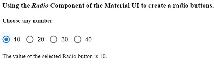
In the example below, we have passed the row as a prop of the RadioGroup component to show all radio buttons in a single row. Also, we have used the ?onChange? event with the RadioGroup component to invoke the handleChange() function whenever the user selects another radio button.
Also, users can observe the value of the selected radio button in the output.
import React from "react";
import RadioGroup from "@mui/material/RadioGroup";
import FormControlLabel from "@mui/material/FormControlLabel";
import Radio from "@mui/material/Radio";
const App = () => {
   const [selected, setSelected] = React.useState("Delhi");
   function handleChange(event) {
      setSelected(event.target.value);
   }
   return (
      <div>
         <h3>
            {" "}
            Using the <i> Radio </i> Component of the Material UI to create a radio buttons. {" "}
         </h3>
         <h4> Choose any number </h4>
         <RadioGroup
               row
               defaultValue = "30"
               name = "radio-buttons-group"
               onChange = {handleChange}
            >
            <FormControlLabel value = "10" control = {<Radio />} label = "10" />
            <FormControlLabel value = "20" control = {<Radio />} label = "20" />
            <FormControlLabel value = "30" control = {<Radio />} label = "30" />
            <FormControlLabel value = "40" control = {<Radio />} label = "40" />
         </RadioGroup>
         <p> The value of the selected Radio button is {selected}. </p>
      </div>
   );
};
export default App;
Output
Example
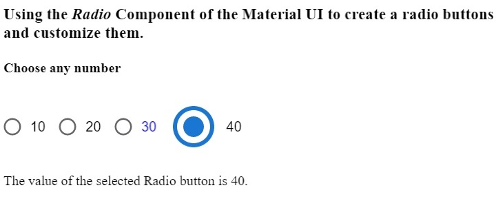
In the example below, we will learn to customize the Radio component of the Material UI. The radio button with value 10 is standard. We have changed the colour of the second radio button using the ?colour? prop.
We have set the custom colour for the third radio button and increased the size of the fourth radio button. In this way, users can customize the radio buttons using the component props.
import React from "react";
import RadioGroup from "@mui/material/RadioGroup";
import FormControlLabel from "@mui/material/FormControlLabel";
import Radio from "@mui/material/Radio";
const App = () => {
   const [selected, setSelected] = React.useState("Delhi");
   function handleChange(event) {
      setSelected(event.target.value);
   }
   return (
      <div>
         <h3>
            {" "}
            Using the <i> Radio </i> Component of the Material UI to create a radio buttons and customize them. {" "}
         </h3>
         <h4> Choose any number </h4>
         <RadioGroup
               row
               defaultValue = "30"
               name = "radio-buttons-group"
               onChange = {handleChange}
            >
            <FormControlLabel value = "10" control = {<Radio />} label = "10" />
            <FormControlLabel
               value = "20"
               control = {<Radio />}
               label = "20"
               color = "secondary"
            />
            <FormControlLabel
               value = "30"
               control = {<Radio />}
               label = "30"
               sx = {{
                  color: "blue",
               }}
            />
            <FormControlLabel
               value = "40"
               control = {<Radio />}
               label = "40"
               sx = {{
                  "& .MuiSvgIcon-root": {
                     fontSize: 58,
                  },
               }}
            />
         </RadioGroup>
         <p> The value of the selected Radio button is {selected}. </p>
      </div>
   );
};
export default App;
Output
We learned to use the Radio component of the Material UI in this tutorial. Also, we learned to customize the Radio component using props. Users can pass various props according to requirements and control the radio component.

3K+ Views
