
Article Categories
- All Categories
-
 Data Structure
-
 Networking
-
 RDBMS
RDBMS
-
 Operating System
-
 Java
Java
-
 MS Excel
-
 iOS
iOS
-
 HTML
HTML
-
 CSS
CSS
-
 Android
-
 Python
-
 C Programming
-
 C++
C++
-
 C#
C#
-
 MongoDB
-
 MySQL
MySQL
-
 Javascript
-
 PHP
PHP
-
 Economics & Finance
How to use UseFormControl() hook in Material UI?
In React MUI, managing form states or validating them is a big task. To solve this issue, we have the useFormControl() hook available in MUI. This hook allows to customize the state according to different project requirements, etc. In this article, we'll explore the usage of the UseFormControl() hook in the Material UI in React.
useFormControl API
The useFormControl API or hook returns the context value of the parent FormControl component. It gives an abstraction layer that allows to manage of the form state and validation of the given form controls.
API returnable objects
There are different useFormControl hook returns, and below we have discussed some of the significant returns
value.adornedStart It is a boolean return that demonstrates if the child Input or Select component has a start adornment.
value.setAdornedStart It is a function type of return that states the adornedStart state value.
value.color It is a stringtype return that demonstrates what theme color is being used.
value.disabled It is a boolean return that demonstrates if the component is being displayed in a disabled state.
value.variant The variant is being used by the FormControl component and its children.
value.onBlur This is a function call only used when the input field is blurred.
value.onFilled This is a function call only used when the input field is fully filled.
value.fullWidth It is a boolean return that demonstrates if the component is taking up the full width of its container.
value.hiddenLabel It is a boolean return that demonstrates if the input field label is hidden.
value.error It is a boolean return that demonstrates if the component is being displayed in an error state.
value.filled It is a boolean return that demonstrates if the input is filled.
value.focused It is a boolean return that demonstrates if the component and its children are being displayed in a focused state.
value.required It is a boolean return that demonstrates if the input field label is displaying that it is a required input.
value.size The size of the component.
How to use MUI useFormControl() hook
Below are the steps for using the useFormControl hook in Material UI
Step 1: Create a react application
The very first step to using the useFormControl hook in MUI is to create a react application. To create a new React app, run the below commands in your terminal
npx create react app formcontrolproject
Once the project is created, navigate to its directory by running
cd formcontrolproject
Step 2: Add MUI in React
Once you have created the react app, it's time to install the Material UI into the react application. To install MUI, run the following command
npm install @mui/material @emotion/react @emotion/styled
Step 3: Define the hook
Now, it's time to define the useFormControl hook so that we can create a form control or add any input elements in React MUI. Below is how to define the hook in React
import { useFormControl } from '@mui/material/FormControl';
const UseFormControl() {
   const valueobject = useFormControl() || {};
   ?
}
//Add the App component below this
That?s all! Now we have successfully learned the steps to use the useFormControl hook in MUI. So, let?s see some examples of different approaches.
Example
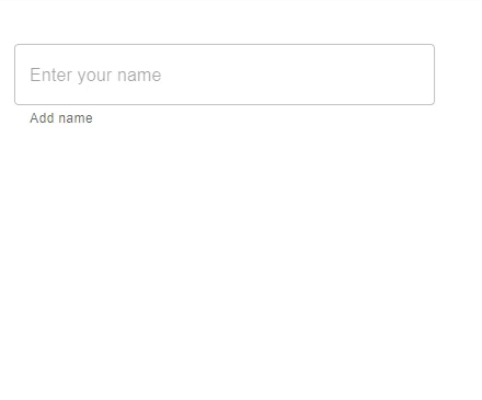
In this example, we have used the useFormControl hook to show the user if the input field is in focus or not. Here, when the user enters any text in the input box, a helper text is displayed that shows the input box is focused. The value.focused returns whether the text field is focused or not.
//App.js file
import React, { useMemo } from "react";
import { FormControl, FormHelperText, OutlinedInput, useFormControl } from "@mui/material";

function CustomFormControl() {
   const { focused } = useFormControl() || {};
   const customHelperTxt = useMemo(() => {
      if (focused) {
         return 'You are editing...';
      }

      return 'Add name';
   }, [focused]);
   return <FormHelperText>{customHelperTxt}</FormHelperText>;
}
const App = () => {
   return (
      <div style={{
         padding: 40,
         width: '20%',
         display: 'flex',
         flexDirection: 'column',
         gap: 20}}>
         <FormControl>
            <OutlinedInput placeholder="Enter your name" />
            <CustomFormControl />
         </FormControl>
      </div>
   );
};

export default App;
To run the above code, run the below command
npm run start
Output
Example
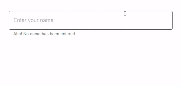
In this example, we have used the useFormControl hook to show the user if the input field is filled or not. Here, when the user enters any text in the input box, a helper text is displayed that shows if the input field is filled or not. The value.filled returns whether the text field input is filled or not.
import React, { useMemo } from "react";
import { FormControl, FormHelperText, OutlinedInput, useFormControl } from "@mui/material";

function CustomFormControl() {
   const { filled } = useFormControl() || {};
   const customHelperTxt = useMemo(() => {
      return filled ? 'You have filled the name' : 'Ahh! No name has been entered.';
   }, [filled]);

   return <FormHelperText>{customHelperTxt}</FormHelperText>;
}

const App = () => {
   return (
      <div style={{
         padding: 40,
         display: 'flex',
         flexDirection: 'column',
         gap: 20}}>
         <FormControl>
            <OutlinedInput placeholder="Enter your name" fullWidth />
            <CustomFormControl />
         </FormControl>
      </div>
   );
};

export default App;
To run the above code, run the below command
npm run start
Output
Example
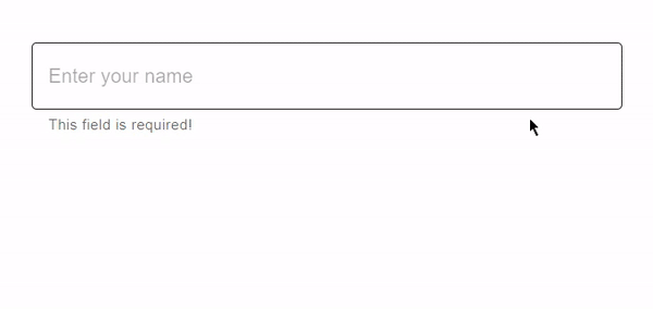
In this example, we have used the useFormControl hook to show the user if the input field is required or not. Here we have used the value.required that checks whether the text label shows if the input is a required input or not. When the user enters any text in the input box, a helper text is displayed that shows a message.
//App.js file
import React, { useMemo } from "react";
import { FormControl, FormHelperText, OutlinedInput, useFormControl } from "@mui/material";

function CustomFormControl() {
   const { required } = useFormControl() || {};
   const customHelperTxt = useMemo(() => {
      return required ? 'Enter name' : 'This field is required!';
   }, [required]);

   return <FormHelperText>{customHelperTxt}</FormHelperText>;
}
const App = () => {
   return (
      <div style={{
         padding: 40,
         display: 'flex',
         flexDirection: 'column',
         gap: 20}}>
         <FormControl>
            <OutlinedInput placeholder="Enter your name" fullWidth />
            <CustomFormControl />
         </FormControl>
      </div>
   );
};

export default App;
To run the above code, run the below command
npm run start
Output
Example
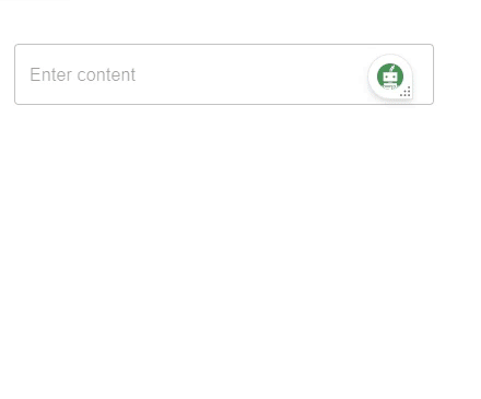
In this example, we have used the useFormControl hook to create a custom TextField component. Here the text field allows to enter the content in multiple lines with the help of the prop called ?multiline?. The multiline prop allows the users to enter the large content by providing a text box area. When the user enters the large content in the input box, a helper text is displayed that shows a message.
//App.js file
import React, { useMemo } from "react";
import { FormControl, FormHelperText, OutlinedInput, useFormControl } from "@mui/material";

function CustomFormControl() {
   const { filled } = useFormControl() || {};

   const customHelperTxt = useMemo(() => {
      if (filled) {
         return 'You content is too long!';
      }
   }, [filled]);

   return <FormHelperText>{customHelperTxt}</FormHelperText>;
}

const App = () => {
   return (
      <div style={{
         padding: 40,
         width: '20%',
         display: 'flex',
         flexDirection: 'column',
         gap: 20}}>
         <FormControl>
            <OutlinedInput placeholder="Enter content" multiline />
            <CustomFormControl />
         </FormControl>
      </div>
   );
};

export default App;
To run the above code, run the below command
npm run start
Output
Conclusion
This article discussed how to use the useFormControl hook in React MUI. In this article, we have learned the complete steps to implement the hook using React and also seen the returnables of the useFormControl hook API. Different examples have also been discussed in this article like using required inputs, filled, focused, etc., with their respective outputs.

1K+ Views
