
Article Categories
- All Categories
-
 Data Structure
-
 Networking
-
 RDBMS
RDBMS
-
 Operating System
-
 Java
Java
-
 MS Excel
-
 iOS
iOS
-
 HTML
HTML
-
 CSS
CSS
-
 Android
-
 Python
-
 C Programming
-
 C++
C++
-
 C#
C#
-
 MongoDB
-
 MySQL
MySQL
-
 Javascript
-
 PHP
PHP
-
 Economics & Finance
How to use virtual lists in autocomplete components in Material UI?
Displaying lists of data is a common requirement for web applications. or tables with scrollable headers. Most likely, you have performed it countless times. But what if you have to display thousands of rows simultaneously?
In this article, we will look at how to use Material UI's Autocomplete components' virtual lists to produce fluid user interfaces with big datasets. Popular React UI framework Material UI provides a large selection of components with cutting-edge designs and top-notch performance. Traditional rendering techniques may cause performance problems when dealing with large datasets in Autocomplete components, so in order to prevent those problems, we will use react-virtualized to efficiently display a large amount of data.
Understanding Virtual Lists
Virtual Lists, also referred to as infinite scrolling is a method for rendering lengthy lists more efficiently by showing only the items that can be seen on the screen. Virtual lists render a smaller subset of items based on the user's viewport rather than rendering the entire dataset, which leads to quicker loading times and smoother scrolling.
Why use react-virtualized?
Developers who use React frequently render lists with multiple rows and use the map function. Even though a scrollbar typically conceals overflowing content, the web browser will always generate thousands of DOM elements if they use that method for rendering thousands of rows. When user events, like scrolling, cause DOM element positions to change, rendering a new DOM element requires physical memory and uses CPU and GPU hardware.
A performance-friendly method of rendering large lists is by using a library like react-virtualized, which uses virtual rendering to render lists in a large number of elements at once. To minimize the performance impact on apps, this library typically renders only the visible rows in a lengthy list and generates fewer DOM elements. To put it another way, this library only shows the necessary rows while virtually indicating the existence of hidden rows using CSS styles.
Steps to Use Virtual Lists in Autocomplete
Step 1: Create a React App
The first step is to create a new react application if not already created. We?ll use the traditional method i.e., create-react-app.
npx create-react-app myproject
cd myproject
Step 2: Install & Import Material UI
Once, we have created the react app let?s first install the material ui and its dependencies and then import it.
npm install @mui/material @emotion/react @emotion/styled
// Importing the autocomplete virtualized
import React from 'react';
import AutocompleteVirtualized from '@mui/lab/AutocompleteVirtualized';
import TextField from '@mui/material/TextField';
Step 3: Create a virtual Data Set
To use the virtual list, we must first create a data set. So, for now we will use array to create a virtual dataset. Later we will also see how to use dynamic API data list also.
const dataset = Array.from({ length: 500 }, (_, index) => ({
   title: `Option ${index + 1}`,
   val: index + 1,
}));
Here, we have create a list of 500 virtual dataset where the title and val are the options of dataset.
Step 4: Define the Virtual List in Autocomplete
Now, we have created our custom dataset that is virtual, let?s integrate the dataset to the autocomplete virtualized. Below is the syntax for using them
const CustomVirtualComponent = () => {
   return (
      <AutocompleteVirtualized
         options={dataset}
         getOptionLabel={(item) => item.title}
         renderInput={(params) => <TextField {...params} label="Add label" />}
      />
   );
};
Example
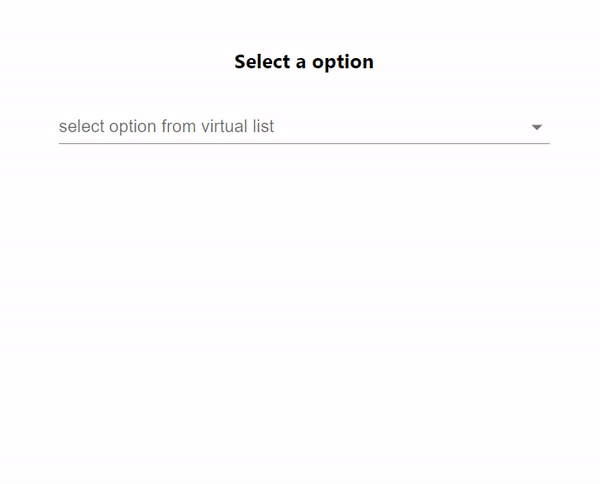
In this example, we have created a virtual data set using an array function that generates a random list of around 400 items with label and val as its options. The items are then rendered effectively using a custom ListboxComponent that we created using react-window's VariableSizeList, and the list is only rendered as necessary for the best performance, even with a large number of options.
import React, { useState } from "react";
import Autocomplete from "@mui/material/Autocomplete";
import TextField from "@mui/material/TextField";
import { VariableSizeList } from "react-window";

const virtualDataSet = () => {
   const arrayOfData = [];
   for (let j = 0; j < 400; j++) {
      arrayOfData.push({
         title: `Random ${j}`,
         val: j,
      });
   }
   return arrayOfData;
};

const dataset = virtualDataSet();

const ItemListComponent = React.forwardRef(function ListboxComponent(
   { children, ...other },
   ref
   ) {
      const getItemSize = (index) => {
         return 35;
      };

      const itCount = Array.isArray(children) ? children.length : 0;

      return (
         <div ref={ref}>
            <VariableSizeList
               height={itCount * 35}
               itemSize={getItemSize}
               itemCount={itCount}
               overscanCount={10}
               {...other}>
               {({ index, style }) => <div style={style}>{children[index]}</div>}
            </VariableSizeList>
         </div>
      );
});

export default function App() {
   const [ipVal, setIpVal] = useState("");

   const handleVal = (event, value) => {
      setIpVal(value);
   };

   return (
      <div
         style={{
            display: "flex",
            marginTop: 30,
            flexDirection: "column",
            alignItems: "center",
            justifyContent: "center",
         }}>
         <h3>Select a option</h3>
         <Autocomplete
            options={dataset}
            inputValue={ipVal}
            sx={{ width: "70%" }}
            getOptionLabel={(item) => item.title}
            ListboxComponent={ItemListComponent}
            onInputChange={handleVal}
            renderInput={(params) => (
               <TextField
                  {...params}
                  label="select option from virtual list"
                  variant="standard"
               />
            )}
         />
      </div>
   );
}
Output
Example
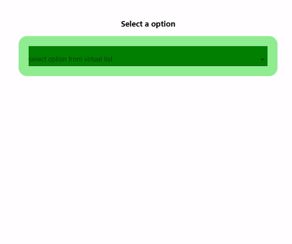
In this example we've utilized an array function to create a dataset that generates a list of approximately 400 items. These items have label and val as their options. To enhance the appeal we've incorporated background colors and styles into the autocomplete component. The rendering of these items is efficiently handled by a custom ListboxComponent that we've developed using react windows VariableSizeList. This ensures performance by rendering the necessary items even when dealing with a large number of options.
import React, { useState } from "react";
import Autocomplete from "@mui/material/Autocomplete";
import TextField from "@mui/material/TextField";
import { VariableSizeList } from "react-window";
import { Chip } from "@mui/material";

const virtualDataSet = () => {
   const arrayOfData = [];
   for (let j = 0; j < 400; j++) {
      arrayOfData.push({
         title: `Random ${j}`,
         val: j,
      });
   }
   return arrayOfData;
};

const dataset = virtualDataSet();

const ItemListComponent = React.forwardRef(function ListboxComponent(
      { children, ...other },
      ref
   ) {
      const getItemSize = (index) => {
         return 35;
      };

      const itCount = Array.isArray(children) ? children.length : 0;

      return (
         <div ref={ref}>
            <VariableSizeList
               height={itCount * 35}
               itemSize={getItemSize}
               itemCount={itCount}
               overscanCount={10}
               {...other}
            >
               {({ index, style }) => <div style={style}>{children[index]}</div>}
            </VariableSizeList>
         </div>
      );
   }
);

export default function App() {
   const [ipVal, setIpVal] = useState("");

   const handleVal = (event, value) => {
      setIpVal(value);
   };

   return (
      <div
         style={{
            display: "flex",
            marginTop: 30,
            flexDirection: "column",
            alignItems: "center",
            justifyContent: "center",
         }}>
         <h3>Select a option</h3>
         <Autocomplete
            options={dataset}
            inputValue={ipVal}
            sx={{ width: "70%", backgroundColor: "lightgreen", padding: 3, borderRadius: 5 }}
            getOptionLabel={(item) => item.title}
            ListboxComponent={ItemListComponent}
            onInputChange={handleVal}
            renderInput={(params) => (
               <TextField
                  sx={{backgroundColor: 'green'}}
                  {...params}
                  label="select option from virtual list"
                  variant="standard"
               />
            )}
         />
      </div>
   );
}
Output
Conclusion
In this article we explore how React can be used to implement lists, within the Material UI component. We've integrated libraries like react window to enable virtualization. This approach allows us to efficiently handle datasets while maintaining fast load times and providing a user experience. By optimizing rendering and performance, through virtualization the Autocomplete component delivers usability when dealing with amounts of data.

1K+ Views
