
Article Categories
- All Categories
-
 Data Structure
-
 Networking
-
 RDBMS
RDBMS
-
 Operating System
-
 Java
Java
-
 MS Excel
-
 iOS
iOS
-
 HTML
HTML
-
 CSS
CSS
-
 Android
-
 Python
-
 C Programming
-
 C++
C++
-
 C#
C#
-
 MongoDB
-
 MySQL
MySQL
-
 Javascript
-
 PHP
PHP
-
 Economics & Finance
How to use Grid Component in Material UI?
The grid means the structure of rows and columns like a table. When we create a table using the HTML <table> tag, we can create every row and column of different dimensions, but the Grid component of the Material Ui library allows us to do so.
We can use the Grid component of the Material UI as a container and item. Also, we can adjust the grid automatically according to the dimensions of the device screen.
Users first need to install the Material Ui library to use the Grid component in the React project using the below command.
npm install @mui/material @emotion/react @emotion/styled
Every device contains 12 columns according to the standards. We can pass 1 to 12 as a prop to create a Grid of a particular number of columns.
Syntax
Users can follow the syntax below to use the Grid component of Material UI.
<Grid container spacing = {2}>
   <Grid item xs = {12}>
      content
   </Grid>
</Grid>
We have used the outside Grid component as a container in the above syntax by passing the container as a pop. The nested Grid component works as a item in the container as we have passed the ?item? as a prop.
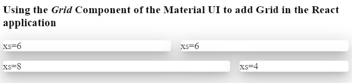
Example 1 (Basic Grid Component)
In the example below, we have used the Grid, paper, and Box components of the Material UI. The Paper component is used to create cards.
We have created the Grid container and added four grids inside that. The first two grids are of similar dimensions occupying six columns, the third Grid occupies eight columns, and the fourth grid occupies four columns in the second row.
Here, ?xs? represents the device breakpoints. Users can use the ?sm? for small devices.
import React from "react";
import Box from "@mui/material/Box";
import Paper from "@mui/material/Paper";
import Grid from "@mui/material/Grid";
const App = () => {
   return (
      <div>
         <h3>
            {" "}
            Using the <i> Grid </i> Component of the Material UI to add Grid in the React application {" "}
         </h3>
         <Box sx = {{ flexGrow: 1 }}>
            <Grid container spacing = {2}>
               <Grid item xs = {6}>
                  <Paper elevation = {16}> xs=6 </Paper>
               </Grid>
               <Grid item xs = {6}>
                  <Paper elevation = {16}> xs=6 </Paper>
               </Grid>
               <Grid item xs = {8}>
                  <Paper elevation = {16}> xs=8 </Paper>
               </Grid>
               <Grid item xs = {4}>
                  <Paper elevation = {16}> xs=4 </Paper>
               </Grid>
            </Grid>
         </Box>
      </div>
   );
};
export default App;
Output
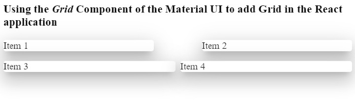
Example 2 (Changing the Spacing Between Grids)
We can use the ?spacing? prop to change the space between the two grids. For example, we have given ?10? as the spacing between the first two grids and ?1? as the spacing between the last two.
import React from "react";
import Paper from "@mui/material/Paper";
import Grid from "@mui/material/Grid";
const App = () => {
   return (
      <div>
         <h3>
            {" "}
            Using the <i> Grid </i> Component of the Material UI to add Grid in the React application {" "}
         </h3>
         <div>
            <Grid container spacing = {10}>
               <Grid item xs = {6}>
                  <Paper elevation = {16}> Item 1 </Paper>
               </Grid>
               <Grid item xs = {6}>
                  <Paper elevation = {16}> Item 2 </Paper>
               </Grid>
            </Grid>
         </div>
         <div style = {{ width: "100%", marginTop: "1rem" }}>
            <Grid container spacing = {1}>
               <Grid item xs = {6}>
                  <Paper elevation = {16}> Item 3 </Paper>
               </Grid>
               <Grid item xs = {6}>
                  <Paper elevation = {16}> Item 4 </Paper>
               </Grid>
            </Grid>
         </div>
      </div>
   );
};
export default App;
Output
In the output, users can observe the spacing difference between every grid. Also, users can set the spacing between the rows similarly.
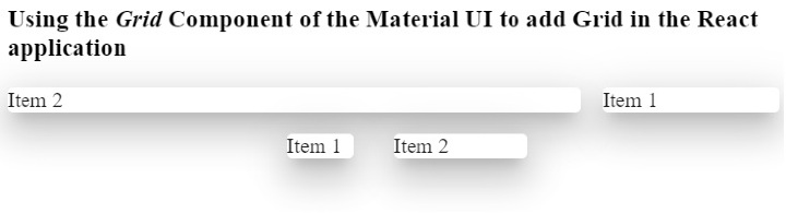
Example 3 (Customizing the Grid style using props)
In the example below, we have created the two Grid containers and added the same content inside both containers.
In the first container, we have added the ?direction? prop with a ?row-reverse? value. In the output, users can observe that it shows all components reversely.
In the second container, we have added the ?justifyContent? prop with the ?flex-end? value.
import React from "react";
import Paper from "@mui/material/Paper";
import Grid from "@mui/material/Grid";
const App = () => {
   return (
      <div>
         <h3>
            {" "}
            Using the <i> Grid </i> Component of the Material UI to add Grid in the React application {" "}
         </h3>
         <div>
            <Grid container spacing = {2} direction = "row-reverse">
               <Grid item xs = {3}>
                  <Paper elevation = {16}> Item 1 </Paper>
               </Grid>
               <Grid item xs = {9}>
                  <Paper elevation = {16}> Item 2 </Paper>
               </Grid>
            </Grid>
         </div>
         <div style = {{ width: "50%", marginTop: "1rem", height: 300 }}>
            <Grid container spacing = {10} justifyContent = "flex-end">
               <Grid item xs = {2}>
                  <Paper elevation = {16} style = {{ width: 50 }}>
                     Item 1
                  </Paper>
               </Grid>
               <Grid item xs = {2}>
                  <Paper elevation = {16} style = {{ width: 100 }}>
                     Item 2
                  </Paper>
               </Grid>
            </Grid>
         </div>
      </div>
   );
};
export default App;
Output
In the output, users can observe that it shows both grids at the end of the div. Here, the width of the div is 50%.
Users learned to use the Grid component of the Material UI in ReactJS. We learned to use the Grid as a container and as a row. Also, we learned to set dimensions for the Grid. If users don?t want to add the breakpoint for the Grid component, they can add an ?auto? layout to make grids responsive. Also, users can customize the CSS of the Grid by passing style as a prop.

1K+ Views
