
Article Categories
- All Categories
-
 Data Structure
-
 Networking
-
 RDBMS
RDBMS
-
 Operating System
-
 Java
Java
-
 MS Excel
-
 iOS
iOS
-
 HTML
HTML
-
 CSS
CSS
-
 Android
-
 Python
-
 C Programming
-
 C++
C++
-
 C#
C#
-
 MongoDB
-
 MySQL
MySQL
-
 Javascript
-
 PHP
PHP
-
 Economics & Finance
How to use controlled states in ComboBox in Material UI?
In the realm of user interface development, proficiently managing user interactions is paramount. Material UI's Autocomplete component offers the concept of controlled states, allowing developers to regulate the component's behavior and data through external state management. Unlike relying solely on the component's local state, controlled states enable synchronization with the overall application state, creating a more centralized and predictable user interaction.
In this article, we will explore the concept of controlled states in autocomplete combo box and learn how to use them effectively to manage the "value" and "input value" states independently.
Understanding controlled states in the Autocomplete combo box
Uncontrolled components refer to those with local states, not influenced by their parent components. For example, the original Panel component, with its isActive state variable, is uncontrolled as its parent cannot affect its activeness.
On the other hand, a component is deemed "controlled" when its significant information is driven by props rather than its internal state. This empowers the parent component to fully dictate its behavior. For instance, the final Panel component, with the isActive prop, is controlled by the Accordion component.
ncontrolled components are simpler to use within their parent structures, demanding less configuration. However, they become less flexible when coordination between them is required. Controlled components offer maximal flexibility, but their parent components must fully configure them using props.
Within the autocomplete component, two states can be controlled ?
Value State ? Managed through the value/onChange props combination, representing the value selected by the user, such as when pressing Enter.
Input Value State ? Governed by the inputValue/onInputChange props combination, signifying the value displayed in the textbox.
These two states remain isolated and should be independently controlled.
Props used
"value" ? Sets the selected value in the Autocomplete, granting developers control over the displayed selected option.
"onChange" ? Handles the event when the selected value in the Autocomplete changes, enabling developers to update the state and take necessary actions when a new value is chosen by the user.
"inputValue" ? Sets and controls the value displayed in the Autocomplete's textbox, allowing developers to show a default or predefined value or update it based on user input.
"onInputChange" ? prop is responsible for handling the event when the user enters or modifies the input in the Autocomplete's textbox. It makes possible responses to user input and manages the displayed value accordingly.
Handling the States
To effectively handle and use the controlled states in the Material UI ComboBox, it is approachable using two methods ?
1. Managing the "value" state
Control the selected value of the ComboBox using the "value" and "onChange" props combination. The "value" prop holds the currently selected value, and the "onChange" prop handles the event when a new value is chosen by the user.
Syntax
import React, { useState } from 'react';
import { Autocomplete, TextField } from '@mui/material';

const MyComboBox = () => {
   const [selectedValue, setSelectedValue] = useState(null);
   const handleValueChange = (event, newValue) => {
      setSelectedValue(newValue);
   };
   return (
      <Autocomplete
         id="combo-box"
         options={options}
         value={selectedValue}
         onChange={handleValueChange}
         getOptionLabel={(option) => option.label}
         renderInput={(params) => <TextField {...params} label="Select an option" />}
      />
   );
};
2. Managing the "input value" state
Control the value displayed in the ComboBox's textbox using the "inputValue" and "onInputChange" props combination. The "inputValue" prop holds the current value displayed in the textbox, and the "onInputChange" prop handles the event when the user enters a new value.
Syntax
import React, { useState } from 'react';
import { Autocomplete, TextField } from '@mui/material';

const MyComboBox = () => {
   const [inputValue, setInputValue] = useState('');

   const handleInputChange = (event, newInputValue) => {
      setInputValue(newInputValue);
   };
   return (
      <Autocomplete
         id="combo-box"
         options={options}
         inputValue={inputValue}
         onInputChange={handleInputChange}
         getOptionLabel={(option) => option.label}
         renderInput={(params) => <TextField {...params} label="Select an option" />}
      />
   );
};
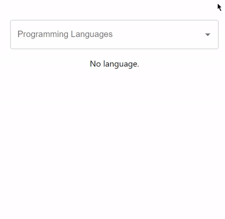
Example 1
The below example demonstrates the usage of value or onchange prop to manage the controlled states in autocomplete combo box in react mui.
import React, { useState } from 'react';
import Autocomplete from '@mui/material/Autocomplete';
import TextField from '@mui/material/TextField';

export default function App() {

   const [selectedValue, setSelectedValue] = useState(null);

   const handleValueChange = (event, newValue) => {
      setSelectedValue(newValue);
   };

   return (
      <div
         style={{
            display: "flex",
            marginTop: 40,
            flexDirection: 'column',
            alignItems: "center",
            justifyContent: "center",
         }}>
         <Autocomplete
            id="combo-box-programming"
            value={selectedValue}
            onChange={handleValueChange}
            options={data}
            sx={{ width: 400 }}
            renderInput={(params) => (
               <TextField {...params} label="Programming Languages" />
            )}
         />
         <div>
            {selectedValue ? (
               <p>Selected Language: <strong>{selectedValue.label}</strong></p>
            ) : (
               <p>No language.</p>
            )}
         </div>
      </div>
   );
}

const data = [
   { label: "Java language" },
   { label: "Python language" },
   { label: "C++ language" },
   { label: "C language" },
   { label: "Go language" },
   { label: "JavaScript language" },
   { label: "SQL" },
   { label: "MySQL" },
   { label: "HTML" },
   { label: "CSS" },
   { label: "Nextjs " },
   { label: "ReactJS " },
   { label: "VueJS " },
   { label: "Angular " },
   { label: "Angular JS " },
   { label: "PHP language" },
   { label: "R language" },
   { label: "Objective C language" },
   { label: "Cobol language" },
   { label: "Perl language" },
   { label: "Pascal language" },
   { label: "LISP language" },
   { label: "Fortran language" },
   { label: "Swift language" },
   { label: "Ruby language" },
   { label: "Algol language" },
   { label: "Scala language" },
   { label: "Rust language" },
   { label: "TypeScript language" },
   { label: "Dart language" },
   { label: "Matlab language" },
   { label: "Ada language" },
   { label: ".NET language" },
   { label: "Bash language" },
];
Output
Example 2
The below example demonstrates the usage of input value or onInputChange prop to manage the controlled states in the autocomplete combo box in react mui.
import React, { useState } from 'react';
import Autocomplete from '@mui/material/Autocomplete';
import TextField from '@mui/material/TextField';

export default function App() {

   const [inputValue, setInputValue] = useState('');

   const handleInputChange = (event, newInputValue) => {
      setInputValue(newInputValue);
   };

   return (
      <div
         style={{
            display: "flex",
            marginTop: 40,
            flexDirection: 'column',
            alignItems: "center",
            justifyContent: "center",
         }}>
         <Autocomplete
            id="combo-box-programming"
            inputValue={inputValue}
            onInputChange={handleInputChange}
            options={data}
            sx={{ width: 400 }}
            renderInput={(params) => (
               <TextField {...params} label="Programming Languages" />
            )}
         />
         <div>
            {inputValue ? (
               <p>Selected Language: <strong>{inputValue}</strong></p>
            ) : (
               <p>No language.</p>
            )}
         </div>
      </div>
   );
}

const data = [
   { label: "Java language" },
   { label: "Python language" },
   { label: "C++ language" },
   { label: "C language" },
   { label: "Go language" },
   { label: "JavaScript language" },
   { label: "SQL" },
   { label: "MySQL" },
   { label: "HTML" },
   { label: "CSS" },
   { label: "Nextjs " },
   { label: "ReactJS " },
   { label: "VueJS " },
   { label: "Angular " },
   { label: "Angular JS " },
   { label: "PHP language" },
   { label: "R language" },
   { label: "Objective C language" },
   { label: "Cobol language" },
   { label: "Perl language" },
   { label: "Pascal language" },
   { label: "LISP language" },
   { label: "Fortran language" },
   { label: "Swift language" },
   { label: "Ruby language" },
   { label: "Algol language" },
   { label: "Scala language" },
   { label: "Rust language" },
   { label: "TypeScript language" },
   { label: "Dart language" },
   { label: "Matlab language" },
   { label: "Ada language" },
   { label: ".NET language" },
   { label: "Bash language" },
];
Output

Conclusion
Controlled states within Material UI ComboBoxes grant developers a potent mechanism to fabricate responsive and interactive user interfaces. By independently governing the "value" and "input value" states, developers attain superior customization and synchronization with the application state. Grasping the nuanced dissimilarity between controlled and uncontrolled components stands as a pivotal aspect in forging well-informed design determinations.
Leveraging the controlled states in Material UI ComboBoxes brings forth an elevation in the user experience of your React projects. The incorporation of controlled components goes beyond guaranteeing a smoother user flow; it bestows a more sustainable and scalable codebase. As your expedition into the realm of controlled states deepens, you shall unfurl the boundless possibilities for crafting more instinctive and captivating ComboBox interactions for your cherished users.

260 Views
