
Article Categories
- All Categories
-
 Data Structure
-
 Networking
-
 RDBMS
RDBMS
-
 Operating System
-
 Java
Java
-
 MS Excel
-
 iOS
iOS
-
 HTML
HTML
-
 CSS
CSS
-
 Android
-
 Python
-
 C Programming
-
 C++
C++
-
 C#
C#
-
 MongoDB
-
 MySQL
MySQL
-
 Javascript
-
 PHP
PHP
-
 Economics & Finance
How to use Button Component in Material UI?
The button is used to perform some actions like form submission, file upload, link click, web page routing etc. The Material Ui provides the pre-styled button component, which users can import into the React application and use inside the React component.
Different variants of the button are available in the Material UI, and users can use any according to their requirements.
Execute the below command in the terminal to install the Material UI library.
npm install @mui/material @emotion/react @emotion/styled
Syntax
Users should follow the syntax below to use the Button component of the Material Ui library.
<Button> Click </Button>
Example 1 (Basic Buttons)
In the example below, we have used the Button component of the Material UI library to add buttons in the App component. The first button will only show the text as we used the ?text? variant. The second button is the default one. The third button is the ?contained? variant, which means a filled button. The final button is disabled as we have passed the ?disabled? attribute as a prop.
import React from "react";
import Button from "@mui/material/Button";

function App() {
   return (
      <div>
         <Button variant = "text"> Content </Button>
         <Button> Click </Button>
         <Button variant = "contained"> Filled button </Button>
         <Button disabled> Can't click </Button>
      </div>
   );
}

export default App;
Output

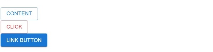
Example 2 (Add Color and Link to the Button)
In the example below, we will learn to change the color of the Button component of Material UI. Users can see that they can add ?primary?, ?secondary?, or ?error? as a value of color prop to apply color from standard colors. Also, users should use the style attribute to apply custom colors.
Furthermore, we have added the ?href? as a prop of the Button component. We need to pass the web page link as a value of the ?href? prop to make the button work as a link.
import React from "react";
import Button from "@mui/material/Button";

function App() {
   return (
      <div>
         <Button variant = "outlined" color = "primary">
            {" "}
            Content {" "}
         </Button>
         <br></br>
         <Button variant = "outlined" color = "error">
            {" "}
            Click {" "}
         </Button>
         <br></br>
         <Button variant = "contained" href = "#">
            {" "}
            Link button {" "}
         </Button>
         <br></br>
      </div>
   );
}
export default App;
Output
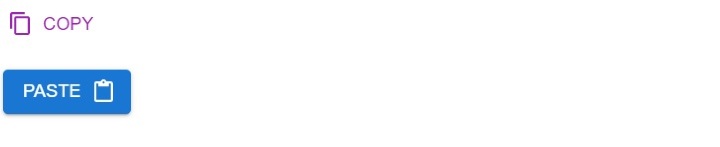
Example 3 (Add Icons to the Button)
When we add icons to the button, it looks much better than the button without icons. In the example below, we have added icons to the buttons. In the first button, we have added the copy icon at the start, and in the second button, we have added the paste icon at the end.
Also, we have imported the icon from the Material Ui library, but users can create a custom component to use the custom icon.
import React from "react";
import Button from "@mui/material/Button";
import ContentCopyIcon from "@mui/icons-material/ContentCopy";
import ContentPasteIcon from "@mui/icons-material/ContentPaste";

function App() {
   return (
      <div>
         <h2>
            Using the <i> Button Component </i> of Material Ui with icons to add
            buttons in the React applications. {" "}
         </h2>
         <Button
            Variant = "contained"
            startIcon = {<ContentCopyIcon />}
            color = "secondary"
            >
            Copy
         </Button>
         <br></br> <br></br>
         <Button variant = "contained" endIcon = {<ContentPasteIcon />}>
            Paste
         </Button>
      </div>
   );
}

export default App;
Output
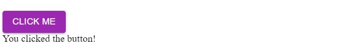
Example 4 (Add Click Event to the Button)
The button is mostly used to perform some action on the click. Here, we have added the ?onClick? event to detect a click on the button. Whenever the user clicks the button, it will invoke the handleClick() function. In the handleClick() function, we set the message value like the button is clicked, which users can observe in the output.
import React from "react";
import Button from "@mui/material/Button";

function App() {
   let [message, setMessage] = React.useState("");

   function handleClick() {
      setMessage("You clicked the button!");
   }

   return (
      <div>
         <Button variant = "contained" onClick = {handleClick} color = "secondary">
            Click me
         </Button>
         <br></br>
         {message}
      </div>
   );
}

export default App;
Output
Users learned to use the button component of the Material UI. In the first example, we learned to use the different variants of the Button component. In the second example, we learned to add color to the button and make it like the link. In the third example, we have added the icon to the button and click event in the final example.

957 Views
