
 Data Structure
 Networking
 RDBMS
RDBMS Operating System
 Java
Java MS Excel
 iOS
iOS HTML
HTML CSS
CSS Android
 Python
 C Programming
 C++
C++ C#
C# MongoDB
 MySQL
MySQL Javascript
 PHP
PHP
- Selected Reading
- UPSC IAS Exams Notes
- Developer's Best Practices
- Questions and Answers
- Effective Resume Writing
- HR Interview Questions
- Computer Glossary
- Who is Who
How to plot means inside boxplot using ggplot2 in R?
When we create a boxplot, it shows the minimum value, maximum value, first quartile, median, and the third quartile but we might want to plot means as well so that the comparison between factor levels can be made on the basis of means also. To create this type of plot, we first need to find the group-wise means then it can be used with geom_text function of ggplot2.
Example
Consider the CO2 data in base R −
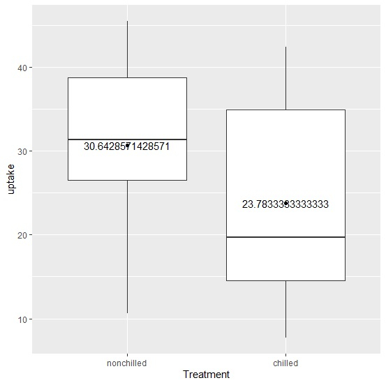
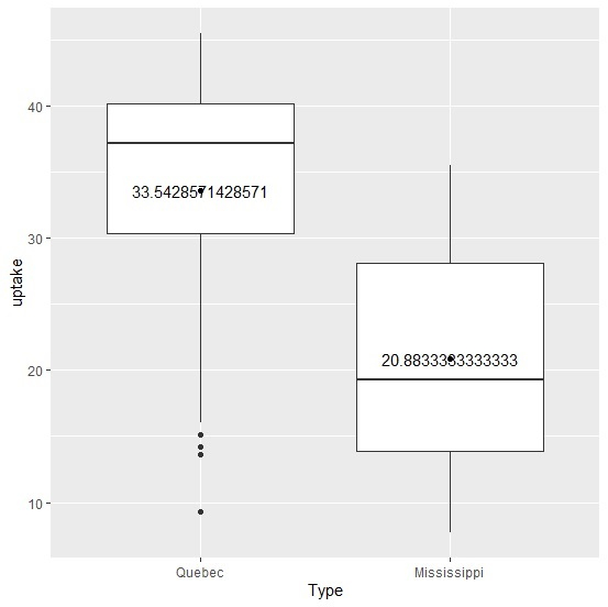
> head(CO2,20)
Plant Type Treatment conc uptake
1 Qn1 Quebec nonchilled 95 16.0
2 Qn1 Quebec nonchilled 175 30.4
3 Qn1 Quebec nonchilled 250 34.8
4 Qn1 Quebec nonchilled 350 37.2
5 Qn1 Quebec nonchilled 500 35.3
6 Qn1 Quebec nonchilled 675 39.2
7 Qn1 Quebec nonchilled 1000 39.7
8 Qn2 Quebec nonchilled 95 13.6
9 Qn2 Quebec nonchilled 175 27.3
10 Qn2 Quebec nonchilled 250 37.1
11 Qn2 Quebec nonchilled 350 41.8
12 Qn2 Quebec nonchilled 500 40.6
13 Qn2 Quebec nonchilled 675 41.4
14 Qn2 Quebec nonchilled 1000 44.3
15 Qn3 Quebec nonchilled 95 16.2
16 Qn3 Quebec nonchilled 175 32.4
17 Qn3 Quebec nonchilled 250 40.3
18 Qn3 Quebec nonchilled 350 42.1
19 Qn3 Quebec nonchilled 500 42.9
20 Qn3 Quebec nonchilled 675 43.9
> means <- aggregate(uptake ~ Treatment, CO2, mean)
> means
Treatment uptake
1 nonchilled 30.64286
2 chilled 23.78333
Creating the boxplot with means for Treatment −
> library(ggplot2)
> ggplot(CO2,aes(Treatment,uptake))+geom_boxplot()+
+ stat_summary(fun.y=mean,geom="point")+
+ geom_text(data=means,aes(label=uptake))
Output
Creating the boxplot with means for Type −
> means <- aggregate(uptake ~ Type, CO2, mean)
> ggplot(CO2,aes(Type,uptake))+geom_boxplot()+
+ stat_summary(fun.y=mean,geom="point")+
+ geom_text(data=means,aes(label=uptake))
Output

Updated on: 2020-08-12T12:30:27+05:30
520 Views

Advertisements