
Article Categories
- All Categories
-
 Data Structure
-
 Networking
-
 RDBMS
RDBMS
-
 Operating System
-
 Java
Java
-
 MS Excel
-
 iOS
iOS
-
 HTML
HTML
-
 CSS
CSS
-
 Android
-
 Python
-
 C Programming
-
 C++
C++
-
 C#
C#
-
 MongoDB
-
 MySQL
MySQL
-
 Javascript
-
 PHP
PHP
-
 Economics & Finance
Selected Reading
How to create bar plot of means with error bars of standard deviations using ggplot2 in R?
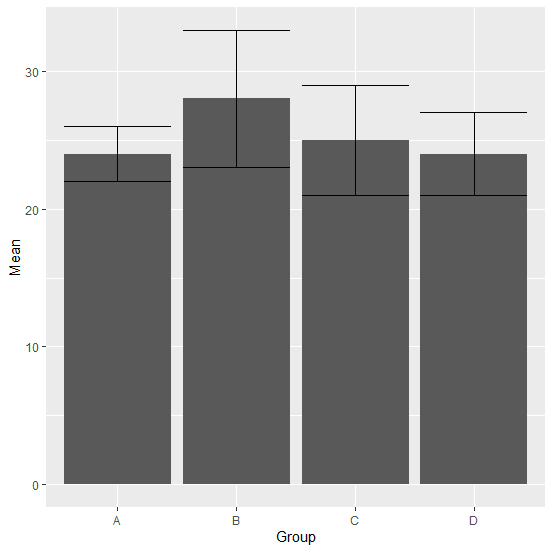
If we have summary data for a group variable then we might want to look at the errors or say differences between mean and standard deviations visually, therefore, we can create a bar plot with error bars of standard deviations. This can be done by using geom_errorbar function of ggplot2 package.
Example
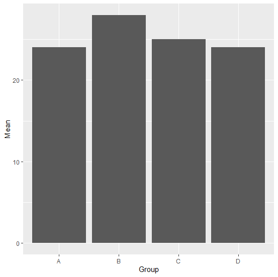
Consider the below data frame −
Group<-c("A","B","C","D")
Mean<-c(24,28,25,24)
SD<-c(2,5,4,3)
df<-data.frame(Group,Mean,SD)
df
Output
 Group Mean SD
1  A   24    2
2  B   28    5
3  C   25    4
4  D   24    3
Loading ggplot2 package and creating bar plot of means −
Example
library(ggplot2)
ggplot(df,aes(Group,Mean))+geom_bar(stat="identity")
Output
Creating bar plot with error bars of standard deviations −
Example
ggplot(df,aes(Group,Mean))+geom_bar(stat="identity")+geom_errorbar(aes(x=Group,ym
in=Mean-SD,ymax=Mean+SD))
Output

Updated on: 2026-03-11T22:50:51+05:30
633 Views

Advertisements