
Article Categories
- All Categories
-
 Data Structure
-
 Networking
-
 RDBMS
RDBMS
-
 Operating System
-
 Java
Java
-
 MS Excel
-
 iOS
iOS
-
 HTML
HTML
-
 CSS
CSS
-
 Android
-
 Python
-
 C Programming
-
 C++
C++
-
 C#
C#
-
 MongoDB
-
 MySQL
MySQL
-
 Javascript
-
 PHP
PHP
-
 Economics & Finance
R Programming how to display both axes' labels of a ggplot2 graph in italics?
To display both axes’ labels of a ggplot2 graph in italics in R, we can use theme function where we can set the face of axis.text.x and axis.text.y argument to italic.
For Example, if we have a data frame called df that contains two columns say X and Y then we can create a scatterplot of X and Y with axes labels in italics by using the below mentioned command −
ggplot(df,aes(X,Y))+geom_point()+theme(axis.text.x=element_text(face="italic"),axis.text.y=element_text(face="italic"))
Example
Following snippet creates a sample data frame −
x<-rnorm(20)
y<-rnorm(20)
df<-data.frame(x,y)
df
The following dataframe is created
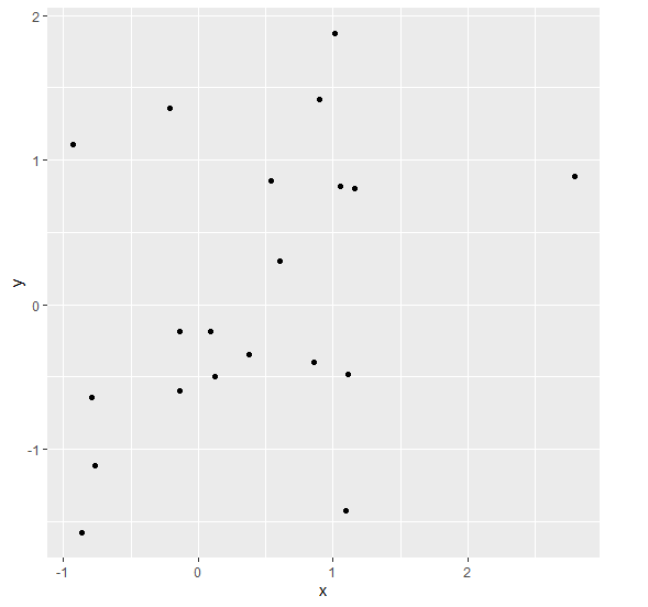
            x         y
 1 -0.21062292  1.3580689
 2  0.85345738 -0.3940783
 3  1.15551683  0.8026387
 4  0.53607421  0.8570883
 5  2.79518912  0.8876277
 6  1.09716564 -1.4281605
 7 -0.13668626 -0.1868037
 8  1.10768308 -0.4847581
 9  1.04976182  0.8196092
10 -0.76949912 -1.1124586
11 -0.78883763 -0.6422824
12  0.11894561 -0.4956317
13  0.09148858 -0.1836053
14 -0.13913979 -0.5980742
15  0.60553342  0.2982480
16  1.01255418  1.8794044
17  0.37599627 -0.3417982
18  0.89855822  1.4217152
19 -0.86766244 -1.5782228
20 -0.93164321  1.1106708
To load ggplot2 package and create scatterplot between x and y on the above created data frame, add the following code to the above snippet −
x<-rnorm(20)
y<-rnorm(20)
df<-data.frame(x,y)
library(ggplot2)
ggplot(df,aes(x,y))+geom_point()
Output
If you execute all the above given snippets as a single program, it generates the following Output −
To create scatterplot between x and y with axes labels in italics on the above created data frame, add the following code to the above snippet −
x<-rnorm(20)
y<-rnorm(20)
df<-data.frame(x,y)
library(ggplot2)
ggplot(df,aes(x,y))+geom_point()+theme(axis.text.x=element_text(face="italic"),axis.text.y=element_text(face="italic"))
Output
If you execute all the above given snippets as a single program, it generates the following Output −


354 Views
