
Article Categories
- All Categories
-
 Data Structure
-
 Networking
-
 RDBMS
RDBMS
-
 Operating System
-
 Java
Java
-
 MS Excel
-
 iOS
iOS
-
 HTML
HTML
-
 CSS
CSS
-
 Android
-
 Python
-
 C Programming
-
 C++
C++
-
 C#
C#
-
 MongoDB
-
 MySQL
MySQL
-
 Javascript
-
 PHP
PHP
-
 Economics & Finance
Create a graph using ggplot2 without axes ticks and axes labels.
To create a graph using ggplot2 without axes ticks and axes labels, we can use theme function where we can use set axes ticks and axis labels to blank with the help of arguments corresponding to each axes such as axis.ticks.x, axis.ticks.y, axis.text.x, and axis.text.y.
To understand how it works, check out the below Example.
Example
Consider the below data frame −
x<-rnorm(20)
y<-rnorm(20)
df<-data.frame(x,y)
df
The following dataframe is created
              x          y
1  -1.029916441 -0.29560947
2  -0.739082074 -0.23020700
3   0.234939440 -0.93942559
4   0.756877856  1.38341053
5   0.389253648 -0.16756918
6  -0.717467618 -0.03400851
7   1.675155881  0.03443810
8   0.174651518  1.28373652
9  -0.003033735  1.74424235
10 -0.737359837  0.66037667
11  0.681099808 -0.94483371
12  0.073636741 -0.91757685
13  0.321299987  0.52778014
14 -1.396619243 -0.05129194
15  0.229400855  1.25622295
16 -0.819646603 -0.39269593
17 -0.417135872 -1.54430356
18  1.637382909  0.32918423
19  0.808213181  1.87005700
20  0.592011449 -0.15108324
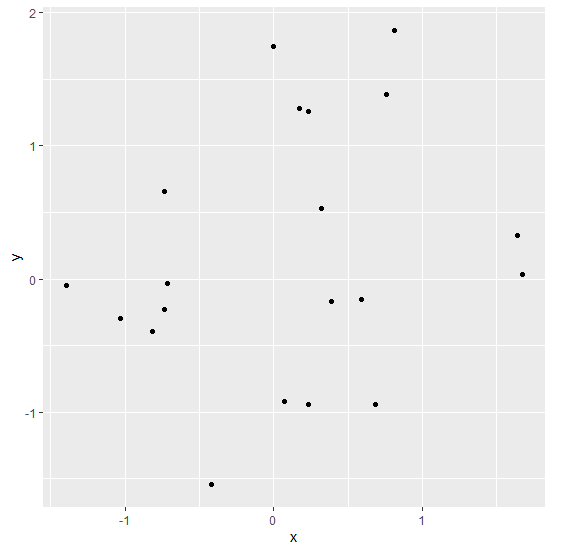
To load the ggplot2 package and create scatterplot between x and y on the above created data frame, add the following code to the above snippet −
x<-rnorm(20)
y<-rnorm(20)
df<-data.frame(x,y)
library(ggplot2)
ggplot(df,aes(x,y))+geom_point()
Output
If you execute all the above given snippets as a single program, it generates the following Output −
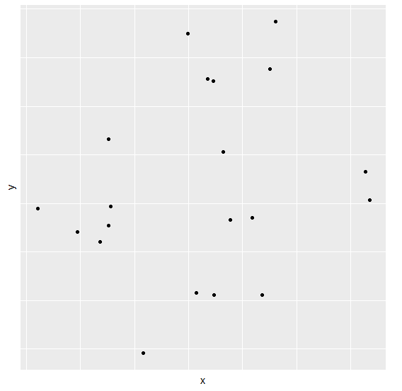
To create scatterplot between x and y without axes ticks and axes labels on the above created data frame, add the following code to the above snippet −
x<-rnorm(20)
y<-rnorm(20)
df<-data.frame(x,y)
library(ggplot2)
ggplot(df,aes(x,y))+geom_point()+theme(axis.ticks.x=element_blank(),axis.ticks.
y=element_blank(),axis.text.y=element_blank(),axis.text.x=element_blank())
Output
If you execute all the above given snippets as a single program, it generates the following Output −

241 Views
