
Article Categories
- All Categories
-
 Data Structure
-
 Networking
-
 RDBMS
RDBMS
-
 Operating System
-
 Java
Java
-
 MS Excel
-
 iOS
iOS
-
 HTML
HTML
-
 CSS
CSS
-
 Android
-
 Python
-
 C Programming
-
 C++
C++
-
 C#
C#
-
 MongoDB
-
 MySQL
MySQL
-
 Javascript
-
 PHP
PHP
-
 Economics & Finance
Selected Reading
How to display tick marks on upper as well as right side of the plot using ggplot2 in R?
To display tick marks on upper as well as right side of the plot, we can create duplicate axes for X as well Y by using scale_x_continuous and scale_y_continuous functions. The argument that will help us in this case is sec.axis and we need to set it to dup_axis as scale_x_continuous(sec.axis=dup_axis()) and scale_y_continuous(sec.axis=dup_axis()). Check out the below example to understand how it can be done.
Example
Consider the below data frame −
x<-rnorm(20)
y<-rnorm(20)
df<-data.frame(x,y)
df
Output
       x             y
1   0.11204135   0.29084737
2   0.61199138   0.48121914
3   0.48760949  -0.21450790
4  -0.87200194   0.67532122
5  -2.24557725   0.27402959
6   0.76593441  -0.12197485
7   1.94506052   2.53583915
8  -0.35843587  -0.77521246
9  -1.50236224  -0.68711682
10 -0.11789693  -0.22534300
11  1.51156266  -0.77355032
12 -0.50594024  -0.91056427
13  0.69102879  -0.01354832
14 -0.62664213   0.44946662
15 -1.00403558  -0.62376588
16 -0.01299667   0.62897816
17 -1.23493618  -0.33727209
18  1.16264196  -0.68264496
19 -2.53843314  -0.21478113
20  0.47694554   0.52879296
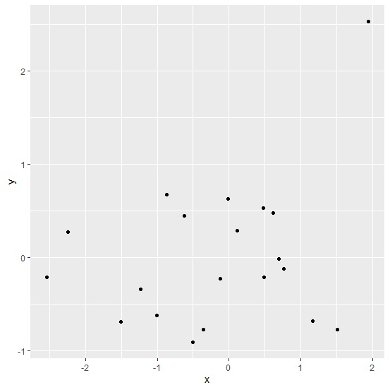
Loading ggplot2 package and creating scatterplot between x and y −
Example
library(ggplot2)
ggplot(df,aes(x,y))+geom_point()
Output
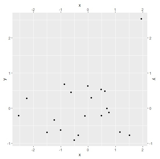
Creating scatterplot between x and y with axes on upper and right side of the plot −
Example
ggplot(df,aes(x,y))+geom_point()+scale_x_continuous(sec.axis=dup_axis())+scale_y_continuous(sec.axis=dup_axis())
Output

Updated on: 2026-03-11T22:50:56+05:30
894 Views

Advertisements