
Article Categories
- All Categories
-
 Data Structure
-
 Networking
-
 RDBMS
RDBMS
-
 Operating System
-
 Java
Java
-
 MS Excel
-
 iOS
iOS
-
 HTML
HTML
-
 CSS
CSS
-
 Android
-
 Python
-
 C Programming
-
 C++
C++
-
 C#
C#
-
 MongoDB
-
 MySQL
MySQL
-
 Javascript
-
 PHP
PHP
-
 Economics & Finance
Selected Reading
How to display a line in segment of a plot using ggplot2 in R?
To display a line in segment of a plot, we can use geom_segment function of ggplot2 package where we need to pass the initial and the ending values for both the axes. For example, if we have data frame called df that contains x and y then a scatterplot with a line segment can be created by using the below command −
ggplot(df,aes(x,y))+geom_point()+
geom_segment(aes(x=xstart,xend=xlast,y=ystart,yend=ylast))
Consider the below data frame −
Example
x<-rpois(20,5)
y<-rpois(20,5)
df<-data.frame(x,y)
df
Output
   x y
1  4 6
2  6 4
3  8 10
4  5 7
5  8 2
6  2 3
7  7 6
8  1 8
9  4 3
10 5 5
11 6 5
12 3 1
13 9 11
14 6 7
15 7 10
16 8 8
17 5 6
18 5 5
19 3 2
20 5 5
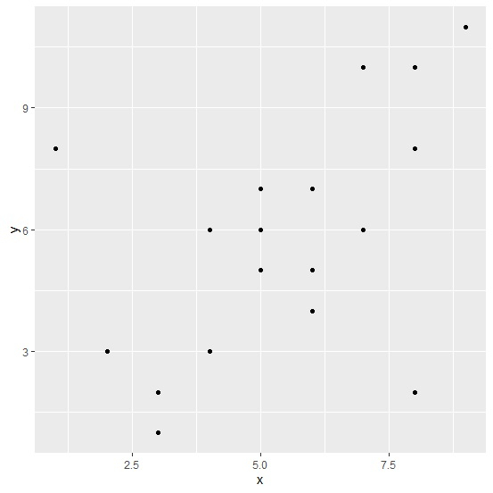
Loading ggplot2 package and creating a scatterplot of x and y −
Example
library(ggplot2)
ggplot(df,aes(x,y))+geom_point()
Output
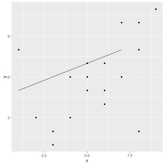
Creating a scatterplot of x and y with a line segment −
Example
ggplot(df,aes(x,y))+geom_point()+geom_segment(aes(x=1,xend=7,y=5,yend=8))
Output

Updated on: 2026-03-11T22:50:55+05:30
415 Views

Advertisements