
Article Categories
- All Categories
-
 Data Structure
-
 Networking
-
 RDBMS
RDBMS
-
 Operating System
-
 Java
Java
-
 MS Excel
-
 iOS
iOS
-
 HTML
HTML
-
 CSS
CSS
-
 Android
-
 Python
-
 C Programming
-
 C++
C++
-
 C#
C#
-
 MongoDB
-
 MySQL
MySQL
-
 Javascript
-
 PHP
PHP
-
 Economics & Finance
Selected Reading
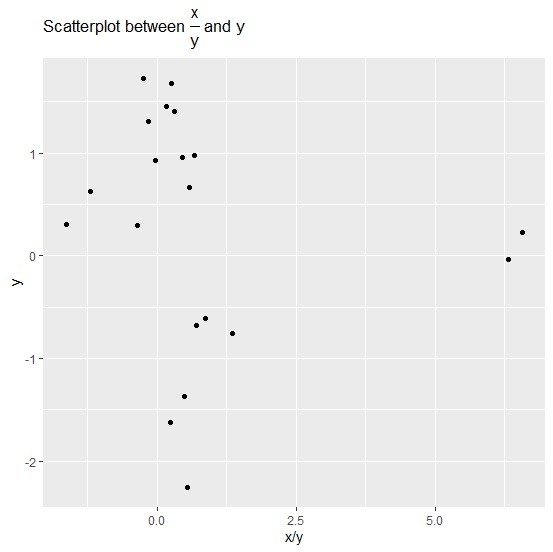
How to display fraction in a plot title using ggplot2 in R?
To display fraction in a plot title using ggplot2 in R, we can use frac function inside ggtitle function of ggplot2 package. Generally, fraction is displayed as X/Y but frac function helps to create the fraction in over form.
Check out the below example to understand how over form of fraction can be displayed in a plot title using ggplot2.
Example
Following snippet creates a sample data frame −
x<-rnorm(20)
y<-rnorm(20)
df<-data.frame(x,y)
df
The following dataframe is created −
       x            y
1   0.23483738  1.4506593
2  -0.53391645 -0.6103884
3   0.43178470  0.9607968
4  -0.02202213  0.9308459
5  -0.67083342 -1.3704258
6  -1.01972845 -0.7536449
7  -0.41450037  1.7233977
8   0.65886251  0.9757482
9   1.47215186  0.2239160
10 -0.50323646  0.3078364
11 -0.75307929  0.6244623
12  0.43689883  1.4064075
13 -0.47781745 -0.6764910
14 -0.21645828  1.3042513
15 -0.39136288 -1.6218892
16 -0.10340456  0.2913214
17  0.41817242  1.6793330
18 -1.21634661 -2.2519936
19 -0.20690016 -0.0327693
20  0.38731829  0.6627035
To load ggplot2 package and create point chart between x and y with plot title displaying fraction in over form, add the following code to the above snippet −
library(ggplot2)
ggplot(df,aes(x/y,y))+geom_point()+ggtitle(expression(paste("Scatterplot between ", frac(x,y), " and y")))
Output
If you execute all the above given snippets as a single program, it generates the following output −

Updated on: 2021-11-23T06:11:56+05:30
1K+ Views

Advertisements