
Article Categories
- All Categories
-
 Data Structure
-
 Networking
-
 RDBMS
RDBMS
-
 Operating System
-
 Java
Java
-
 MS Excel
-
 iOS
iOS
-
 HTML
HTML
-
 CSS
CSS
-
 Android
-
 Python
-
 C Programming
-
 C++
C++
-
 C#
C#
-
 MongoDB
-
 MySQL
MySQL
-
 Javascript
-
 PHP
PHP
-
 Economics & Finance
Selected Reading
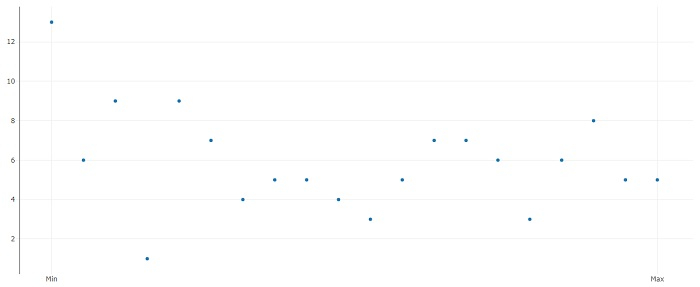
How to display X-axis tick marks as minimum and maximum only without their values using plotly in R?
To display X-axis tick marks as minimum and maximum only without their values using plotly, we can use layout function of plot_ly package where we can pass the values for minimum and maximum using xaxis argument and the text using ticktext argument as shown in the below example.
Example
Following snippet creates a sample data frame −
x<-1:20
y<-rpois(20,5)
df<-data.frame(x,y)
df
output
The following dataframe is created −
    x  y
1   1 13
2   2  6
3   3  9
4   4  1
5   5  9
6   6  7
7   7  4
8   8  5
9   9  5
10 10  4
11 11  3
12 12  5
13 13  7
14 14  7
15 15  6
16 16  3
17 17  6
18 18  8
19 19  5
20 20  5
To load plotly package and create point chart between x and y with minimum and maximum shown by Min and Max on X-axis, add the following code to the above snippet −
library(plotly)
plot_ly(data=df,x=x,y=y)%>%layout(xaxis=list(tickvals=c(1,20),ticktext=c("Min","Max")))
Output
If you execute all the above given snippets as a single program, it generates the following Output −

Updated on: 2021-11-02T07:08:52+05:30
571 Views

Advertisements