
Article Categories
- All Categories
-
 Data Structure
-
 Networking
-
 RDBMS
RDBMS
-
 Operating System
-
 Java
Java
-
 MS Excel
-
 iOS
iOS
-
 HTML
HTML
-
 CSS
CSS
-
 Android
-
 Python
-
 C Programming
-
 C++
C++
-
 C#
C#
-
 MongoDB
-
 MySQL
MySQL
-
 Javascript
-
 PHP
PHP
-
 Economics & Finance
How to display data frame name in ggplot2 graph title in R?
To display data frame name in ggplot2 graph title, we can use ggtitle function and pass the name of the data frame.
For example, if we have a data frame called df that contains two columns say x and y and we can create a point chart between x and y then the plot with data frame name as title can be created by using the below mentioned command −
ggplot(df,aes(x,y))+geom_point()+ggtitle("df")
Example
Following snippet creates a sample data frame −
x<-rnorm(20)
y<-rnorm(20)
Scatter_data<-data.frame(x,y)
Scatter_data
Output
The following dataframe is created −
       x            y
1  -0.845697847   0.35455909
2  -0.407797990  -0.07965950
3  -1.367080923   0.29868478
4  -0.420351817   0.08100959
5  -0.232664470  -0.42197926
6  -0.009006127   0.23762401
7   0.085037204   1.51553702
8   0.878031537   1.67593567
9  -0.727112555  -0.01688995
10 -0.575278542  -0.92132421
11  2.435161686  -0.63178483
12  1.221422580  -0.55697074
13 -0.159321562  -1.28573020
14 -0.448990571  -0.21382377
15  0.101589928  -0.82813014
16 -0.522879574   0.78420506
17 -0.491609573   1.35435264
18 0.788076407    0.41095225
19 -1.381463480  -0.79977881
20 -0.161756452  -0.03442085
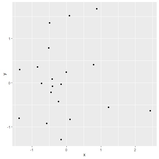
To load ggplot2 package and create scatterplot between x and y, add the following code to the above snippet −
library(ggplot2) ggplot(Scatter_data,aes(x,y))+geom_point()
Output
If you execute all the above given snippets as a single program, it generates the following Output −
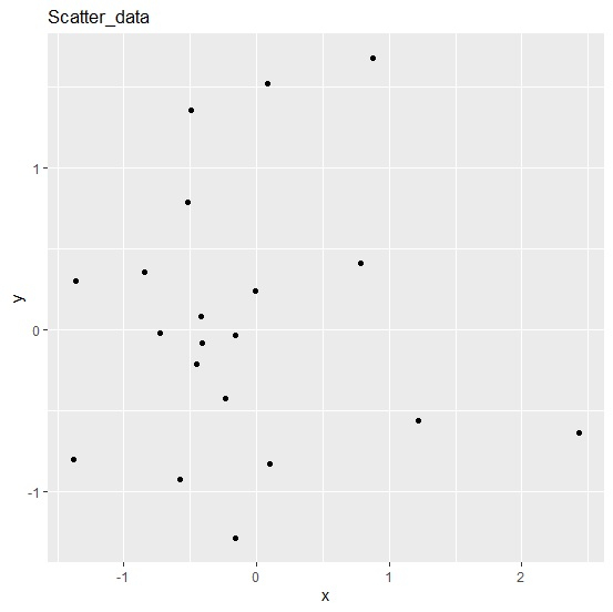
To create scatterplot between x and y with Scatter_data as plot title add the following code to the above snippet −
Example
ggplot(Scatter_data,aes(x,y))+geom_point()+ggtitle("Scatter_data")
Output
If you execute all the above given snippets as a single program, it generates the following Output −

682 Views
