
Article Categories
- All Categories
-
 Data Structure
-
 Networking
-
 RDBMS
RDBMS
-
 Operating System
-
 Java
Java
-
 MS Excel
-
 iOS
iOS
-
 HTML
HTML
-
 CSS
CSS
-
 Android
-
 Python
-
 C Programming
-
 C++
C++
-
 C#
C#
-
 MongoDB
-
 MySQL
MySQL
-
 Javascript
-
 PHP
PHP
-
 Economics & Finance
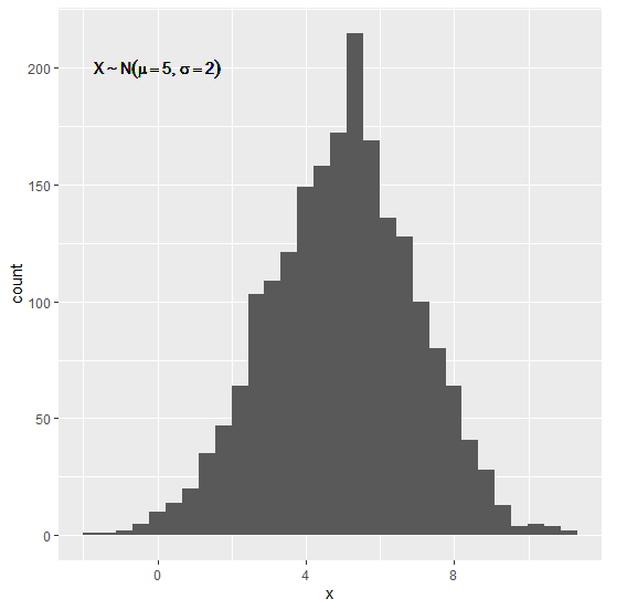
How to display tilde ggplot2 graph in R?
Let’s say we want to display tilde sign at a particular position in histogram using ggplot2 graph. In this situation, we can use geom_text function and pass all the text with label argument inside aes where tilde will be written as %~%.
For Example, if we want to display X follows Normal Distribution then we can write it as −
geom_text(aes(label="X %~% Normal Distribution",x=0,y=200),parse=TRUE)
Here, x=0 and y=200 is the position of the label in the histogram.
Example
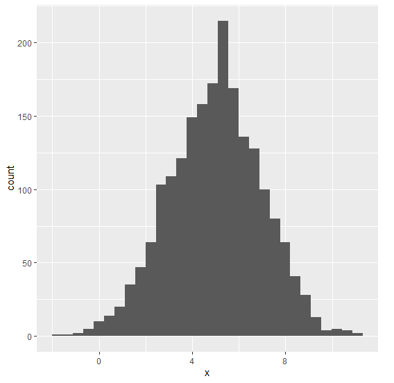
Consider the below data frame −
xThe following dataframe is created
x 1 3.429893 2 2.873259 3 4.621022 4 4.873246 5 4.707371 6 7.650049 7 6.402318 8 4.427331 9 6.830767 10 4.535618 11 6.622828 12 4.770918 13 1.018385 14 5.725048 15 2.238412 16 6.623515 17 4.835721 18 5.266638 19 5.380624 20 4.381922To load the ggplot2 package and create histogram of x on the above created data frame, add the following code to the above snippet −
xOutput
If you execute all the above given snippets as a single program, it generates the following Output −
To create a histogram of x with representing tilde sign in the graph on the above created data frame, add the following code to the above snippet −
xOutput
If you execute all the above given snippets as a single program, it generates the following Output −

471 Views
