
Article Categories
- All Categories
-
 Data Structure
-
 Networking
-
 RDBMS
RDBMS
-
 Operating System
-
 Java
Java
-
 MS Excel
-
 iOS
iOS
-
 HTML
HTML
-
 CSS
CSS
-
 Android
-
 Python
-
 C Programming
-
 C++
C++
-
 C#
C#
-
 MongoDB
-
 MySQL
MySQL
-
 Javascript
-
 PHP
PHP
-
 Economics & Finance
How to create a colored frame for ggplot2 graph in R?
To create a colored frame for ggplot2 graph, we can use theme function and set the plot.background argument to different color for rectangular element.
For example, if we have a data frame called df that contains two columns say X and Y then we can create point chart between X and Y with blue colored frame of the plot using the below mentioned command −
ggplot(df,aes(X,Y))+geom_point()+theme(plot.background=element_rect(colour="blue",size=3))
Example
Following snippet creates a sample data frame −
x<-rnorm(20)
y<-rnorm(20)
df<-data.frame(x,y)
df
Output
The following dataframe is created −
       x            y
1   0.39846728  -1.03040367
2  -0.63807103  -1.26192931
3  -0.26771290   0.39218463
4   0.35987956  -1.13143826
5  -1.31286609   0.54414448
6  -0.88396961   1.17660893
7   2.07709479   0.02522857
8  -2.09922563   0.51513317
9  -1.23850597  -0.65410976
10  0.99043309   0.50364199
11  1.08866186  -1.27211922
12  0.83985225  -0.07677115
13  0.05685864  -1.34531938
14  0.32387805  -0.26631756
15 -0.90466867   1.08756300
16 -0.65218385   0.70056780
17 -0.26245464  -0.44275951
18 -0.93466284  -0.78851997
19  0.82116121  -0.85677571
20 -1.62425917  -0.74641901
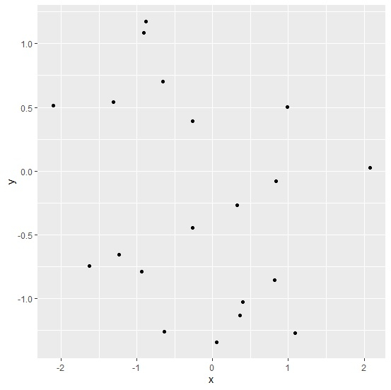
To load ggplot2 package and create point chart between x and y, add the following code to the above snippet −
library(ggplot2)
ggplot(df,aes(x,y))+geom_point()
Output
If you execute all the above given snippets as a single program, it generates the following Output −
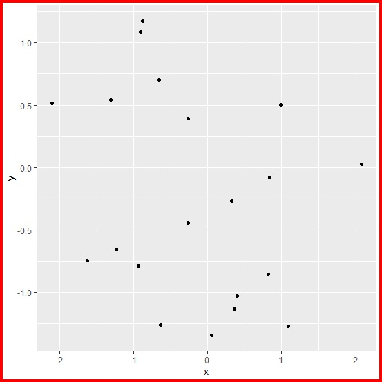
To create point chart between x and y with red colored frame, add the following code to the above snippet −
ggplot(df,aes(x,y))+geom_point()+theme(plot.background=element_rect(colour="red",size=3))
Output
If you execute all the above given snippets as a single program, it generates the following Output −

347 Views
