
Article Categories
- All Categories
-
 Data Structure
-
 Networking
-
 RDBMS
RDBMS
-
 Operating System
-
 Java
Java
-
 MS Excel
-
 iOS
iOS
-
 HTML
HTML
-
 CSS
CSS
-
 Android
-
 Python
-
 C Programming
-
 C++
C++
-
 C#
C#
-
 MongoDB
-
 MySQL
MySQL
-
 Javascript
-
 PHP
PHP
-
 Economics & Finance
Selected Reading
How to change the legend title in ggplot2 in R?
In ggplot2, by default the legend title is the title of the grouping column of the data frame. If we want to change that title then scale_color_discrete function. For example, if we have a data frame called df that contains two numerical columns x and y and one grouping column say group then the scatterplot with a different legend title can be created by using the below command −
ggplot(df,aes(x,y,color=group))+geom_point()+scale_color_discrete("Gender")
Example
Consider the below data frame −
> x<-rnorm(20)
> y<-rnorm(20)
> grp<-sample(c("Male","Female"),20,replace=TRUE)
> df<-data.frame(x,y,grp)
> df
Output
             x          y    grp
1  -2.27846496  0.8121008   Male
2  -1.75112768 -0.1718679 Female
3  -0.12504696 -0.3265867 Female
4   0.10895490 -0.2015613 Female
5  -1.51196132  0.8480887   Male
6   1.68028497 -1.1329240   Male
7  -0.65238760 -0.9495177   Male
8   0.84725937  1.4825983 Female
9   0.53645228  2.1630524 Female
10 -2.04814594  0.4503883 Female
11 -0.37741279 -1.1621875   Male
12  0.79303416 -0.1804637   Male
13 -0.02095395 -0.9740427   Male
14  0.61453646  1.0327821 Female
15 -0.32875489 -0.4071753   Male
16  0.94227215  2.0651996 Female
17  1.79740910  0.8630703   Male
18  1.09133101 -0.1053076   Male
19  0.33748223 -0.1238961 Female
20 -0.10264760  1.5338488   Male
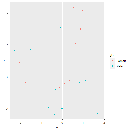
Loading ggplot2 package and creating a point chart between x and y with grouping of grp −
> library(ggplot2)
> ggplot(df,aes(x,y,color=grp))+geom_point()
Output
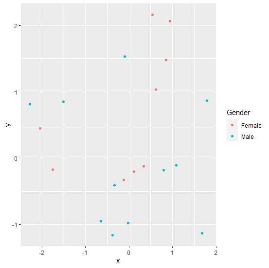
Creating a point chart between x and y with grouping of grp and legend title Gender −
> ggplot(df,aes(x,y,color=grp))+geom_point()+scale_color_discrete("Gender")
Output

Updated on: 2026-03-11T22:50:56+05:30
552 Views

Advertisements