
Article Categories
- All Categories
-
 Data Structure
-
 Networking
-
 RDBMS
RDBMS
-
 Operating System
-
 Java
Java
-
 MS Excel
-
 iOS
iOS
-
 HTML
HTML
-
 CSS
CSS
-
 Android
-
 Python
-
 C Programming
-
 C++
C++
-
 C#
C#
-
 MongoDB
-
 MySQL
MySQL
-
 Javascript
-
 PHP
PHP
-
 Economics & Finance
Selected Reading
How to display NA frequency for a ggplot2 graph using color brewer in R?
To display NA frequency for a ggplot2 graph using color brewer in R, we can follow the below steps −
- First of all, create a data frame.
- Then, create the chart with default colors.
- After that, use scale_colour_brewer function to create the bar chart and set the color of NA values bar with na.value.
Create the data frame
Let's create a data frame as shown below −
Group<-c("A","B","C",NA)
Count<-c(24,21,27,25)
df<-data.frame(Group,Count)
df
On executing, the above script generates the below output(this output will vary on your system due to randomization) −
   Group Count
1   A    24
2   B    21
3   C    27
4 <NA>   25
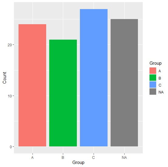
Create the bar chart with default colors
Loading ggplot2 package and creating the bar for the data in df −
Group<-c("A","B","C",NA)
Count<-c(24,21,27,25)
df<-data.frame(Group,Count)
library(ggplot2)
ggplot(df,aes(Group,Count,fill=Group))+geom_bar(stat="identity")
Output
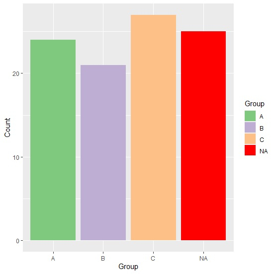
Create the bar chart with color brewer and change the color of bar representing NA
Use scale_colour_brewer function of ggplot2 package to create the bar chart and set the color of NA values bar to red with na.value as shown below −
Group<-c("A","B","C",NA)
Count<-c(24,21,27,25)
df<-data.frame(Group,Count)
library(ggplot2)
ggplot(df,aes(Group,Count,fill=Group))+geom_bar(stat="identity")+scale_fill_brewer(pa
lette="Accent",na.value="red")
Output

Updated on: 2026-03-11T22:50:58+05:30
1K+ Views

Advertisements