
Article Categories
- All Categories
-
 Data Structure
-
 Networking
-
 RDBMS
RDBMS
-
 Operating System
-
 Java
Java
-
 MS Excel
-
 iOS
iOS
-
 HTML
HTML
-
 CSS
CSS
-
 Android
-
 Python
-
 C Programming
-
 C++
C++
-
 C#
C#
-
 MongoDB
-
 MySQL
MySQL
-
 Javascript
-
 PHP
PHP
-
 Economics & Finance
Selected Reading
How to define the breaks for a histogram using ggplot2 in R?
To manually define the breaks for a histogram using ggplot2, we can use breaks argument in the geom_histogram function. While creating the number of breaks we must be careful about the starting point and the difference between values for breaks. This will define the number of bars for histogram so it should be taken seriously and should be according to the distribution of the data.
Consider the below data frame −
Example
x<-rnorm(5000,525,30.24)
df<-data.frame(x)
head(df,20)
Output
    x
1  524.0964
2  490.5952
3  518.6243
4  544.0018
5  480.8306
6  461.2975
7  464.0870
8  516.5240
9  517.3936
10 506.0277
11 480.3274
12 505.6415
13 440.9464
14 532.0064
15 482.7700
16 517.3608
17 536.5500
18 518.7121
19 598.5776
20 506.3834
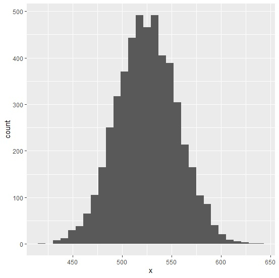
Loading ggplot2 package and creating a histogram of x −
Example
library(ggplot2)
ggplot(df,aes(x))+geom_histogram(bins=30)
Output
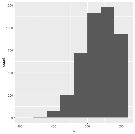
Creating histogram of x with manually defined breaks −
Example
ggplot(df,aes(x))+geom_histogram(bins=30,breaks=c(400,420,440,460,480,500,520,540,560))
Output

Updated on: 2026-03-11T22:50:55+05:30
9K+ Views

Advertisements