
Article Categories
- All Categories
-
 Data Structure
-
 Networking
-
 RDBMS
RDBMS
-
 Operating System
-
 Java
Java
-
 MS Excel
-
 iOS
iOS
-
 HTML
HTML
-
 CSS
CSS
-
 Android
-
 Python
-
 C Programming
-
 C++
C++
-
 C#
C#
-
 MongoDB
-
 MySQL
MySQL
-
 Javascript
-
 PHP
PHP
-
 Economics & Finance
Selected Reading
How to create a histogram using weights in R?
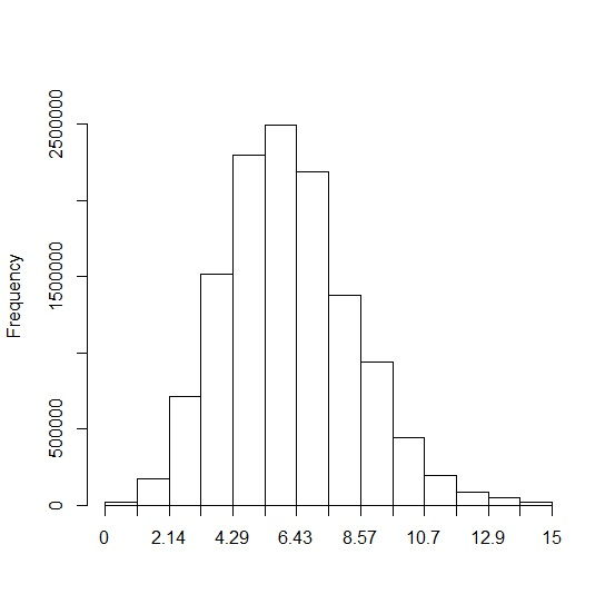
A histogram using weights represent the weighted distribution of the values. In R, we can use weighted.hist function of plotrix package to create this type of histogram and we just need the values and weights corresponding to each value. Since plotrix is not frequently used, we must make sure that we install this package using install.packages("plotrix") then load it in R environment.
Loading plotrix package −
library("plotrix")
Consider the below vector and the weight associated with that vector −
Example
xCreating weighted histogram for x −
Output
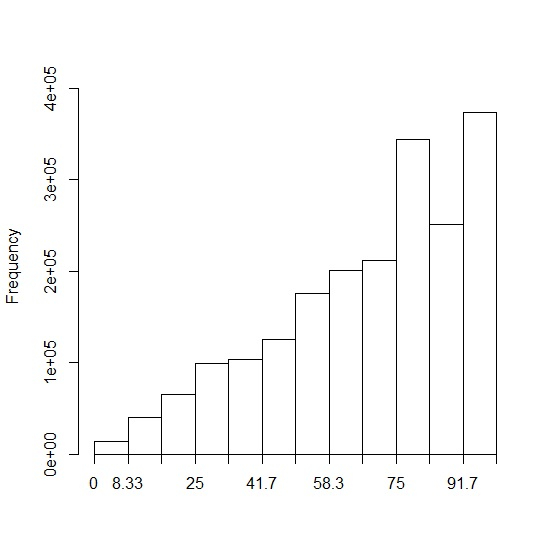
Let’s have a look at another example −
Example
yOutput

Updated on: 2020-10-10T13:07:31+05:30
1K+ Views

Advertisements