
Article Categories
- All Categories
-
 Data Structure
-
 Networking
-
 RDBMS
RDBMS
-
 Operating System
-
 Java
Java
-
 MS Excel
-
 iOS
iOS
-
 HTML
HTML
-
 CSS
CSS
-
 Android
-
 Python
-
 C Programming
-
 C++
C++
-
 C#
C#
-
 MongoDB
-
 MySQL
MySQL
-
 Javascript
-
 PHP
PHP
-
 Economics & Finance
Selected Reading
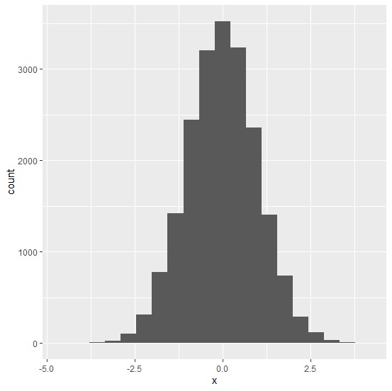
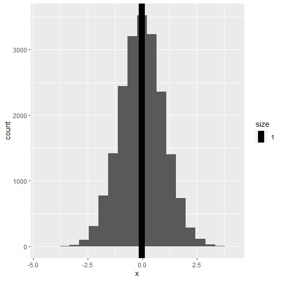
How to display mean in a histogram using ggplot2 in R?
To display mean in a histogram using ggplot2, we can use geom_vline function where we need to define the x-intercept value as the mean of the column for which we want to create the histogram. Also, we can change the size of the line for mean in the histogram by using size argument inside geom_vline function.
Consider the below data frame −
x<-rnorm(20000)
df<-data.frame(x)
Loading ggplot2 package and creating histogram of x −
Example
library(ggplot2)
ggplot(df,aes(x))+geom_histogram(bins=20)
Output
Creating histogram of x with mean displayed on the plot −
Example
ggplot(df,aes(x))+geom_histogram(bins=20)+geom_vline(aes(xintercept=mean(x),size=1))
Output

Updated on: 2021-02-06T11:11:57+05:30
5K+ Views

Advertisements