
Article Categories
- All Categories
-
 Data Structure
-
 Networking
-
 RDBMS
RDBMS
-
 Operating System
-
 Java
Java
-
 MS Excel
-
 iOS
iOS
-
 HTML
HTML
-
 CSS
CSS
-
 Android
-
 Python
-
 C Programming
-
 C++
C++
-
 C#
C#
-
 MongoDB
-
 MySQL
MySQL
-
 Javascript
-
 PHP
PHP
-
 Economics & Finance
Selected Reading
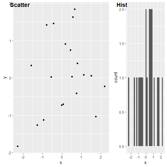
How to create the plots arranged in a list that were generated using ggplot2 in R?
If we have two plots generated by using ggplot2 and arranged in a list then we can create them using ggarrange function. For example, if we have two objects p1 and p2 that are stored in the list called named as LIST then those plots can be created in the plot window by using the command ggarrange(plotlist=LIST,widths=c(2,1),labels=c("Scatter","Hist"))
Example
Consider the below data frame −
set.seed(21)
x<−rnorm(20)
y<−rnorm(20)
df<−data.frame(x,y)
df
Output
       x          y
1 0.793013171   0.39299759
2 0.522251264   0.03675713
3 1.746222241   -1.03208366
4 −1.271336123 −1.26486147
5 2.197389533  −0.22696529
6 0.433130777   0.74558930
7 −1.570199630  0.33281918
8 −0.934905667 −1.12404046
9 0.063493345   −0.70613078
10 −0.002393336 −0.72754386
11 −2.276781240 −1.83431439
12 0.757412225  −0.40768794
13 −0.548405554 0.02686119
14 0.172549478 0.91162864
15 0.562853068 1.63434648
16 1.511817959 0.06068561
17 0.659025169 1.84757253
18 1.122028075 0.08012495
19 −0.784641369 1.41855588
20 −0.425692289 1.45861594
Loading the ggplot2 package and creating the plots −
Example
library(ggplot2)
Scatterplot<−ggplot(df,aes(x,y))+geom_point()
Hist_of_x<−ggplot(df,aes(x))+geom_histogram(bins=30)
List<−list(Scatterplot,Hist_of_x)
ggarrange(plotlist=List,widths=c(2,1),labels=c("Scatter","Hist"))
Output

Updated on: 2026-03-11T22:50:55+05:30
611 Views

Advertisements