
Article Categories
- All Categories
-
 Data Structure
-
 Networking
-
 RDBMS
RDBMS
-
 Operating System
-
 Java
Java
-
 MS Excel
-
 iOS
iOS
-
 HTML
HTML
-
 CSS
CSS
-
 Android
-
 Python
-
 C Programming
-
 C++
C++
-
 C#
C#
-
 MongoDB
-
 MySQL
MySQL
-
 Javascript
-
 PHP
PHP
-
 Economics & Finance
Selected Reading
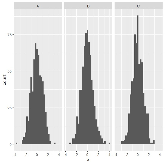
How to create facetted histograms using ggplot2 in R?
The facetted histograms are the separated histograms created for different categories in a single plot window. We can follow the below steps to create such type of histograms using ggplot2 −
- First of all, create the data frame.
- Load the ggplot2 package and create facetted histogram with the help of facet_grid function of ggplot2 package.
Create the data frame
Let's create a data frame as shown below −
Group<-sample(LETTERS[1:3],2000,replace=TRUE)
x<-rnorm(2000)
df<-data.frame(Group,x)
head(df,30)
On executing, the above script generates the below output(this output will vary on your system due to randomization) −
 Group    x
1 A -0.15109174
2 B 0.79993882
3 C 0.08982681
4 B -0.14506660
5 A -0.11787381
6 C -0.96427342
7 A 1.11687020
8 B -1.07769076
9 C -1.01850658
10 B 0.24430195
11 B -0.15510646
12 A 0.13364920
13 A -0.15671764
14 A -1.96636140
15 B 1.72444566
16 B 0.74713059
17 C -0.98136868
18 C -1.93135045
19 C -0.51990385
20 B -2.15635971
21 B 0.35730736
22 C -0.16965592
23 A 0.82810224
24 B -1.58918990
25 C 0.32902104
26 C -0.08942102
27 B 0.31243311
28 B -0.01585389
29 B -0.78921478
30 A -1.27632182
Creating the facetted histograms
Loading ggplot2 package and creating facetted histograms for values in Group column −
Group<-sample(LETTERS[1:3],2000,replace=TRUE)
x<-rnorm(2000)
df<-data.frame(Group,x)
library(ggplot2)
ggplot(df,aes(x))+geom_histogram(bins=30)+facet_grid(.~Group)
Output

Updated on: 2026-03-11T22:50:58+05:30
5K+ Views

Advertisements