
Article Categories
- All Categories
-
 Data Structure
-
 Networking
-
 RDBMS
RDBMS
-
 Operating System
-
 Java
Java
-
 MS Excel
-
 iOS
iOS
-
 HTML
HTML
-
 CSS
CSS
-
 Android
-
 Python
-
 C Programming
-
 C++
C++
-
 C#
C#
-
 MongoDB
-
 MySQL
MySQL
-
 Javascript
-
 PHP
PHP
-
 Economics & Finance
Selected Reading
How to create a line chart using ggplot2 that touches the edge in R?
To create a line chart using ggplot2 that touches the edge we can follow the below steps −
- First of all, creating data frame.
- Then loading ggplot2 package and creating the line chart in default manner.
- After that creating the line chart with coord_cartesian function.
Create the data frame
Let's create a data frame as shown below −
x<-rpois(5,2)
y<-rpois(5,5)
df<-data.frame(x,y)
df
On executing, the above script generates the below output(this output will vary on your system due to randomization) −
  x y
1 2 5
2 1 4
3 3 8
4 1 3
5 2 5
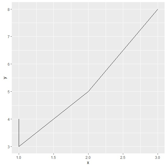
Creating the line chart in default manner
Loading ggplot2 package and creating the line chart in default manner −
library(ggplot2)
x<-rpois(5,2)
y<-rpois(5,5)
df<-data.frame(x,y)
ggplot(df,aes(x,y))+geom_line()
Output
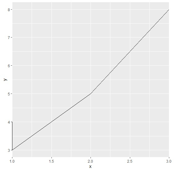
Creating the line chart that touches the edges
Use coord_cartesian function of ggplot2 package to create the line chart where line touches the edges −
library(ggplot2)
x<-rpois(5,2)
y<-rpois(5,5)
df<-data.frame(x,y)
ggplot(df,aes(x,y))+geom_line()+coord_cartesian(xlim=c(1.09,2.91))
Output

Updated on: 2026-03-11T22:50:58+05:30
411 Views

Advertisements