
Article Categories
- All Categories
-
 Data Structure
-
 Networking
-
 RDBMS
RDBMS
-
 Operating System
-
 Java
Java
-
 MS Excel
-
 iOS
iOS
-
 HTML
HTML
-
 CSS
CSS
-
 Android
-
 Python
-
 C Programming
-
 C++
C++
-
 C#
C#
-
 MongoDB
-
 MySQL
MySQL
-
 Javascript
-
 PHP
PHP
-
 Economics & Finance
Selected Reading
How to limit the length of regression line using ggplot2 in R?
To limit the length of regression line using ggplot2 in R, we can follow the below steps −
- First of all, create a data frame.
- Then, create the scatterplot using ggplot2 with regression line.
- After that, create the scatterplot with regression and add xlim function.
Create the data frame
Let's create a data frame as shown below −
x<-rnorm(20)
y<-rnorm(20,5,0.24)
df<-data.frame(x,y)
df
On executing, the above script generates the below output(this output will vary on your system due to randomization) −
      x          y
1 -0.988803542 5.414778
2 0.698684062 4.627536
3 0.891143869 4.461881
4 -0.516950077 4.657352
5 0.145037494 5.105152
6 -0.528889920 5.083324
7 1.379575319 4.904177
8 0.975201898 5.240997
9 -0.983342263 4.757083
10 1.458508452 5.219206
11 0.151370004 4.941212
12 -0.656576442 5.526522
13 1.221435134 5.096742
14 -0.441853461 4.976549
15 -0.007734295 5.042228
16 0.250223974 4.584807
17 -1.839967551 4.985860
18 -1.386944529 4.716434
19 -2.143977782 5.016142
20 -0.187381571 5.205459
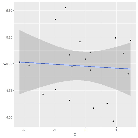
Create the scatterplot with regression line
Using geom_point and stat_smooth function of ggplot2 package to create the scatterplot with regression line −
x<-rnorm(20)
y<-rnorm(20,5,0.24)
df<-data.frame(x,y)
library(ggplot2)
ggplot(df,aes(x,y))+geom_point()+stat_smooth(method="lm")
`geom_smooth()` using formula 'y ~ x'
Output
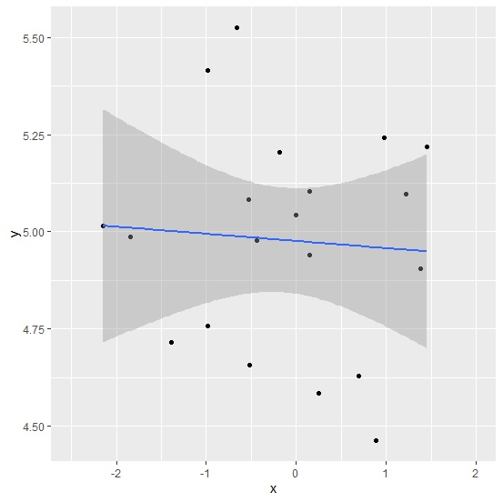
Create the limited regression line
Adding xlim function to the above function to create the limited regression line −
x<-rnorm(20)
y<-rnorm(20,5,0.24)
df<-data.frame(x,y)
library(ggplot2)
ggplot(df,aes(x,y))+geom_point()+stat_smooth(method="lm")+xlim(-2.5,2)
`geom_smooth()` using formula 'y ~ x'
Output

Updated on: 2026-03-11T22:50:58+05:30
1K+ Views

Advertisements