
Article Categories
- All Categories
-
 Data Structure
-
 Networking
-
 RDBMS
RDBMS
-
 Operating System
-
 Java
Java
-
 MS Excel
-
 iOS
iOS
-
 HTML
HTML
-
 CSS
CSS
-
 Android
-
 Python
-
 C Programming
-
 C++
C++
-
 C#
C#
-
 MongoDB
-
 MySQL
MySQL
-
 Javascript
-
 PHP
PHP
-
 Economics & Finance
How to Create Population Pyramid Chart in Excel
Population pyramids are potent visual depictions that show how a population is distributed across various age groups and genders. They are extensively utilised in disciplines including sociology, economics, and public health because they offer useful insights about the demographic make?up of a society.
Using the well?known spreadsheet programme Microsoft Excel, we will walk you through each step of the process of making a population pyramid chart in this lesson. The knowledge you gain from this tutorial will enable you to make population pyramids that are easy to understand and visually appealing, whether you're a student, researcher, or professional looking to evaluate and visualise demographic data.
Creating Population Pyramid Chart in Excel
Here we will first calculate the percentage of each category, then create the chart, and finally format the chart to complete the task. So let us see a simple process to learn how you can create a population pyramid chart in Excel.
Step 1
Consider an Excel sheet where you have a population list of every age group, similar to the below image.
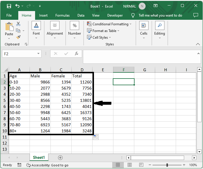
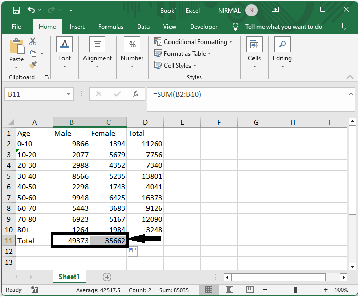
First, to calculate the total, click on cell B11, enter the formula as =SUM(B2:B10), click enter, and drag the formula to cell C11.
Empty cell > Formula > Enter > Drag.
Step 2
Then enter the formulas =0?(100*B2/$B$11) and =(100*C2/$C$11) in cells E2 and F2, respectively. Then drag down using the autofill handle.
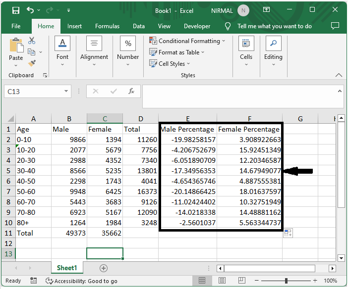
Empty cell > Formula > Enter > Drag.
Step 3
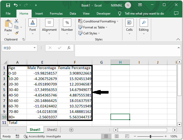
Then hide the B, C, D column.
Select Range > Right Click > Hide.
Step 4
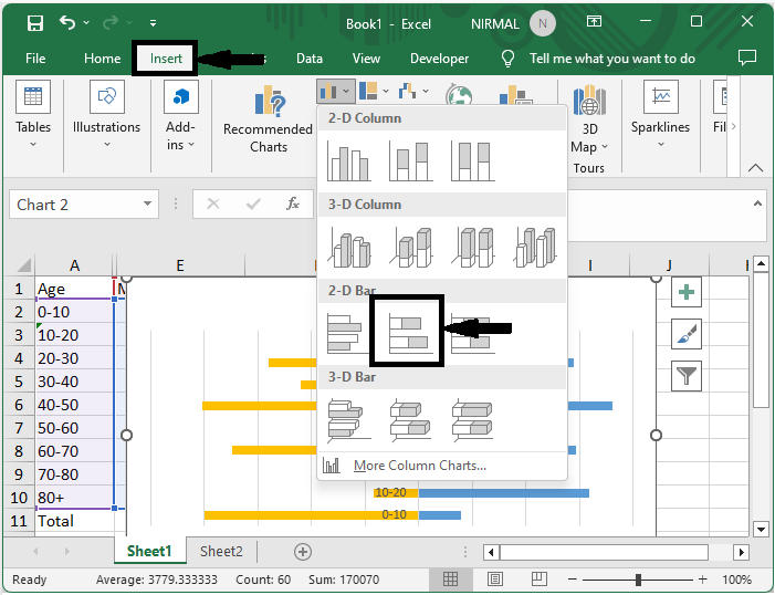
Now to create the chart, select the range of cells, then click on insert and select stacked bar chart.
Select cells > Insert > Stacked Bar.
Step 5
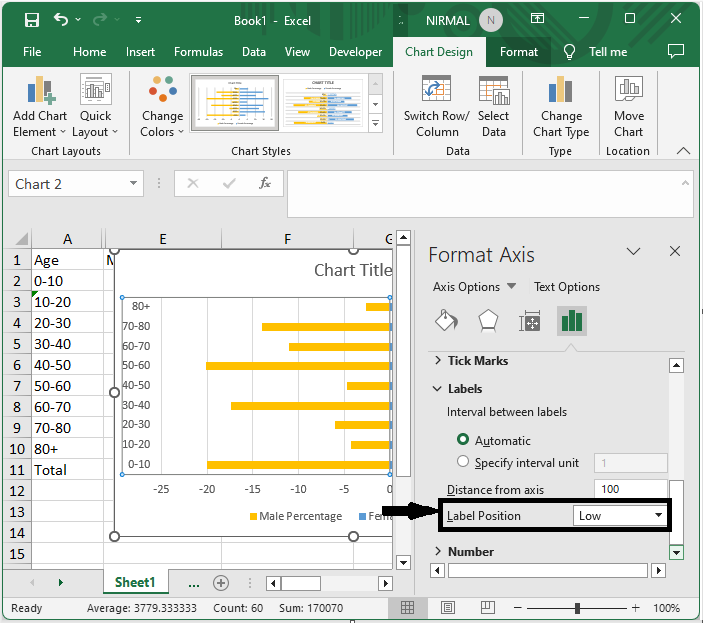
Then right?click on the Y axis, select format axis, and set label position to low.
Right click > Format axis > Label Position.
Step 6
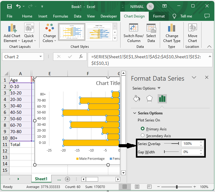
Then again, right?click on the series and select "Format Data Series," and set size overlap to 100 and gap width to zero.
Right click > Format Data Series > Size Overlap > Gap Width.
Step 7
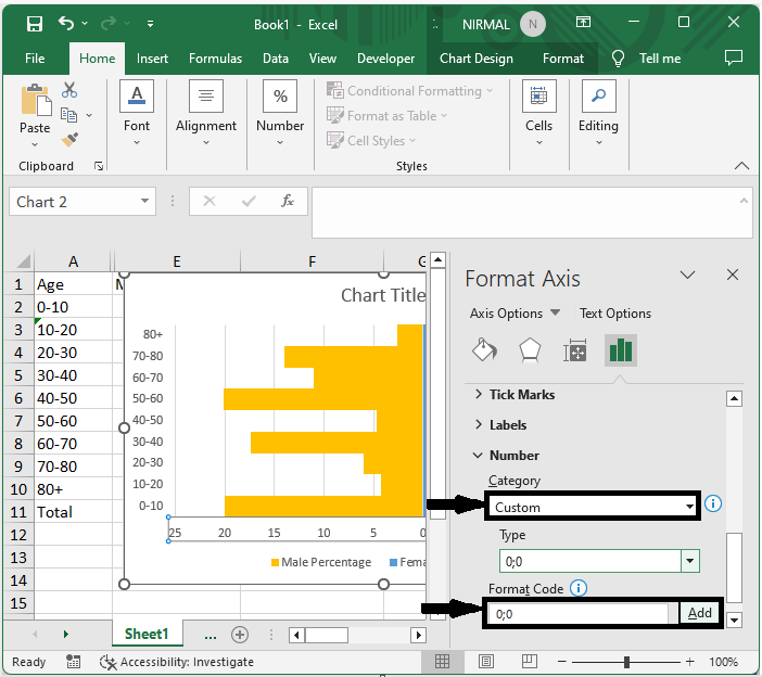
Then right?click on the x axis, select format axis, and make the below changes.
Right click > Category > Type.
Conclusion
In this tutorial, we have used a simple example to demonstrate how you can create a population pyramid chart in Excel to highlight a particular set of data.

7K+ Views
