- Excel Charts - Home
- Excel Charts - Introduction
- Excel Charts - Creating Charts
- Excel Charts - Types
- Excel Charts - Column Chart
- Excel Charts - Line Chart
- Excel Charts - Pie Chart
- Excel Charts - Doughnut Chart
- Excel Charts - Bar Chart
- Excel Charts - Area Chart
- Excel Charts - Scatter (X Y) Chart
- Excel Charts - Bubble Chart
- Excel Charts - Stock Chart
- Excel Charts - Surface Chart
- Excel Charts - Radar Chart
- Excel Charts - Combo Chart
- Excel Charts - Chart Elements
- Excel Charts - Chart Styles
- Excel Charts - Chart Filters
- Excel Charts - Fine Tuning
- Excel Charts - Design Tools
- Excel Charts - Quick Formatting
- Excel Charts - Aesthetic Data Labels
- Excel Charts - Format Tools
- Excel Charts - Sparklines
- Excel Charts - PivotCharts
Excel Charts - Doughnut Chart
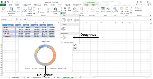
Doughnut charts show the size of items in a data series, proportional to the sum of the items. The doughnut chart is similar to a pie chart, but it can contain more than one data series.
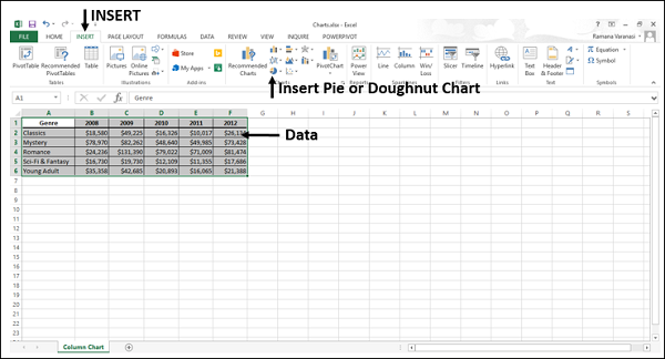
Step 1 − Arrange the data in columns or rows on the worksheet.
Step 2 − Select the data.
Step 3 − On the INSERT tab, in the Charts group, click the Pie chart icon on the Ribbon. It is used to insert a Doughnut chart also.
You will see the different types of Doughnut charts available.
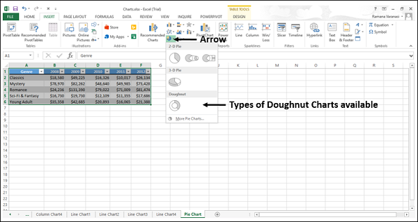
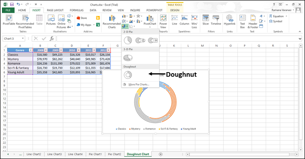
Step 4 − Point your mouse on the Doughnut icon. A preview of that chart type will be shown on the worksheet.
Consider using a Doughnut chart when −
You have more than one data series.
None of the values in your data are negative.
Almost none of the values in your data series are zero values.
You have no more than seven categories, all of which represent parts of the whole pie.
Doughnut Charts show data in rings, where each ring represents a data series. If percentages are shown in data labels, each ring will total to 100%.
Doughnut charts are not easy to read. You can use a Stacked Column or Stacked Bar chart instead.
