
- Excel - Home
- Excel - Getting Started
- Excel - Explore Window
- Excel - Backstage
- Excel - Entering Values
- Excel - Move Around
- Excel - Save Workbook
- Excel - Create Worksheet
- Excel - Copy Worksheet
- Excel - Hiding Worksheet
- Excel - Delete Worksheet
- Excel - Close Workbook
- Excel - Open Workbook
- Excel - Merge Workbooks
- Excel - File Password
- Excel - File Share
- Excel - Emoji & Symbols
- Excel - Context Help
- Excel - Insert Data
- Excel - Select Data
- Excel - Delete Data
- Excel - Move Data
- Excel - Rows & Columns
- Excel - Copy & Paste
- Excel - Find & Replace
- Excel - Spell Check
- Excel - Zoom In-Out
- Excel - Special Symbols
- Excel - Insert Comments
- Excel - Add Text Box
- Excel - Shapes
- Excel - 3D Models
- Excel - CheckBox
- Excel - Add Sketch
- Excel - Scan Documents
- Excel - Auto Fill
- Excel - SmartArt
- Excel - Insert WordArt
- Excel - Undo Changes
- Formatting Cells
- Excel - Setting Cell Type
- Excel - Move or Copy Cells
- Excel - Add Cells
- Excel - Delete Cells
- Excel - Setting Fonts
- Excel - Text Decoration
- Excel - Rotate Cells
- Excel - Setting Colors
- Excel - Text Alignments
- Excel - Merge & Wrap
- Excel - Borders and Shades
- Excel - Apply Formatting
- Formatting Worksheets
- Excel - Sheet Options
- Excel - Adjust Margins
- Excel - Page Orientation
- Excel - Header and Footer
- Excel - Insert Page Breaks
- Excel - Set Background
- Excel - Freeze Panes
- Excel - Conditional Format
- Excel - Highlight Cell Rules
- Excel - Top/Bottom Rules
- Excel - Data Bars
- Excel - Color Scales
- Excel - Icon Sets
- Excel - Clear Rules
- Excel - Manage Rules
- Working with Formula
- Excel - Formulas
- Excel - Creating Formulas
- Excel - Copying Formulas
- Excel - Formula Reference
- Excel - Relative References
- Excel - Absolute References
- Excel - Arithmetic Operators
- Excel - Parentheses
- Excel - Using Functions
- Excel - Builtin Functions
- Excel Formatting
- Excel - Formatting
- Excel - Format Painter
- Excel - Format Fonts
- Excel - Format Borders
- Excel - Format Numbers
- Excel - Format Grids
- Excel - Format Settings
- Advanced Operations
- Excel - Data Filtering
- Excel - Data Sorting
- Excel - Using Ranges
- Excel - Data Validation
- Excel - Using Styles
- Excel - Using Themes
- Excel - Using Templates
- Excel - Using Macros
- Excel - Adding Graphics
- Excel - Cross Referencing
- Excel - Printing Worksheets
- Excel - Email Workbooks
- Excel- Translate Worksheet
- Excel - Workbook Security
- Excel - Data Tables
- Excel - Pivot Tables
- Excel - Simple Charts
- Excel - Pivot Charts
- Excel - Sparklines
- Excel - Ads-ins
- Excel - Protection and Security
- Excel - Formula Auditing
- Excel - Remove Duplicates
- Excel - Services
- Excel Useful Resources
- Excel - Keyboard Shortcuts
- Excel - Quick Guide
- Excel - Functions
- Excel - Useful Resources
- Excel - Discussion
Pivot Charts in Excel
Pivot Charts
A pivot chart is a graphical representation of a data summary, displayed in a pivot table. A pivot chart is always based on a pivot table. Although Excel lets you create a pivot table and a pivot chart at the same time, you cant create a pivot chart without a pivot table. All Excel charting features are available in a pivot chart.
Pivot charts are available under Insert tab » PivotTable dropdown » PivotChart.
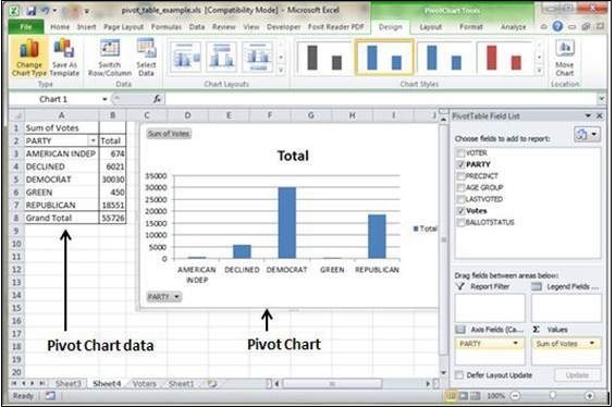
Pivot Chart Example
Now, let us see Pivot table with the help of an example. Suppose you have huge data of voters and you want to see the summarized view of the data of voter Information per party in the form of charts, then you can use the Pivot chart for it. Choose Insert tab » Pivot Chart to insert the pivot table.
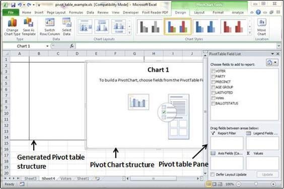
MS Excel selects the data of the table. You can select the pivot chart location as an existing sheet or a new sheet. Pivot chart depends on automatically created pivot table by the MS Excel. You can generate the pivot chart in the below screen-shot.