- Advanced Excel Charts - Home
- Advanced Excel - Introduction
- Advanced Excel - Waterfall Chart
- Advanced Excel - Band Chart
- Advanced Excel - Gantt Chart
- Advanced Excel - Thermometer
- Advanced Excel - Gauge Chart
- Advanced Excel - Bullet Chart
- Advanced Excel - Funnel Chart
- Advanced Excel - Waffle Chart
- Advanced Excel Charts - Heat Map
- Advanced Excel - Step Chart
- Box and Whisker Chart
- Advanced Excel Charts - Histogram
- Advanced Excel - Pareto Chart
- Advanced Excel - Organization Chart
- Advanced Excel Charts - Quick Guide
- Advanced Excel Charts - Resources
- Advanced Excel Charts - Discussion
Advanced Excel - Thermometer Chart
Thermometer chart is a visualization of the actual value of well-defined measure, for example, task status as compared to a target value. This is a linear version of Gauge chart that you will learn in the next chapter.
You can track your progress against the target over a period of time with a simple rising Thermometer chart.
What is a Thermometer Chart?
A Thermometer chart keeps track of a single task, for example, completion of work, representing the current status as compared to the target. It displays the percentage of the task completed, taking target as 100%.
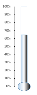
A Thermometer chart looks as shown below.
Advantages of Thermometer Charts
Thermometer chart can be used to track any actual value as compared to the target value as percentage completed. It works with a single value and is an appealing chart that can be included in dashboards for a quick visual impact on % achieved, % performance against the target sales target, % profit, % work completion, % budget utilized, etc.
If you have multiple values to track the actuals against the targets, you can use Bullet chart that you will learn in a later chapter.
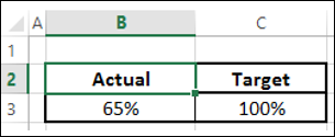
Preparation of Data
Prepare the data in the following way −
Calculate the Actual as a percentage of the actual value as compared to the target value.
Target should always be 100%.
Place your data in a table as given below.
Creating a Thermometer Chart
Following are the steps to create a Thermometer chart −
Step 1 − Select the data.
Step 2 − Insert a Clustered Column chart.
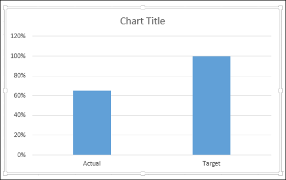
As you can see, the right Column is Target.
Step 3 − Click on a Column in the chart.
Step 4 − Click the DESIGN tab on the Ribbon.
Step 5 − Click the Switch Row/ Column button.
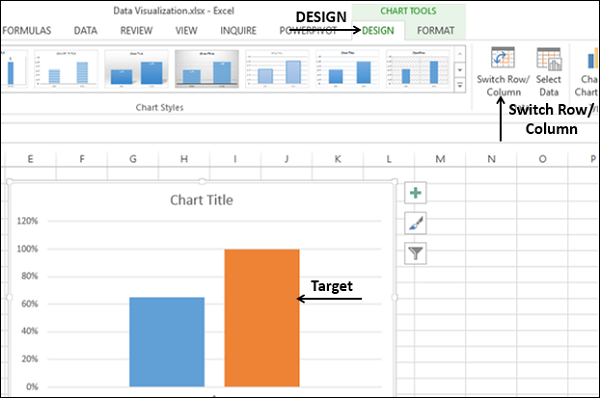
Step 6 − Right click on the Target Column.
Step 7 − Select Format Data Series from the dropdown list.
Step 8 − Click on Secondary Axis under SERIES OPTIONS in the Format Data Series pane.
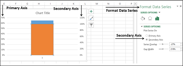
As you can see, the Primary Axis and the Secondary Axis have different ranges.
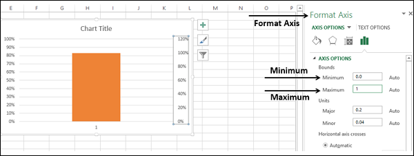
Step 9 − Right click on the Primary Axis. Select Format Axis from the dropdown list.
Step 10 − Type the following in Bounds under AXIS OPTIONS in the Format Axis pane −
- 0 for Minimum.
- 1 for Maximum.
Repeat the steps given above for the Secondary Axis to change the Bounds to 0 and 1.
Both the Primary Axis and Secondary Axis will be set to 0% - 100%.
As you can observe, the Target Column hides the Actual Column.
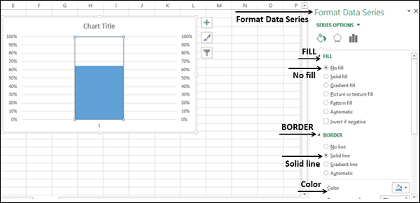
Step 11 − Right click on the visible Column, i.e. Target.
Step 12 − Select Format Data Series from the dropdown list.
In the Format Data Series pane, select the following −
- No fill under the FILL option.
- Solid line under the BORDER option.
- Blue under the Color option.
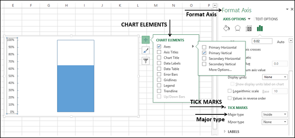
Step 13 − In Chart Elements, deselect the following −
- Axis → Primary Horizontal.
- Axis → Secondary Vertical.
- Gridlines.
- Chart Title.
Step 14 − Right click on the Primary Vertical Axis.
Step 15 − Select Format Axis from the dropdown list.
Step 16 − Click TICK MARKS under the AXIS OPTIONS in the Format Axis pane.
Step 17 − Select the option Inside for Major type.
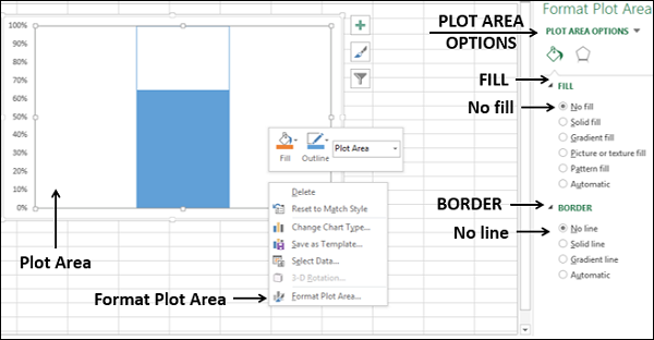
Step 18 − Right click on the Chart Area.
Step 19 − Select Format Plot Area from the dropdown list.
Step 20 − Click Fill & Line in the Format Plot Area pane. Select the following −
- No fill under the FILL option.
- No line under the BORDER option.
Step 21 − Resize the Chart Area to get the Thermometer shape for the chart.
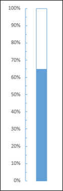
You got your Thermometer chart, with the Actual Value as against Target Value being shown.
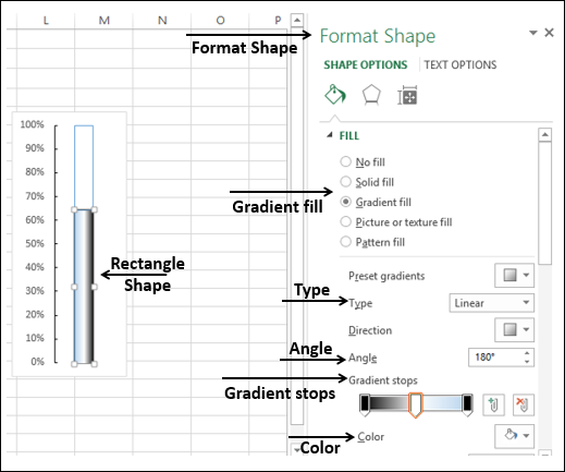
Step 22 − You can make this Thermometer chart more appealing with some formatting.
- Insert a Rectangle shape superimposing the blue rectangular part in the chart.
- In the Format Shape options, select the following −
- Gradient fill for FILL.
- Linear for Type.
- 1800 for Angle.
- Set the Gradient stops at 0%, 50% and 100%.
- For the Gradient stops at 0% and 100%, choose the color black.
- For the Gradient stop at 50%, choose the color white.
- Insert an oval shape at the bottom.
- Format the oval shape with the same options as of rectangle.
- The result will be as shown below −
Your aesthetic Thermometer chart is ready. This will look good on a dashboard or as a part of a presentation.
