
Article Categories
- All Categories
-
 Data Structure
-
 Networking
-
 RDBMS
RDBMS
-
 Operating System
-
 Java
Java
-
 MS Excel
-
 iOS
iOS
-
 HTML
HTML
-
 CSS
CSS
-
 Android
-
 Python
-
 C Programming
-
 C++
C++
-
 C#
C#
-
 MongoDB
-
 MySQL
MySQL
-
 Javascript
-
 PHP
PHP
-
 Economics & Finance
How to Create Speedometer or Gauge Chart in Excel
Speedometer charts are a fantastic method to dynamically and engagingly display progress or performance and visually depict data. Whether you want to track important metrics, show achievement levels, or show survey findings, a speedometer chart may provide your Excel reports a polished, clear look.
In this tutorial, we'll walk you through each step of making an Excel speedometer chart. We'll go through the essential ideas, look at various design alternatives, and give you useful advice on how to improve and customise your chart to meet your individual requirements. Don't worry if you're new to Excel or only have a little expertise with charts. We'll divide the directions into straightforward, understandable steps.
After completing this tutorial, you will be equipped with the knowledge and abilities needed to produce outstanding speedometer charts that clearly convey your data insights. So, let's get going and unleash Excel's visual narrative potential!
Create Speedometer/Gauge Chart
Here we will first make changes to the data, then insert a chart, and finally format the chart to complete the task. So let us see a simple process to learn how you can create a speedometer or gauge chart in Excel.
Step 1
Consider an Excel sheet where the data in the sheet is similar to the below image.
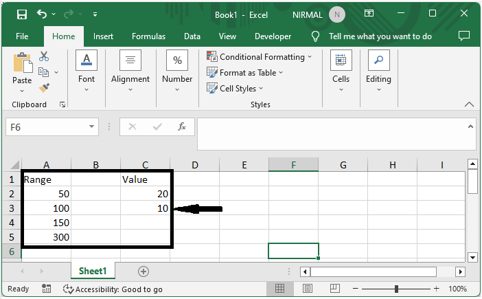
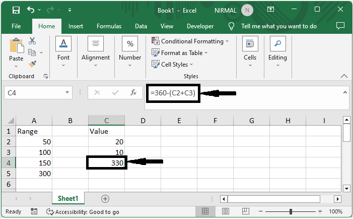
In the data Cells A2, A3, A4 are the range and A4 is total of the three cells. First, click on cell C4 and enter the formula as =360?(C2+C3) and click enter.
C4 > Formula > Enter.
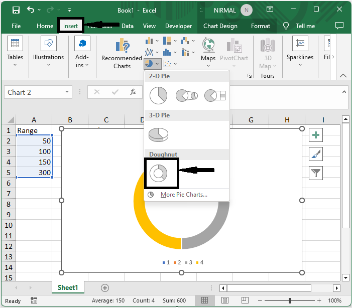
Step 2
Then select the range of cells and insert a doughnut chart.
Select cells > Insert > Doughnut chart.
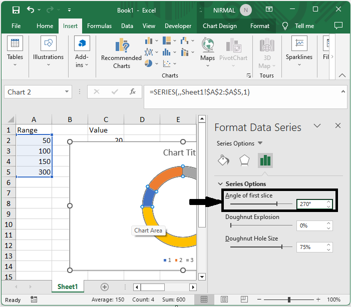
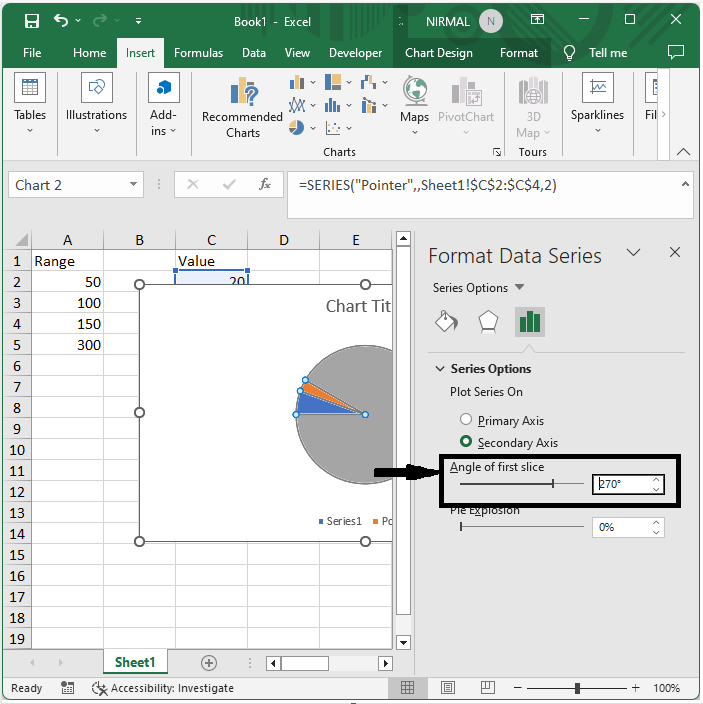
Step 3
Then right?click on the doughnut, select Format data series, and change the angle of the first slice to 271.
Right click > Format data series > Angle of slice.
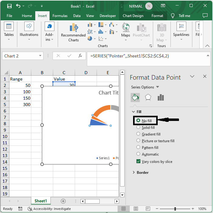
Step 4
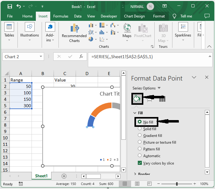
Then right?click on the biggest point, select format data point, and select no fill.
Right click > Format data point > No fill.
Step 5
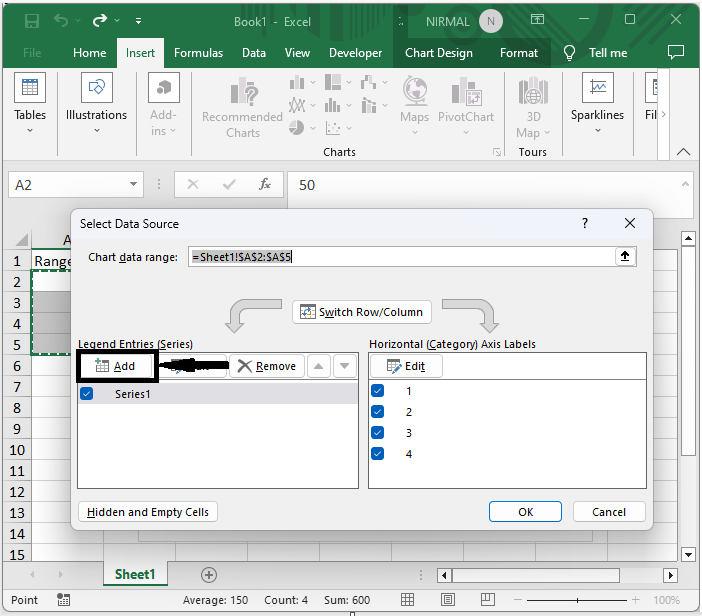
Then right?click on the chart, click on select data, and click Add under Legend entries.
Right click > Select data > Add.
Step 6
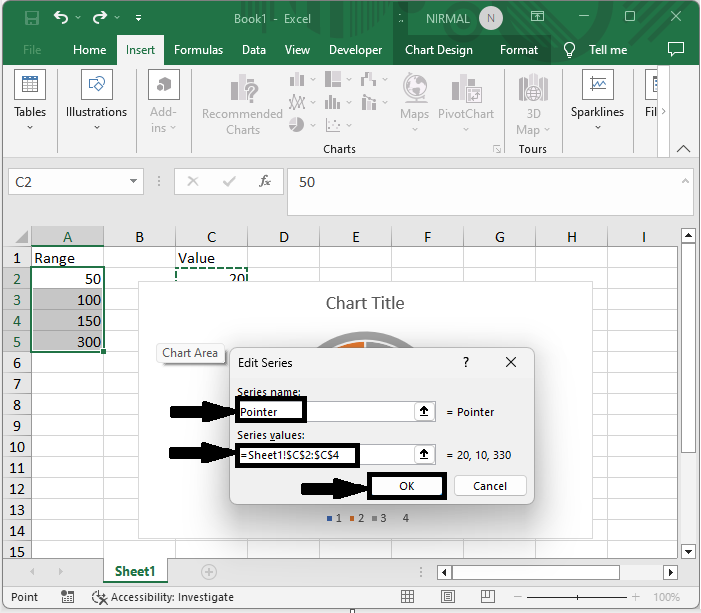
Then set the series name to pointer and the series value to C2:C4, and click Ok and click Ok.
Series Name > Series Value > Ok > Ok.
Step 7
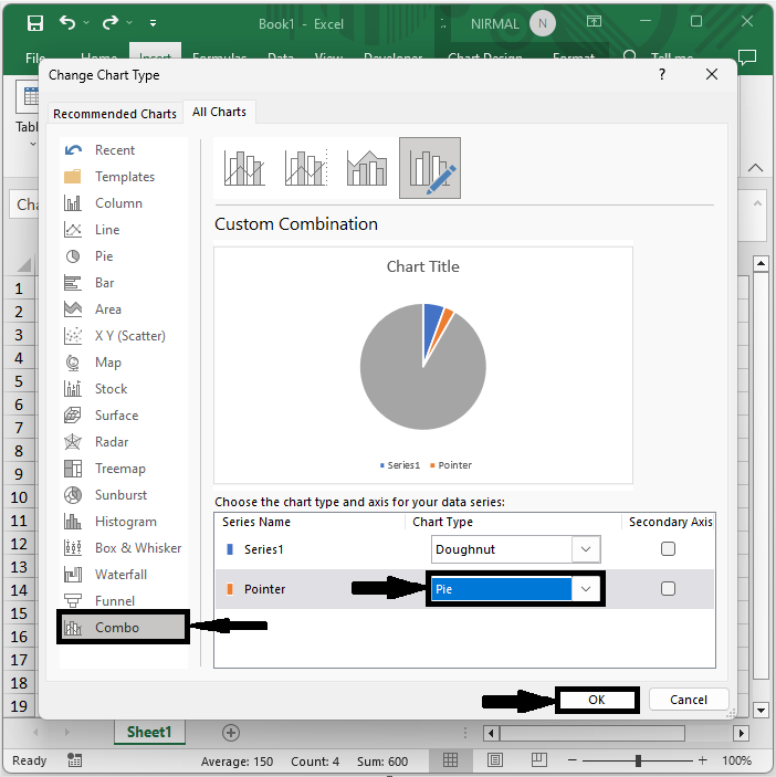
Then right?click on the second chart and click on "Change chart series type." Then click on "Combo" and select Pointer chart to "Pie." Click "OK.
Right click > Change series type > Combo > Pie > Ok.
Step 8
Then right?click on the chart, select format data series, and change the angle of the first slice to 270.
Right click > Format data Series > Angle of first slice.
Step 9
Then right?click on the biggest point, select format data point, and set Fill to No Fill.
Right click > Format data point > No fill.
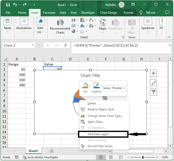
Step 10
Then right?click on the pointer and select "Add Data Labels".
Right click > Add data labels.
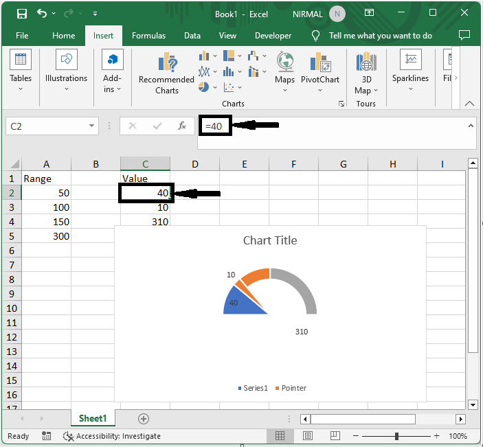
Step 11
Finally, changes the values in cell C2 and click enter.
C2 > =Value > Enter.
Conclusion
In this tutorial, we have used a simple example to demonstrate how you can create a speedometer or gauge chart in Excel to highlight a particular set of data.

762 Views
