
Article Categories
- All Categories
-
 Data Structure
-
 Networking
-
 RDBMS
RDBMS
-
 Operating System
-
 Java
Java
-
 MS Excel
-
 iOS
iOS
-
 HTML
HTML
-
 CSS
CSS
-
 Android
-
 Python
-
 C Programming
-
 C++
C++
-
 C#
C#
-
 MongoDB
-
 MySQL
MySQL
-
 Javascript
-
 PHP
PHP
-
 Economics & Finance
How To Create A Floating Column Chart In Excel?
Excel is a powerful tool for data analysis and visualization, and one of the most popular chart types is the column chart. While a traditional column chart can be effective in many situations, sometimes you may want to create a more visually appealing and informative chart that highlights certain data points. This is where a floating column chart can be useful.
A floating column chart, also known as a waterfall chart, is a type of column chart that shows how an initial value is affected by subsequent values. It can be used to display changes in a financial statement or to show how different factors contribute to a final result. In this tutorial, we will guide you through the process of creating a floating column chart in Excel step-by-step, so you can effectively visualize your data and gain insights from it.
Create A Floating Column Chart
Here we will first add a new column for difference, then create a chart for the lowest and difference columns, then format the chart to complete the task.
Step 1
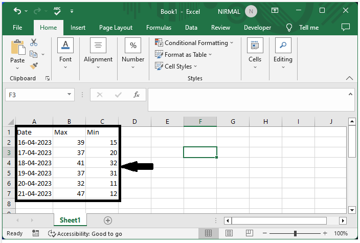
Consider an Excel sheet where the data is similar to the below image.
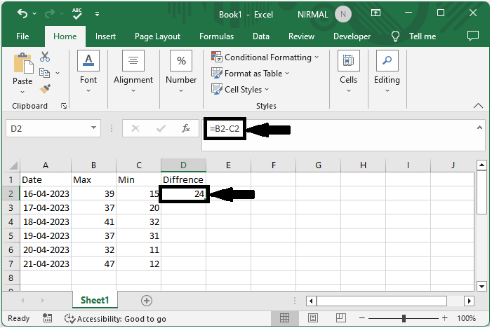
First, click on an empty cell, in our case cell D2, and enter the formula as =B2-C2 and click enter to get the first value.
Empty cell > Formula > Enter
Step 2
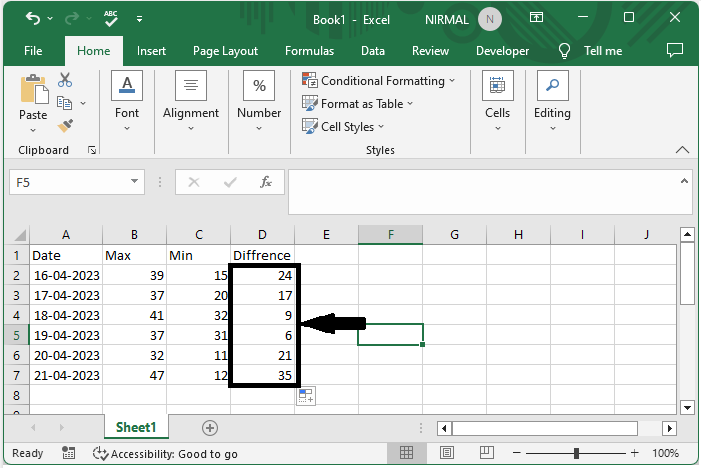
Then drag down using the auto-fill handle from the first value to fill all the values.
Step 3
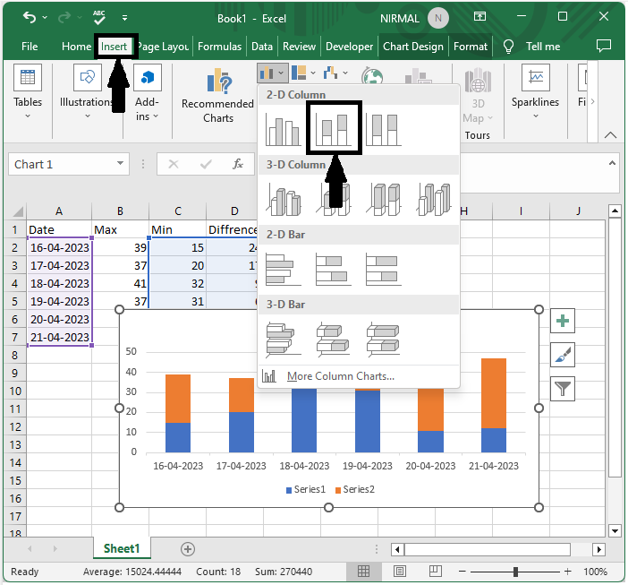
Now select the columns for date, minimum, and difference, then click on insert and select column chart.
Select data > Insert > Column chart.
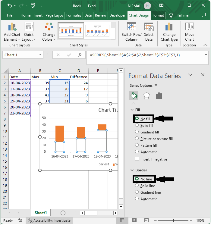
Step 4
Then right-click on the below series of charts and select Format data series. Then change fill to no fill and border to no fill.
Right click > Format data series > No fill > No fill.
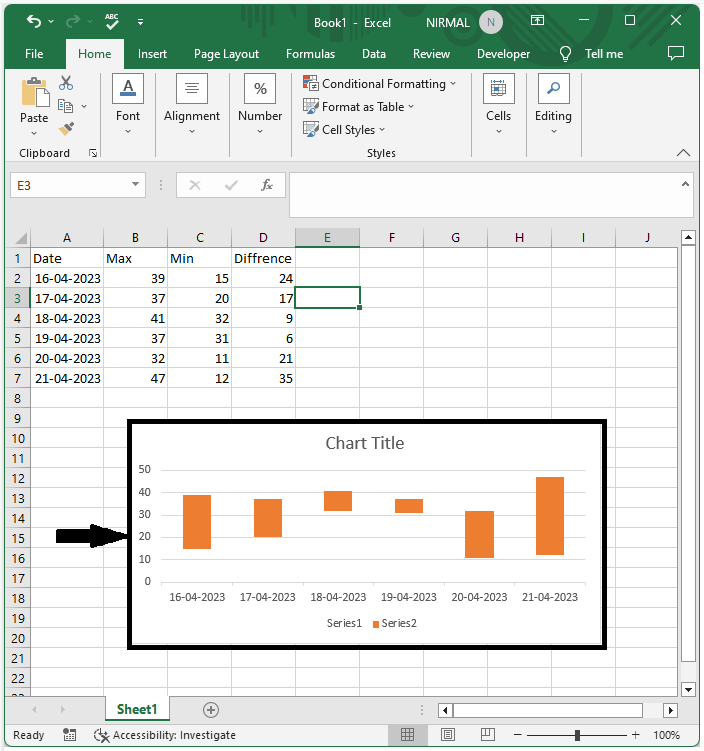
The final output will be similar to the below image.
Conclusion
In this tutorial, we have used a simple example to demonstrate how you can create a floating column chart in Excel to highlight a particular set of data.

955 Views
