
Article Categories
- All Categories
-
 Data Structure
-
 Networking
-
 RDBMS
RDBMS
-
 Operating System
-
 Java
Java
-
 MS Excel
-
 iOS
iOS
-
 HTML
HTML
-
 CSS
CSS
-
 Android
-
 Python
-
 C Programming
-
 C++
C++
-
 C#
C#
-
 MongoDB
-
 MySQL
MySQL
-
 Javascript
-
 PHP
PHP
-
 Economics & Finance
Selected Reading
How to create a bar chart using plotly in R?
Plotly in R is a package specifically designed to create highly-interactive and publication-quality charts. The chart can be created by using plot_ly function of the package and there are three main arguments of plot_ly defined as x, y, and type, where x refers to the X-axis, y refers to the Y-axis and type refers to the chart type but the axes values are stored in a data frame or itself a shared.
Example
Loading plotly package:
> library(plotly)
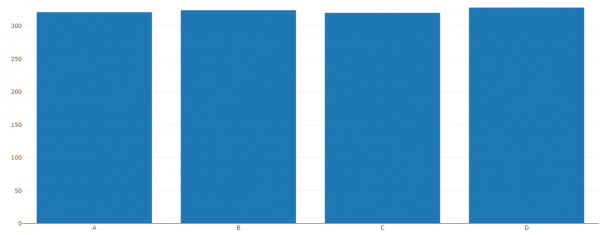
Consider the below data frame:
> x<-c("A","B","C","D")
> count<-c(321,324,320,328)
> df<-data.frame(x,count)
> df
Output
x count
1 A 321
2 B 324
3 C 320
4 D 328
Creating the bar plot for x:
> plot_ly(x=x,y=count,type='bar')
Output
<p>Warning message:</p>`arrange_()` is deprecated as of dplyr 0.7.0.
Please use `arrange()` instead.
See vignette('programming') for more help
This warning is displayed once every 8 hours.
Call `lifecycle::last_warnings()` to see where this warning was generated.
Here it is showing a warning but it is not related to our chart hence there is no problem in ignoring it.
Output:
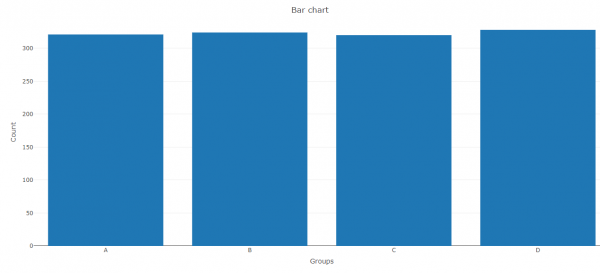
If we want to create the chart with main title and axes titles then we need to store it in an object and then use the layout function as shown below:
Example
> Bar<-plot_ly(x=x,y=count,type='bar')
> layout(Bar,title="Bar chart",xaxis=list(title="Groups"),yaxis=list(title="Count"))
Output:

Updated on: 2026-03-11T22:50:53+05:30
569 Views

Advertisements