
Article Categories
- All Categories
-
 Data Structure
-
 Networking
-
 RDBMS
RDBMS
-
 Operating System
-
 Java
Java
-
 MS Excel
-
 iOS
iOS
-
 HTML
HTML
-
 CSS
CSS
-
 Android
-
 Python
-
 C Programming
-
 C++
C++
-
 C#
C#
-
 MongoDB
-
 MySQL
MySQL
-
 Javascript
-
 PHP
PHP
-
 Economics & Finance
Selected Reading
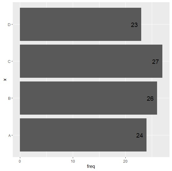
How to create a horizontal bar chart using ggplot2 with labels at inside end of the bars in R?
To create a horizontal bar chart using ggplot2 package, we need to use coord_flip() function along with the geom_bar and to add the labels geom_text function is used. These two functions of ggplot2 provides enough aesthetic characteristics to create the horizontal bar chart and put the labels at inside end of the bars.
Example
x<-c("A","B","C","D")
freq<-c(24,26,27,23)
df<-data.frame(x,freq)
df
Output
x freq
1 A 24
2 B 26
3 C 27
4 D 23
library(ggplot2) ggplot(df,aes(x,freq))+geom_bar(stat="identity")+coord_flip()
Output

> ggplot(df,aes(x,freq,label=freq))+geom_bar(stat="identity")+geom_text(size=5,hjust=1.5)+coord_flip()
Output
> ggplot(df,aes(x,freq,label=freq))+geom_bar(stat="identity")+geom_text(size=10,hjust=1.5)+coord_flip()
Output


Updated on: 2026-03-11T22:50:52+05:30
3K+ Views

Advertisements