
Article Categories
- All Categories
-
 Data Structure
-
 Networking
-
 RDBMS
RDBMS
-
 Operating System
-
 Java
Java
-
 MS Excel
-
 iOS
iOS
-
 HTML
HTML
-
 CSS
CSS
-
 Android
-
 Python
-
 C Programming
-
 C++
C++
-
 C#
C#
-
 MongoDB
-
 MySQL
MySQL
-
 Javascript
-
 PHP
PHP
-
 Economics & Finance
Selected Reading
How to create the bar chart with ggplot2 using color brewer in R?
To create the bar chart with ggplot2 using color brewer in R, we can follow the below steps −
- First of all, create a data frame.
- Then, create the chart with default colors.
- After that, use scale_colour_brewer function to create the bar chart.
Create the data frame
Let's create a data frame as shown below −
Group<-c("A","B","C")
Count<-c(24,21,27)
df<-data.frame(Group,Count)
df
On executing, the above script generates the below output(this output will vary on your system due to randomization) −
 Group Count
1 A    24
2 B    21
3 C    27
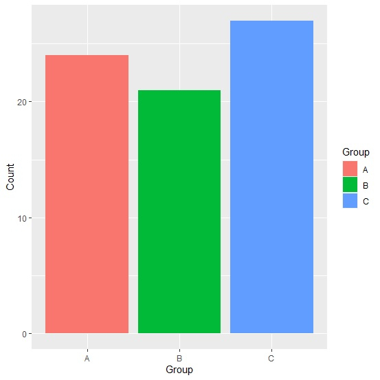
Create the bar chart with default colors
Loading ggplot2 package and creating the bar for the data in df −
Group<-c("A","B","C")
Count<-c(24,21,27)
df<-data.frame(Group,Count)
library(ggplot2)
ggplot(df,aes(Group,Count,fill=Group))+geom_bar(stat="identity")
Output
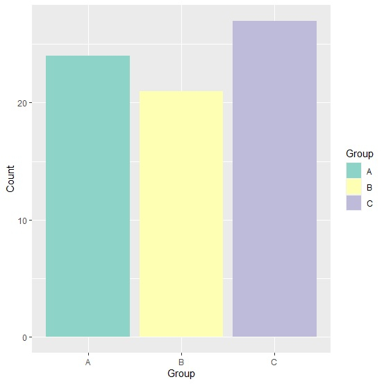
Create the bar chart with color brewer
Use scale_colour_brewer function of the ggplot2 package to create the bar chart for the data in df −
Group<-c("A","B","C")
Count<-c(24,21,27)
df<-data.frame(Group,Count)
library(ggplot2)
ggplot(df,aes(Group,Count,fill=Group))+geom_bar(stat="identity")+scale_fill_brewer(pa
lette="Set3")
Output

Updated on: 2026-03-11T22:50:58+05:30
2K+ Views

Advertisements