
Article Categories
- All Categories
-
 Data Structure
-
 Networking
-
 RDBMS
RDBMS
-
 Operating System
-
 Java
Java
-
 MS Excel
-
 iOS
iOS
-
 HTML
HTML
-
 CSS
CSS
-
 Android
-
 Python
-
 C Programming
-
 C++
C++
-
 C#
C#
-
 MongoDB
-
 MySQL
MySQL
-
 Javascript
-
 PHP
PHP
-
 Economics & Finance
How to create pie chart using plotly in R?
To create pie chart using plotly, we first need to find the count data based on categories and then use the plot_ly function by mentioning chart type as "pie".
To find the count data, we can use count function from dplyr package after that plot_ly function will be applied.
Check out the below example to understand how it can be done.
Example
Following snippet creates the mtcars data −
data(mtcars)
head(mtcars,20)
Output
The following mtcars data is created −
                    mpg  cyl disp   hp  drat   wt    qsec   vs am gear carb
Mazda RX4           21.0 6  160.0  110  3.90  2.620  16.46  0  1   4   4
Mazda RX4 Wag       21.0 6  160.0  110  3.90  2.875  17.02  0  1   4   4
Datsun 710          22.8 4  108.0   93  3.85  2.320  18.61  1  1   4   1
Hornet 4 Drive      21.4 6  258.0  110  3.08  3.215  19.44  1  0   3   1
Hornet Sportabout   18.7 8  360.0  175  3.15  3.440  17.02  0  0   3   2
Valiant             18.1 6  225.0  105  2.76  3.460  20.22  1  0   3   1
Duster 360          14.3 8  360.0  245  3.21  3.570  15.84  0  0   3   4
Merc 240D           24.4 4  146.7   62  3.69  3.190  20.00  1  0   4   2
Merc 230            22.8 4  140.8   95  3.92  3.150  22.90  1  0   4   2
Merc 280            19.2 6  167.6  123  3.92  3.440  18.30  1  0   4   4
Merc 280C           17.8 6  167.6  123  3.92  3.440  18.90  1  0   4   4
Merc 450SE          16.4 8  275.8  180  3.07  4.070  17.40  0  0   3   3
Merc 450SL          17.3 8  275.8  180  3.07  3.730  17.60  0  0   3   3
Merc 450SLC         15.2 8  275.8  180  3.07  3.780  18.00  0  0   3   3
Cadillac Fleetwood  10.4 8  472.0  205  2.93  5.250  17.98  0  0   3   4
Lincoln Continental 10.4 8  460.0  215  3.00  5.424  17.82  0  0   3   4
Chrysler Imperial   14.7 8  440.0  230  3.23  5.345  17.42  0  0   3   4
Fiat 128            32.4 4  78.7    66  4.08  2.200  19.47  1  1   4   1
Honda Civic         30.4 4  75.7    52  4.93  1.615  18.52  1  1   4   2
Toyota Corolla      33.9 4  71.1    65  4.22  1.835  19.90  1  1   4   1
To create pie chart using plotly in R, add the following code to the above snippet −
library(dplyr)
Pie_Data<-count(mtcars,am)
Pie_Data
Output
If you execute all the above given snippets as a single program, it generates the following output −
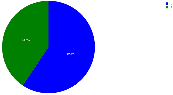
  am  n
1 0  19
2 1  13
To create pie chart using plotly in R, add the following code to the above snippet −
library(plotly)
plot_ly(Pie_Data,values=~n,labels=~factor(am),marker=list(colors=c("blue","green")),type="pie")
Output
If you execute all the above given snippets as a single program, it generates the following output −

1K+ Views
