
Article Categories
- All Categories
-
 Data Structure
-
 Networking
-
 RDBMS
RDBMS
-
 Operating System
-
 Java
Java
-
 MS Excel
-
 iOS
iOS
-
 HTML
HTML
-
 CSS
CSS
-
 Android
-
 Python
-
 C Programming
-
 C++
C++
-
 C#
C#
-
 MongoDB
-
 MySQL
MySQL
-
 Javascript
-
 PHP
PHP
-
 Economics & Finance
How to decrease the width of bars for plotly bar chart in R?
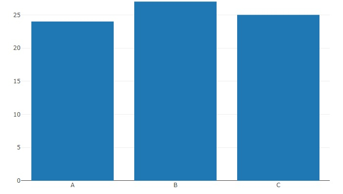
To decrease the width of bars for plotly bar chart, we can use layout function and set the autosize argument to FALSE.
For example, if we have a data frame called that contains a categorical column C and a numerical column Count then bar chart with decreased width of the bars can be created by using the below command −
plot_ly(df,x=x,y=y,type="bar")%>%layout(autosize=F)
Example
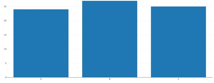
Following snippet creates a sample data frame −
x<-LETTERS[1:3]
y<-c(24,27,25)
df<-data.frame(x,y)
df
Output
The following dataframe is created −
  x   y
1 A  24
2 B  27
3 C  25
To load plotly package and create bar chart for data in df, add the following code to the above snippet −
library(plotly)
plot_ly(df,x=x,y=y,type="bar")
Output
If you execute all the above given snippets as a single program, it generates the following output −
Now, to create bar chart for data in df with decreased width of bars (This will be better understood after application), add the following code to the above snippet −
plot_ly(df,x=x,y=y,type="bar")%>%layout(autosize=FALSE)
Output
If you execute all the above given snippets as a single program, it generates the following output −

1K+ Views
