
Article Categories
- All Categories
-
 Data Structure
-
 Networking
-
 RDBMS
RDBMS
-
 Operating System
-
 Java
Java
-
 MS Excel
-
 iOS
iOS
-
 HTML
HTML
-
 CSS
CSS
-
 Android
-
 Python
-
 C Programming
-
 C++
C++
-
 C#
C#
-
 MongoDB
-
 MySQL
MySQL
-
 Javascript
-
 PHP
PHP
-
 Economics & Finance
Selected Reading
How to create line chart using ggplot2 in R with 3-sigma limits?
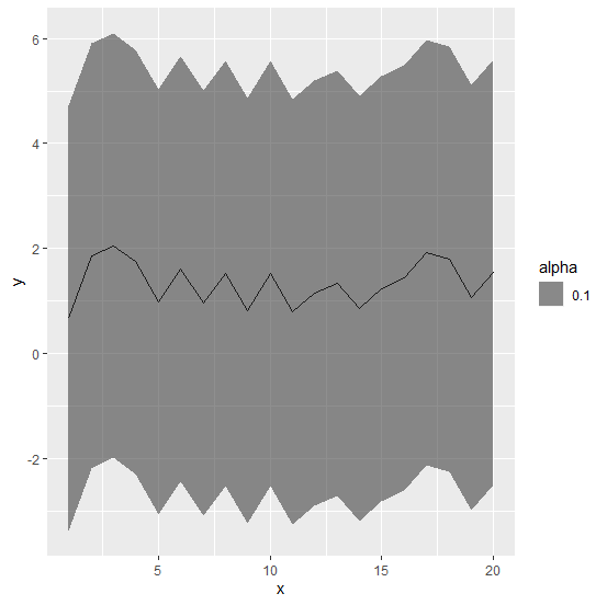
To create a line chart with 3-sigma limits using ggplot2, we first need to calculate the limits then the chart can be created. We can use geom_ribbon function of ggplot2 for this purpose where we can pass lower 3-sigma limit for ymin argument in aes and upper 3-sigma limit for ymin argument in aes, also we need to specify alpha so that the color of lines and the limits can be differentiated.
Example
Consider the below data frame:
> set.seed(14)
> x<-1:20
> y<-rnorm(20,1,0.5)
> df<-data.frame(x,y)
> df
Output
   x    y
1  1 0.6690751
2  2 1.8594771
3  3 2.0608335
4  4 1.7485768
5  5 0.9819297
6  6 1.6159726
7  7 0.9675596
8  8 1.5344969
9  9 0.8115173
10 10 1.5215915
11 11 0.8085891
12 12 1.1497108
13 13 1.3371199
14 14 0.8535918
15 15 1.2440267
16 16 1.4414009
17 17 1.9313745
18 18 1.8058626
19 19 1.0677398
20 20 1.5440430
Calculating the lower and upper limits:
> df$Lower<-df$y-3*mean(df$y)
> df$Upper<-df$y+3*mean(df$y)
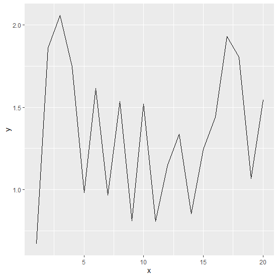
Loading ggplot2 package and creating line chart for y:
Example
> library(ggplot2)
> ggplot(df,aes(x,y))+geom_line()
Output:
Creating line chart with 3-sigma limits:
Example
> ggplot(df,aes(x,y))+geom_line()+geom_ribbon(aes(ymin=Lower,ymax=Upper,alpha=0.1))
Output:

Updated on: 2026-03-11T22:50:53+05:30
403 Views

Advertisements