
Article Categories
- All Categories
-
 Data Structure
-
 Networking
-
 RDBMS
RDBMS
-
 Operating System
-
 Java
Java
-
 MS Excel
-
 iOS
iOS
-
 HTML
HTML
-
 CSS
CSS
-
 Android
-
 Python
-
 C Programming
-
 C++
C++
-
 C#
C#
-
 MongoDB
-
 MySQL
MySQL
-
 Javascript
-
 PHP
PHP
-
 Economics & Finance
Selected Reading
How to create a line chart using ggplot2 with a vertical line in R?
In general, the line chart is drawn to view the trend of something and we might also have some threshold point for that trend, for example, if blood pressure is plotted then we might want to show 60 mm Hg as well because this is the lowest acceptable value for blood pressure recommended by doctors. Therefore, it can be plotted as a vertical line if we want to plot blood pressures of a person. Similarly, there can be many situations where we can use a vertical line to visualize the threshold value. This can be achieved in ggplot2 with the help of geom_vline function.
Example
Consider the below data frame −
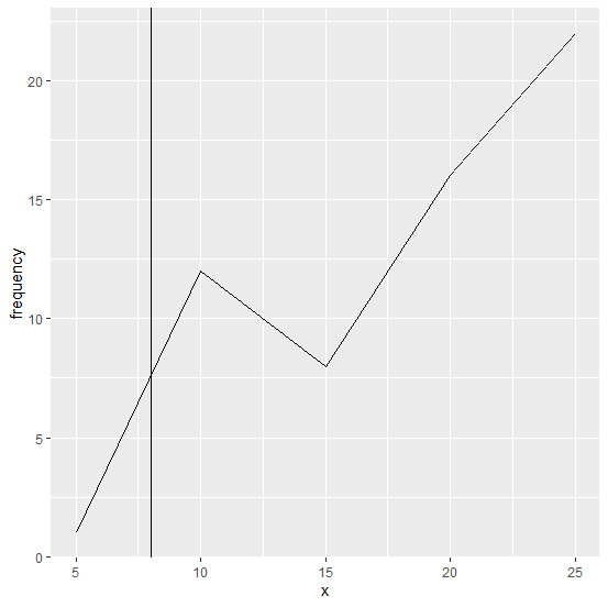
set.seed(10)
x<-c(5,10,15,20,25)
frequency<-c(1,12,8,16,22)
df<-data.frame(x,frequency)
df
Output
x frequency
1 5 1
2 10 12
3 15 8
4 20 16
5 25 22
library(ggplot2)
Creating a simple line chart −
ggplot(df,aes(x,frequency,group=1))+geom_line()
Output

Creating the chart with a vertical line on it −
ggplot(df,aes(x,frequency,group=1))+geom_line()+geom_vline(xintercept=8)
Output

Updated on: 2026-03-11T22:50:51+05:30
390 Views

Advertisements