
Article Categories
- All Categories
-
 Data Structure
-
 Networking
-
 RDBMS
RDBMS
-
 Operating System
-
 Java
Java
-
 MS Excel
-
 iOS
iOS
-
 HTML
HTML
-
 CSS
CSS
-
 Android
-
 Python
-
 C Programming
-
 C++
C++
-
 C#
C#
-
 MongoDB
-
 MySQL
MySQL
-
 Javascript
-
 PHP
PHP
-
 Economics & Finance
Selected Reading
How to create grouped line chart using ggplotly in R?
To create grouped line chart using ggplotly in R, we can follow the below steps −
First of all, create a data frame.
Then, create the line chart using ggplot2.
After that, convert the ggplot2 chart into ggplotly chart
Create the data frame
Let’s create a data frame as shown below −
x<-rnorm(25)
y<-rnorm(25)
Group<-sample(c("I","II","III"),25,replace=TRUE)
df<-data.frame(x,y,Group)
df
On executing, the above script generates the below output(this output will vary on your system due to randomization) −
Output
        x          y       Group
1 0.055893139 1.80500795    II
2 -0.008805130 0.25417605   I
3 -0.096145098 -0.65512324 III
4 2.061795227 -0.39675142  III
5 -0.791066243 -0.81345899 II
6 1.518561858 -0.37407892  III
7 -0.440314718 2.18183761  III
8 0.214819659 -0.44803164   I
9 -0.034639480 -0.55574934  I
10 1.016072324 -0.20519741 II
11 0.698884339 -1.35238046 II
12 -1.577733308 -1.05247509 I
13 0.132008750 2.46469660  III
14 -0.980944492 0.47077713  I
15 -0.254753319 0.10160084 II
16 0.003648357 0.21754415  II
17 -1.441777160 -2.29870950 III
18 -0.378483457 -0.34548182 II
19 0.519169688 0.40076114   I
20 -1.729318452 0.48670806  I
21 -1.780768430 -0.19625596 II
22 0.061640755 1.24154777  III
23 0.276974003 0.28268840  III
24 -0.128222440 0.02363404 III
25 1.392855257 0.30475375  II
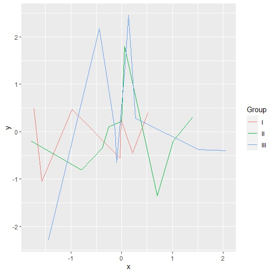
Create the line chart using ggplot2
Usin g geom_line function of ggplot2 package to create the line chart between x and y based on Group column and sav ing it in an object −
x<- rnorm(25)
y<-rnorm(25)
Group<-sample(c("I","II","III"),25,replace=TRUE)
df<-data.frame(x,y,Group)
library(ggplot2)
library(plotly)
Plot<-ggplot(df,aes(x,y,col=Group))+geom_line()
Plot
Output
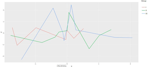
Convert the ggplot2 graph into a ggplotly graph
Using ggplotly function of plotly package to convert the ggplot2 graph into a ggplotly graph −
x<-rnorm(25)
y<-rnorm(25)
Group<-sample(c("I","II","III"),25,replace=TRUE)
df<-data.frame(x,y,Group)
library(ggplot2)
library(plotly)
Plot<-ggplot(df,aes(x,y,col=Group))+geom_line()
ggplotly(Plot)
Output

Updated on: 2026-03-11T22:50:58+05:30
610 Views

Advertisements