
Article Categories
- All Categories
-
 Data Structure
-
 Networking
-
 RDBMS
RDBMS
-
 Operating System
-
 Java
Java
-
 MS Excel
-
 iOS
iOS
-
 HTML
HTML
-
 CSS
CSS
-
 Android
-
 Python
-
 C Programming
-
 C++
C++
-
 C#
C#
-
 MongoDB
-
 MySQL
MySQL
-
 Javascript
-
 PHP
PHP
-
 Economics & Finance
Selected Reading
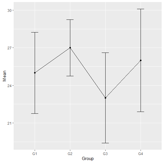
How to create a line chart with mean and standard deviation using ggplot2 in R?
Sometimes we have mean and standard deviation given for groups or factors, these are generally obtained from previous research studies and is referred to as the secondary data. In this case. the line chart with mean and standard deviation using ggplot2 can be created by defining the minimum and maximum inside geom_error function of ggplot2 package, where the difference between mean and standard deviation defines the standard deviation if the minimum is set as mean minus one standard deviation and the maximum is set as mean plus one standard deviation.
Example
Consider the below data frame −
Group<−c("G1","G2","G3","G4")
Mean<−c(25,27,23,26)
SD<−c(3.24,2.25,3.6,4.1)
df<−data.frame(Group,Mean,SD)
df
Output
Group Mean SD
1 G1 25 3.24
2 G2 27 2.25
3 G3 23 3.60
4 G4 26 4.10
Loading ggplot2 package and creating the plot with mean and standard deviation −
library(ggplot2)
ggplot(df,aes(Group,Mean))+geom_errorbar(aes(ymin=Mean-SD,ymax=Mean+SD),width=0.2)+geom_line(group=1)+geom_point()
Output

Updated on: 2026-03-11T22:50:55+05:30
3K+ Views

Advertisements