
Article Categories
- All Categories
-
 Data Structure
-
 Networking
-
 RDBMS
RDBMS
-
 Operating System
-
 Java
Java
-
 MS Excel
-
 iOS
iOS
-
 HTML
HTML
-
 CSS
CSS
-
 Android
-
 Python
-
 C Programming
-
 C++
C++
-
 C#
C#
-
 MongoDB
-
 MySQL
MySQL
-
 Javascript
-
 PHP
PHP
-
 Economics & Finance
How to Add Leader Lines to a Doughnut Chart in Excel?
Analysing doughnut charts could be a complex process if there are no leader lines for the data. The line that connects the data label and its associated data is known as the "Leader line." Although using a leader line is not the default in Excel, we can add leader lines to the doughnut chart using this simple process. In this tutorial, we will discuss how we can add leader lines to a doughnut chart in Excel.
Adding Leader Lines to a Doughnut Chart
Here we will first create a doughnut chart, convert it into a pie chart, and then finally add data labels to it. Let's take a look at a simple procedure for adding leader lines to a doughnut chart in Excel.
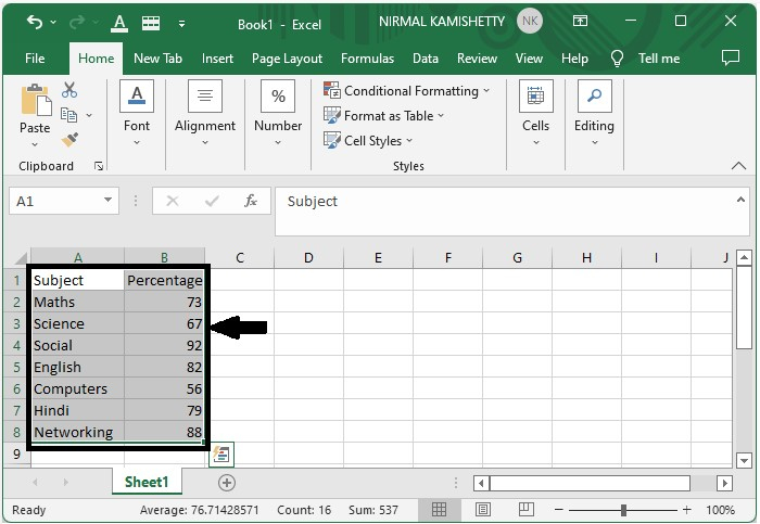
Step 1
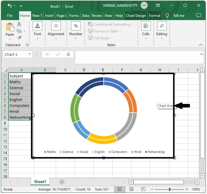
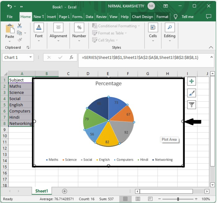
Consider the following Excel sheet with data similar to the image below.
Step 2
Select the doughnut chart from many in the charts section, which is named "3D pie," before selecting the data and copying it.
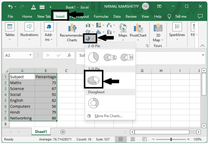
The above process will create a doughnut chart without the leader lines.
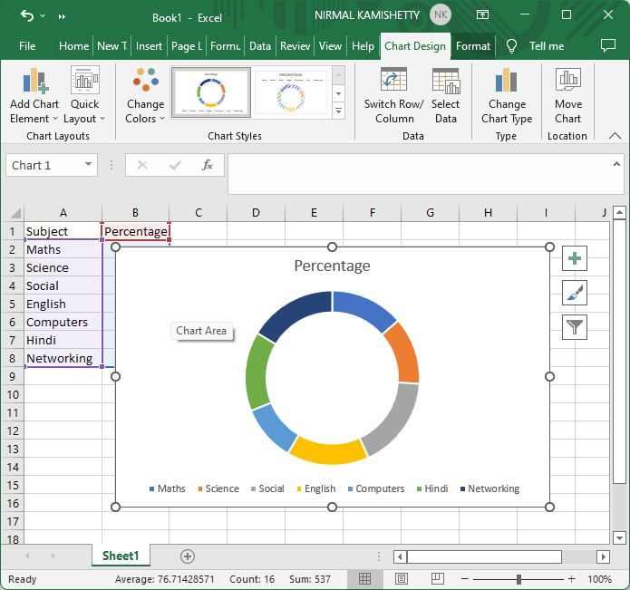
Step 3
Select the data and copy it using the command CTRL + C. Click on the existing doughnut chart and click on "Paste Special" from the paste menu at home.
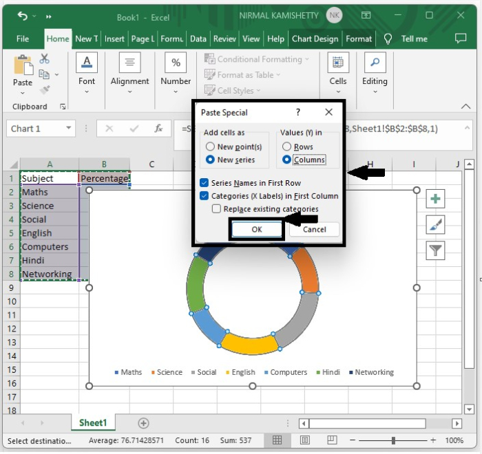
Now Select both check boxes that are shown, then click "OK." This modifies the doughnut chart as shown below.
Step 4
Now right-click on the outer portion of the chart and select change series chart type, and then select 3D pie in the pie category as shown in the below table.
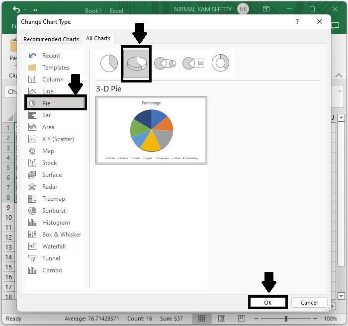
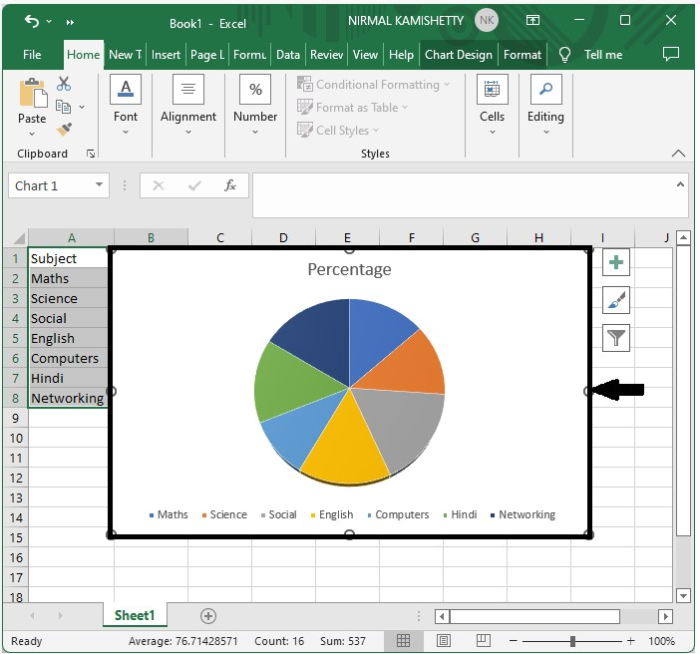
Then click OK, which converts our doughnut graph into a 3D pie chart.
Step 5
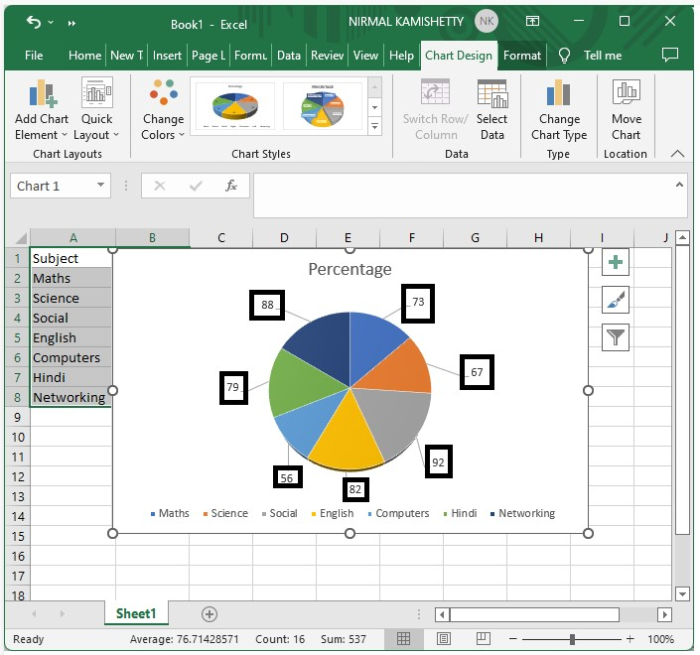
Then click on the pie chart, then right-click and select "Add labels" from the content menu.
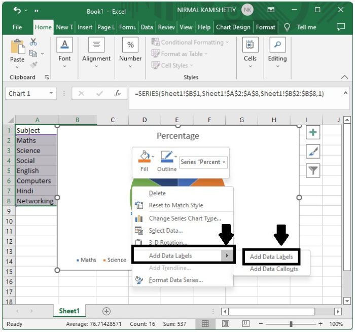
The data labels will be added to the chart.
Step 6
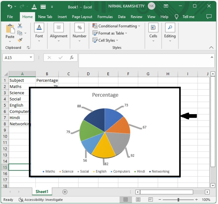
Then drag each data label to the outside of the pie chart, which makes pie charts look like the below image.
Step 7
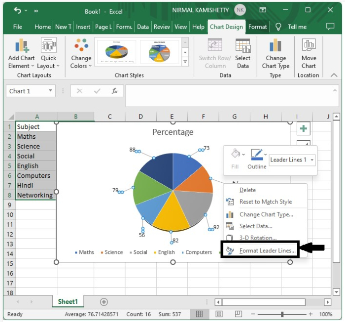
As we can see, the leader lines are very thin. We can change the type of line used.
Click on any leader line, then right-click on the leader line. Select format leader line from the content menu, and then it shows the formatting table for leader lines as shown.
Then format options will be opened, as shown below.
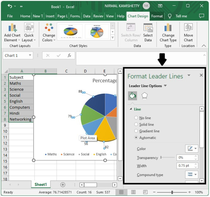
Now select the solid line in the line section, then select the colour black, set the transparency to zero, and finally increase the width to 4 points.

Now close the formatting table.
The final output will have a leader line as shown in the below image.
Conclusion
In this tutorial, we used a simple example to demonstrate how you can add leader lines to a doughnut chart in Excel to highlight a particular set of data.

734 Views
