
Article Categories
- All Categories
-
 Data Structure
-
 Networking
-
 RDBMS
RDBMS
-
 Operating System
-
 Java
Java
-
 MS Excel
-
 iOS
iOS
-
 HTML
HTML
-
 CSS
CSS
-
 Android
-
 Python
-
 C Programming
-
 C++
C++
-
 C#
C#
-
 MongoDB
-
 MySQL
MySQL
-
 Javascript
-
 PHP
PHP
-
 Economics & Finance
How to create bar plot with gradient colors using ggplot2 in R?
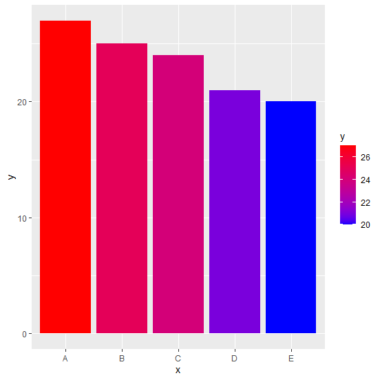
To create bar plot with gradient colors using ggplot2, we can use scale_fill_gradient function where we can set the lower and higher color values.
For Example, if we have a data frame called df that contains two columns say Cat and Count then we can create the bar plot with gradient colors by using the below command −
ggplot(df,aes(Cat,Count,fill=Cat))+geom_bar(stat="identity")+scale_fill_gradient(low="blue",high="red")
Example
Following snippet creates a sample data frame −
x<-LETTERS[1:5]
y<-c(27,25,24,21,20)
df<-data.frame(x,y)
df
The following dataframe is created
  x  y
1 A 27
2 B 25
3 C 24
4 D 21
5 E 20
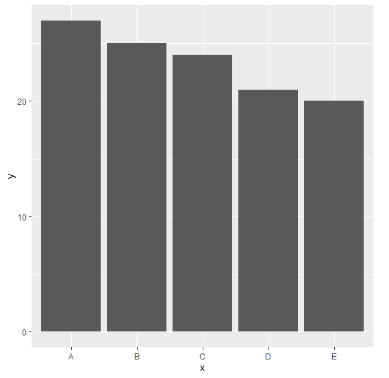
To load ggplot2 package and create bar plot for data in df on the above created data frame, add the following code to the above snippet −
x<-LETTERS[1:5]
y<-c(27,25,24,21,20)
df<-data.frame(x,y)
library(ggplot2)
ggplot(df,aes(x,y))+geom_bar(stat="identity")
Output
If you execute all the above given snippets as a single program, it generates the following Output −
To create bar plot for data in df having bars filled with gradient color on the above created data frame, add the following code to the above snippet −
x<-LETTERS[1:5]
y<-c(27,25,24,21,20)
df<-data.frame(x,y)
library(ggplot2)
ggplot(df,aes(x,y,fill=y))+geom_bar(stat="identity")+scale_fill_gradient(low="blue",high="red")
Output
If you execute all the above given snippets as a single program, it generates the following Output −

6K+ Views
