
Article Categories
- All Categories
-
 Data Structure
-
 Networking
-
 RDBMS
RDBMS
-
 Operating System
-
 Java
Java
-
 MS Excel
-
 iOS
iOS
-
 HTML
HTML
-
 CSS
CSS
-
 Android
-
 Python
-
 C Programming
-
 C++
C++
-
 C#
C#
-
 MongoDB
-
 MySQL
MySQL
-
 Javascript
-
 PHP
PHP
-
 Economics & Finance
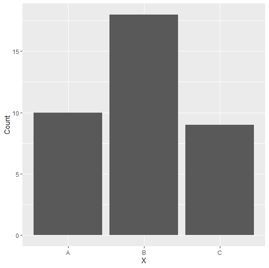
How to create bar plot using ggplot2 with structure data frame?
To create bar plot using ggplot2 with structure data, we need to set the stat argument of geom_bar function to identity. This is same for the regular data frame.
For example, if we have a structured data frame called df that contains a column X for categories and a numerical column say Y for frequency then we can the bar plot for this data by using the below given command −
ggplot(df,aes(X,Y))+geom_bar(stat="identity")
Example
Following snippet creates a sample data frame −
df<-structure(list(X=c("A","B","C"),Count=c(10,18,9)),.Names=c("X","Count"),row.names=c(NA, -3L),class="data.frame")
df
Output
The following dataframe is created −
   X  Count
1  A  10
2  B  18
3  C   9
To load ggplot2 package and create bar plot for data in df, add the following code to the above snippet −
library(ggplot2)
ggplot(df,aes(x=X,y=Count))+geom_bar()
Output
If you execute all the above given snippets as a single program, it generates the following Output −
Error: stat_count() can only have an x or y aesthetic.
Run `rlang::last_error()` to see where the error occurred.
The correct code to load ggplot2 package and create bar plot is as follows −
ggplot(df,aes(x=X,y=Count))+geom_bar(stat="identity")
Output
If you execute all the above given snippets as a single program, it generates the following Output −

1K+ Views
