
Article Categories
- All Categories
-
 Data Structure
-
 Networking
-
 RDBMS
RDBMS
-
 Operating System
-
 Java
Java
-
 MS Excel
-
 iOS
iOS
-
 HTML
HTML
-
 CSS
CSS
-
 Android
-
 Python
-
 C Programming
-
 C++
C++
-
 C#
C#
-
 MongoDB
-
 MySQL
MySQL
-
 Javascript
-
 PHP
PHP
-
 Economics & Finance
Selected Reading
How to create a bar plot with ggplot2 using stat_summary in R?
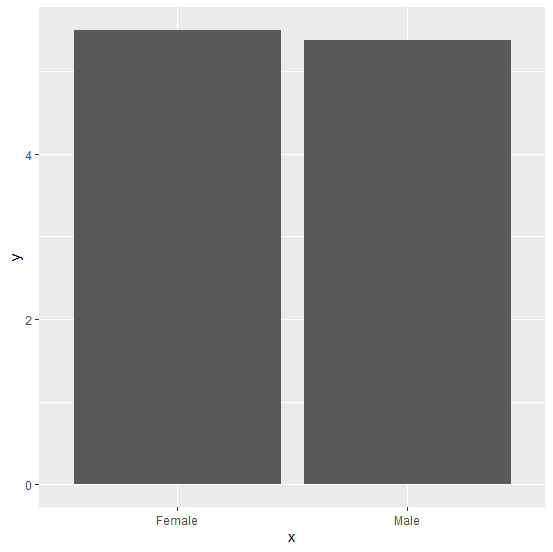
There are multiple ways to create a bar plot in R and one such way is using stat_summary of ggplot2 package. In this function, we need to supply a function for the y-axis and to create the bars we must use geom="bar". The main thing is to decide which function should be used for y-axis values.
Example
Consider the below data frame:
> x<-sample(c("Male","Female"),20,replace=TRUE)
> y<-rpois(20,5)
> df<-data.frame(x,y)
> df
Output
    x    y
1 Female 3
2 Male 3
3 Female 7
4 Male 3
5 Female 8
6 Female 5
7 Male 11
8 Male 6
9 Male 5
10 Female 3
11 Female 2
12 Female 7
13 Male 6
14 Female 5
15 Male 3
16 Male 6
17 Female 9
18 Female 6
19 Female 8
20 Female 3
Loading ggplot2 package and creating bar plot using stat_summary:
Example
> library(ggplot2)
> ggplot(df,aes(x,y))+stat_summary(fun="mean",geom="bar")
Output

Updated on: 2026-03-11T22:50:53+05:30
1K+ Views

Advertisements